Final part of a 3 parts series on how to create a Geographical Flow Map in Microsoft Excel
 This is the third and final part of our series on how to create a Geographical Flow Map in Microsoft Excel and it will be a relatively short article (at least by my standards).
Why? Because the technique of how to visualize flows on a map in Excel was already covered in part 1 and part 2. Today’s post will simply enhance that visualization with a technique which has been covered in many blog posts here throughout the last 10 years: adding a so called Choropleth or Filled Map. Check out the category Choropleth Maps to see what has already been published about this topic on this blog.
To cut a long story short, this article will only briefly explain the idea and how to configure the colors used on the Flow and the Choropleth Map. As usual, the example Excel workbook is provided for free download.
The Idea
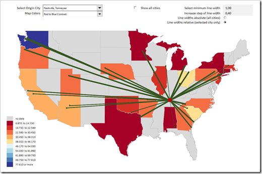
As described in the first part of the series, the XY Scatter Chart, which plots the cities and the flows, sits on top of a group of shapes visualizing a map of the United States. Although the map is static, it is very important, because it provides the necessary geographical context.
Now, having the map already (and also needing it), it seems natural to use it for an additional visualization. What immediately comes to mind is color-coding the shapes according to the total amount of quantity moved from the selected city to each state.
In other words, a Choropleth Map based on the sum of quantities per state.
The Choropleth Map
If you are a long time reader of this blog (and yes, there are a few…), you are certainly familiar with the technique of how to create Choropleth Maps in Excel.
If not, here are a few links to get you started:
Faster Choropleth Maps with Microsoft Excel, posted in September 2012, describes the concept and the algorithm how a freeform shape map can be color-coded.
Create Excel Choropleth Maps from Shape Files shows how to transform ESRI Shape Files into a freeform shape map in Excel.
The following posts demonstrate a few variations and enhancements of the technique:
- Fast Choropleth Map with Enhanced Features
- Drill Up and Down on Choropleth Maps in Excel
- Cartograms in Microsoft Excel
- US Choropleth Map by County per State
You see: the idea, the technique and the algorithm for creating Choropleth Maps in Excel have been around for a long time already, but they’re still useful.
Configuration of the Color Scales
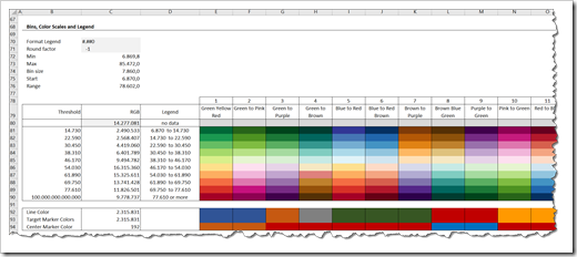
With the second combo box above the view, the user can select one out of 45 options how the map shall be color-coded. You can change those scales, add your own ones or delete some of the existing on the worksheet [control choropleth map] in the range E80:AW90.
Please note that in the range beneath (E92:AW94) you can also define the colors of the selected city, the target city and the lines of the Flow Map individually for each color scale:
Simply change the cell fill colors of those ranges as you think fit and run the code again by selecting a new scale on the worksheet with the view.
The Download Link
Download US Flow and Choropleth Map (zipped Microsoft Excel Workbook, 954K)
Acknowledgement
If you have already used one of the Choropleth Maps provided on this blog, you might notice that there are new and very interesting scales available in today’s workbook. They are particularly helpful because they are designed to focus on specific aspects of the data and thereby support the data analytics process. Have a look at e.g. High Focus, Low Focus, Center Loaded, Outlier Loaded or Blue Stepped Red Tips. Depending on your data and what you want to analyze, these color scales can be very helpful.
Those great additional scales were contributed by Ron Whale. Many thanks, Ron. Greatly appreciated.
More new posts should hopefully come soon, so stay tuned.

Leave a Reply