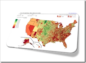
Interactive drill up and down geographical hierarchies on a Choropleth Map in Microsoft Excel

The post Faster Choropleth Maps with Microsoft Excel provided a faster version to update a Choropleth Map in Microsoft Excel. The approach made it possible to use Choropleth Maps with several thousand regions on an interactive Microsoft Excel dashboard in production.
This also opened up new possibilities to enhance the maps with additional features. Leonid Koyfman contributed a couple of great enhancements in the follow-up article Fast Choropleth Map with Enhanced Features like filtering the data by value bin, showing tooltips and letting the user decide whether the map shall be colored by state or by county.
Very soon after this follow-up article was published, Leonid came up with another great idea. He suggested to take the user selection of how to color the map to the next level: let the user easily drill up and down the geographical hierarchy by simply clicking on the map. One click toggles from coloring the entire state to the counties in that state and vice versa. I have to admit, I am sitting on this nugget for one and half years already and never found (well, more precisely never took) the time to publish it. But finally the time has come. Here it is.
Today’s article explains Leonid’s idea and implementation how to drill up and down geographical hierarchies on a Microsoft Excel Choropleth Map.
The article includes two example workbooks for free download: the USA by states and counties and Germany by the two common ZIP-code levels PLZ2 and PLZ5 (first two digits of the ZIP-code and the entire five digits ZIP-code).
The Idea
Let’s say you have data divided into several geographical hierarchies like administrative levels, e.g. USA by states and counties, France by régions and départements or Germany by ZIP-code levels (“PLZ2” and “PLZ5”).
If you want to visualize this data of both hierarchy levels on one Excel dashboard, you have various options:
- Create several dashboards, one for each hierarchy. The disadvantage: the user has to switch forth and back between the dashboards
- Display several maps on one dashboard. The disadvantage: maps require a lot of real estate. You either have to make the maps very small and/or you refrain from showing any other charts and tables on this dashboard
- Let the user decide (e.g. with an option button) which hierarchy level to be displayed and use the camera object to switch between the geographical hierarchies. This avoids the additional maps, but allows the display of only one hierarchy level at a time
If you are creating an interactive Excel dashboard, the last option is probably the one you would want to go with.
Having said that, wouldn’t it be nice, if the user would be able to define the hierarchy level not only for the entire map, but also for each region individually by simply clicking on the map?
Exactly this feature is the idea of today’s article.
The Functionality
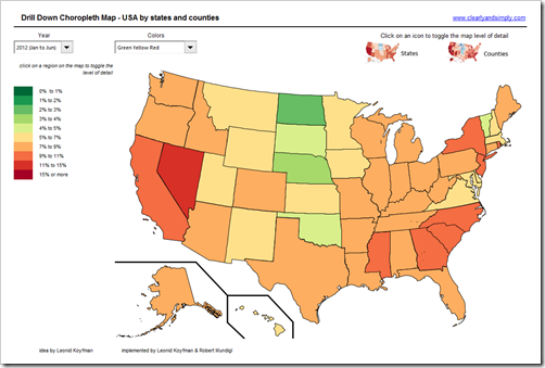
Here is a map of the United States colored by states:

Nothing new under the sun. A Choropleth Map with the states colored according to the values in the data.
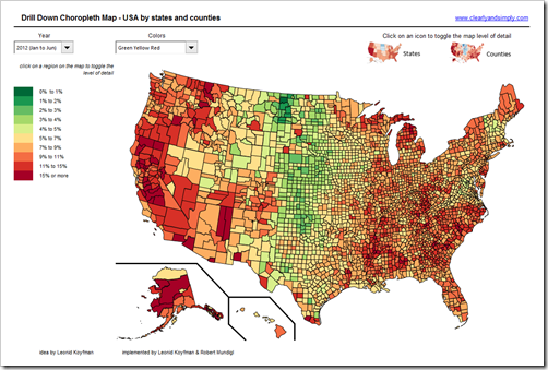
Here is a map of the USA by counties:

Same data, same functionality, just a different level of detail.
So what’s new?
It is all on one dashboard and the user can easily switch from one hierarchy level to the other by clicking on one of the map icons at top right of the dashboard.
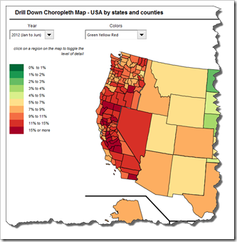
But that’s not all. The user also has the option to click on any state to toggle the level of detail for only this state. E.g. you are interested especially in the details on the West Coast? Starting with the map showing all data on state level, you need only three clicks to get this:

You can switch back to the state level by clicking again or show the entire map by one level of detail with one click on one of the map icons on top right.
The Implementation
The implementation is based on the workbook provided in the article Faster Choropleth Maps with Microsoft Excel. I won’t go into the details of this approach again. If you are interested, please check out that post.
Providing the option of drilling up and down geographical hierarchy levels requires a few additional things:
- The dashboard contains two entire maps, one for each hierarchy level (e.g. states and counties) sitting on top of each other
- A naming convention for the shapes is introduced to differentiate between the hierarchy levels. In our implementation we used “S1_” as the prefix for level 1 shapes (states, i.e. “S1_WY”) and “S2_” as the prefix for level 2 shapes (counties, e.g. “S2_WY_Weston”).
- The basic idea is to make those shapes invisible which are not selected to be displayed, e.g. if only states shall be displayed, all level 2 shapes are made invisible by setting the .Visible property of those shapes to False.
- The additional VBA code is in the module “modDrill”. There are 4 subs in total:
- ToggleEntireMapLevel (intLevel As Integer) makes all shapes of the selected hierarchy level visible and all shapes of the other level invisible
- Toggle2Level1 and Toggle2Level2 use this sub to switch to the according level. These two subs are assigned to the according map icon on top right of the dashboard
- The sub “Drill” detects which shape has been clicked on and changes the visibility of the according shapes of this state depending on the current status. I.e. if the map currently displays this region on state level, it makes the state shape invisible and all county shapes of this state visible and vice versa.
This sub is assigned to each shape of both maps, i.e. it is executed each time the user clicks on the map
The VBA code isn’t too complicated. A couple of Ifs, For Each loops, Lefts to get the hierarchy level according to the naming convention (see above) and setting the .Visible property. That’s pretty much it. 79 lines of code. No rocket science. If you are interested in the details, please download one of the workbooks (see below) and have a look.
The Disadvantages
What can I say? It is still a workaround and it comes with a couple of disadvantages:
- It is quite a challenge to find and insert two maps which fit exactly in size. The shapes always get a bit distorted during the process of converting SHP to SVG, SVG to EMF and ungrouping inserted EMF files in Excel. I think we managed it pretty well in the two examples posted for download, but if you go to a very high zoom level, you will still see some distortions
- Two maps, a lot of shapes, naming convention, assigning a macro to all shapes, etc. require a lot of time to set up the workbook
- The performance: although toggling the level of detail does not recolor the shapes, it still takes some time to make shapes visible / invisible. Not as much as recoloring the map when selecting another measure or color scale, but still. However, for a workaround it is still sufficiently fast in my humble opinion
- Finally, the file size: more shapes = bigger file. The USA workbook by states and counties has more than 2.5 MB, Germany by ZIP-codes PLZ2 and PLZ5 even almost 9 MB. Unfortunately there is nothing you can do about that. The more shapes you have, the bigger the workbook and even zipping the file doesn’t really help
Despite all those downsides, the workaround for creating Choropleth Maps is still a viable option from my point of view. It is free, it works well and it is fast enough even on an interactive dashboard in production.
The Download Links
Here are the Excel workbooks for free download.
The USA by states and counties:
Download Choropleth Map USA by states and counties (Microsoft Excel 2007 – 2013, 2656.4K)
Germany by ZIP-code level PLZ2 and PLZ5:
Download Drill Down Choropleth Map Germany by ZIP-codes (Microsoft Excel 2007 – 2013, 9106.2K)
Acknowledgement
A big thank you very much goes again to Leonid Koyfman for his great ideas, his time, his ongoing support and last but not least his admirable patience with me.
Thanks, Leonid!
Stay tuned.
Leave a Reply