Part 2 of a 3 parts series on how to create a Geographical Flow Map in Microsoft Excel
 Whilst the workbook and explanations provided in the first post laid the foundation for a Geographical Flow Map in Excel, the visualization was very limited in its usability. It only visualized the flow or movement from one city to several endpoints, but not any measure or value which is moved like shipped quantities, USD, persons, or something similar.
Today’s post removes this limitation by visualizing a measure by the thickness of the lines between the cities: the thicker the line, the larger the measure and vice versa.
As always, the post comes with the example Excel workbook for free download.
Setting the Expectations
The first part of the series describes the most simple version of a geographical Flow Map in Microsoft Excel (technically spoken a Route Map). It uses standard Excel features only (e.g. no VBA) and is thereby limited in its functionality: it shows only the paths from the starting point to the endpoints without visualizing how much is moved from origin to target.
Today’s article will fix this by using a VBA code snippet to adjust the line widths according to the values of the connections.
The following sections describe the necessary enhancements of the foundation provided in the first post. If you want to follow along, I recommend to download, unzip and open the workbook before you continue to read:
Download US Flow Map enhanced (zipped Microsoft Excel Workbook, 1.07MB)
The Data
Although this second version includes more data (more cities of the US), the structure of the data worksheets is almost unchanged compared to the simple version.
One exception, of course: the table [tab_data] on worksheet [data] has one additional column with a measure (number) for each connection. This value could represent shipped quantity or USD or whatever you need.
Please note that all data (connections and values) used in this series is made up.
The Visualization of the Measure and a few interactive Options to configure it
The sheet showing the Flow Map is enhanced by three interactive options to give the viewer at least some control over how the visualization should look like:
 Not each individual value will get its own line width. Instead, the underlying data is grouped into 10 bins of equal size and the values of the connections will be visualized by 10 different line widths, depending on the bin the value belongs to.
With the first two parameters, the user can configure the line widths for those bins:
- the minimum width of the lines in points defines the line width of the first bin
- the increase step of the line width is the number of points the line width increases from bin to bin
An example: if the minimum line width is set to 1.0 and the step increase is set to 0.5, the values in the first bin will get a line width of 1.0pt, the values in the largest bin a line width of 5.5.pt.
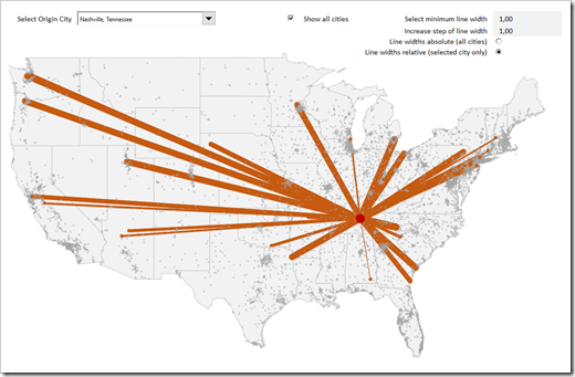
A picture says more than 1,000 words. Here is the Flow Map with a minimum of 1.0pt and a step increase of also 1.0pt:
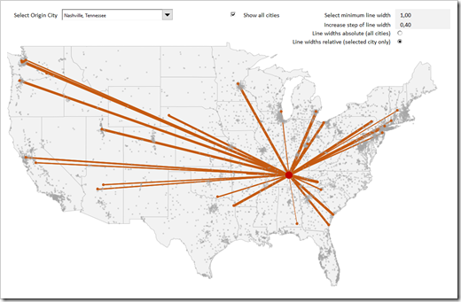
 If we reduce the step from 1.0pt to 0.4pt, the same data looks like this:
With the third interactive option (radio buttons), the user can decide whether the line widths should be proportional to the values of all connections of all cities (absolute) or only to the values of the connections of the selected city (relative):
- absolute: the bin sizes are calculated based on minimum and maximum of all values (all cities)
- relative: the bin sizes are calculated based on minimum and maximum of the values of the selected city only
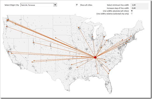
The screenshot above shows relative line widths. If this is changed to absolute line widths, the lines are much thinner for the same data, as shown below:
 The Calculations
On the [control] worksheet, some additional calculations are required:
- In cells C53:C55, the minimum and maximum values and the size of the bins are calculated
- The new table [tab_line_widths] beneath defines the bins and their according line widths, based on the data (minimum and maximum) and the user-defined line width parameters
- Finally the table [tab_lines] is extended by two columns: the value and the line width. The VBA code refers to this table to adjust the line widths of each data point
I won’t go into the details of the new formulas in this version. Except for the two array formulas, which calculate minimum and maximum, the formulas should be very easy to understand. Again, if you do have a question regarding the formulas, please leave me a comment or send me an email.
The VBA Code
Last, but not least, the heart of the solution: the VBA code.
Believe it or not, there are only two subs in two different objects:
- The sub AdjustLineWidth in Module modChartThe sub loops through each data point of the series “Lines” of the XY Scatter Chart and sets the line width to the calculated value in the column [Line Widths] of the table [tab_lines]. No big deal, pretty straight forward. The sub is assigned to the combo box and the radio buttons on the worksheet and will be fired each time these form controls are used.
- The event driven sub Worksheet_Change in the worksheet object of Sheet1This sub will automatically be fired if anything changes on the first worksheet. The code checks if something is changed in the range of the named range [myWidthDefinition], which are the two cells where the user can define the line widths. Anytime the user changes something, this event driven sub will kick in and call the AdjustLineWidth sub (see above)
I won’t post the code itself here. There are only 24 (!) lines of code. If you are interested, download the workbook and have a look for yourself. The code is not password protected.
The Download Link
Here is the download link again:
Download US Flow Map enhanced (zipped Microsoft Excel Workbook, 1.07MB)
What’s next?
The series will be closed with a rather short, but fancy third version: the grey background map will be turned into a Choropleth Map (Filled Map or Heat Map), visualizing a second measure like the total amounts shipped from the selected city to the states.
Stay tuned.

Leave a Reply