Part 1 of a 3 parts series on how to create a Geographical Flow Map in Microsoft Excel
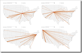
 A Geographical Flow Map visualizes the physical route or flow of material, people, money, information, etc. from a starting point to several endpoints.
Flow Maps do certainly not belong to the visualization types in daily use. But it is definitely helpful to have such a template in your toolbox in case you may need it one day.
Today’s article is the first of a 3 post series about how to create Geographical Flow Maps in Excel.
This first part lays the foundation with a workbook setting up the data, the calculations and the chart by using standard Excel features only, i.e. no VBA. As always, all three posts will come with the according Excel workbook for free download.
Setting the Expectations
This first part of the series describes the most simple version of a geographical Flow Map in Microsoft Excel. It uses standard Excel features only (e.g. no VBA) and is thereby limited in its functionality: it shows only the paths from the starting point to the endpoints without visualizing how much is moved from origin to target.
Technically spoken it isn’t a even a Flow Map, but a so called Route Map. Agreed, Route Maps do not have many uses cases, but since this workbook is the foundation for the more advanced Flow Maps shown in the next two articles, I recommend having a closer look at this workbook first.
The following sections describe how the workbook and Flow Map chart is created. If you want to follow along, I recommend to download, unzip and open the workbook before you continue to read:
Download US Flow Map simple (zipped Microsoft Excel Workbook, 427K)
The Visualization
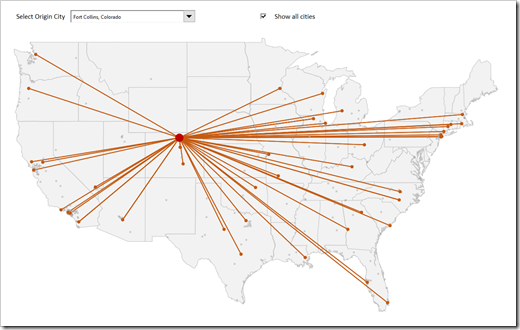
As an exception, let’s start with a look at the final result: the chart on worksheet [geographical flow map]. The view consists of two objects:
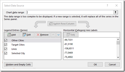
- an XY Scatter Chart with four data series
- a group of freeform shapes visualizing the map of the United States
The only dynamic part of the view is the XY Scatter Chart, i.e. only the XY Scatter changes if the user selects a new starting point or if the source data is updated. The map in the background serves the simple, but important purpose to set the dots and lines of the XY Scatter Chart into a comprehensible geographical context.
The tricky part of setting up this view is the synchronization and alignment of the Scatter Chart and the map. This is definitely tedious work, but since I have done this already for the post Select Areas on a USA Map in Microsoft Excel, I only had to copy the two objects to a new workbook and change the data series.
The Data
The following two tables are required as the underlying input data:
- [tab_data] on worksheet [data]The table contains all combinations for each starting point (column [From]) to its endpoints (column [To]). An additional calculated column concatenates the two cities separated by a pipe (“|”) in order to have a unique identifier for each combination of start and end.
Important: please note that this table has to be sorted ascending by column [From] to facilitate the calculations.
- [tab_geo_data] on worksheet [geo_data]. The table provides city and state name and their geodata (latitude and longitude).
The Interactive Controls
Two interactive form controls above the chart allow the user to define what to display: a combo box to select the starting point and a checkbox to define whether or not all other cities (i.e. neither starting nor endpoint) should be shown. The target cells of these controls are on worksheet [control] and used in the calculations to define the geodata which will be plotted.
The Data Series of the XY Scatter Chart and the Calculations
Based on this input data and the target cells of the form controls, the following four data series are calculated and plotted on the Flow Map:
Selected City: the series contains one data point only, calculated in range B7:B8 on worksheet [control] using a simple INDEX function based on the user selection.
Target Cities: the data source of this series are the calculated columns [Latitude Target] and [Longitude Target] in the table [tab_geo_data]. The formulas check if the city is not the selected city AND the combination of the starting point and the name of this city can be found in column [Combination] of the table [tab_data], i.e. this flow does exist in the raw data. If both is the case, the formulas return latitude and longitude and #N/A otherwise.
Other Cities: the data source of this series are the calculated columns [Latitude Others] and [Longitude Others] in the table [tab_geo_data]. The formulas check if the city is neither the starting point nor one of its endpoints and the “Show all cities” box is checked. If this is the case, the formulas return latitude and longitude and #N/A otherwise.
Lines: the series “Lines” refers to the columns [Latitude] and [Longitude] of the table [tab_lines] on the worksheet [control].
And here is the trick: the first row of the table are the coordinates of the starting city. From there on, every combination between start and end is represented by two data rows: the first one is the endpoint, the second point is the starting point again.
Why? Since this series will plot the lines, we have to get back to the starting point every time. Otherwise the line would be drawn from the starting point to the first endpoint, from the first endpoint to the second endpoint, and so forth. This would result in a continuous path between all end points, but this is not what we are trying to achieve. By returning to the starting point every time, we plot each line twice, but since they are sitting on top of each other, this cannot be seen in the view.
Here is the catch: the size of table [tab_lines] has to be adjusted according to the data. It must have at least twice as many rows as the maximum count of a city in the [From] column of the table [tab_data]. In the example posted for download, this is Brownsville, Texas with 50 occurrences in the [From] column, hence, [tab_lines] has 100 rows. The disadvantage is that you may have to resize this table if your input data changes.
The formulas aren’t too complicated. They are mainly based on the functions IF, AND, OR, INDEX, MATCH, ISNA, NA(). Nothing to write home about. However, if you do have a question regarding the formulas, leave me a comment or send me an email and I will try to explain.
Here is an example how this could look like:
 The Download Link
For those of you who are used to directly jump to the end of the post to get the workbook, here is the download link again:
Download US Flow Map simple (zipped Microsoft Excel Workbook, 427K)
What’s next?
The second part of the series will turn this into a real Geographical Flow Map, visualizing a measure (the quantity, weight or value of the thing which is moved) by different widths of the lines proportional to the value.
Stay tuned.

Leave a Reply