How to create Cartograms in Microsoft Excel
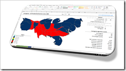 The article Cartograms in Tableau described the limitations of Choropleth Maps under certain circumstances and why Cartograms can sometimes be a viable alternative to color coded maps.
Building upon that, the previous post (Create your own Cartograms in Tableau) provided a Microsoft Excel tool to create the polygons for Cartograms based on your own data. The Excel tool (called Cartogram Data Generator) is based on my VBA implementation of “an algorithm to construct continuous area cartograms” by J. Dougenik, N. Chrisman and D. Niemeyer, published in “Professional Geographer” back in 1985.
With this VBA algorithm and two other techniques previously published here (Faster Choropleth Maps with Microsoft Excel and Create Excel Freeform Shapes from Polygons), we have all modules available to calculate and plot Cartograms directly in a stand-alone Microsoft Excel workbook.
Today’s post describes how to create Cartograms in Microsoft Excel and provides two versions of the Cartogram workbook for free download.
The Idea and the Result
As mentioned in the introduction, we already have all the techniques and VBA implementations available to plot Cartograms in Excel. All we have to do is to pull the different code snippets into one workbook.
The code in this workbook will
- calculate the distorted polygons of the regions using the algorithm provided in Create your own Cartograms in Tableau
- create freeform shapes based on the resulting distorted polygons using the code published in Create Excel Freeform Shapes from Polygons
- and finally color the freeform shapes (regions) in the tried and tested way shown in Faster Choropleth Maps with Microsoft Excel
Nothing new under the sun, but the combination of all these techniques makes an interesting and easy-to-use Excel workbook for plotting Cartograms:
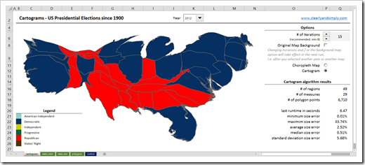
Cartograms of the US Presidential Elections since 1900:
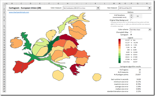
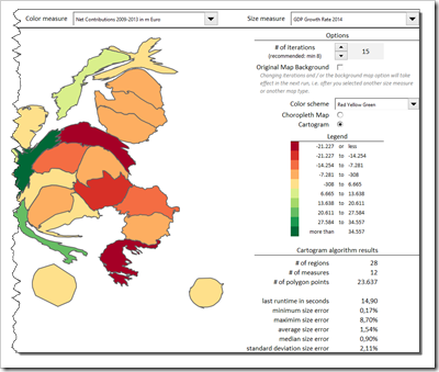
 Or selected statistics of the European Union:
 2 Versions
As you can see in the screenshots above, I reused the examples of the previous articles: statistics of the European Union and the results of the US Presidential Elections. I thereby noticed that it may be useful to create two different versions of the workbook depending on the structure of the underlying data:
- Version 1 (the EU Statistics)
Different measures and the option for the user to define which measure shall be used for color coding and which one for resizing the regions - Version 2 (the US Presidential Elections)
Data on a yearly basis and the option to select one specific year to be plotted. The measures for coloring (winner of the region) and the size (popular votes) stay the same
The VBA algorithm itself is pretty much the same in the two versions. There are only a few differences in referencing the input data and the user-defined selections.
Data Set Up
As mentioned before, the code is very similar, but the data set up is different.
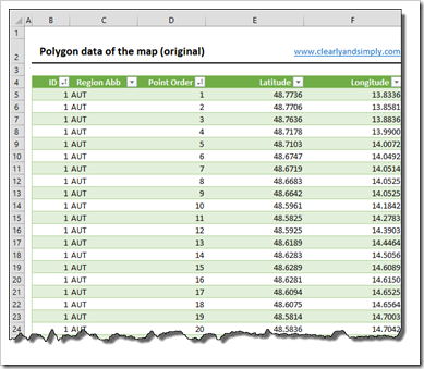
But let’s start with the things the two versions have in common: both workbooks need the original polygon data on a worksheet called [polygons]:
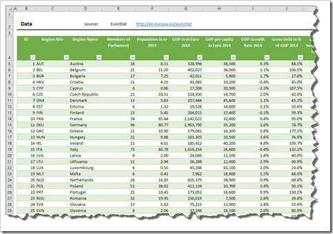
 In addition to this polygon sheet, version 1 requires only one data worksheet with the measures organized in a cross table (regions in the rows and measures in the columns). The sheet looks like this:
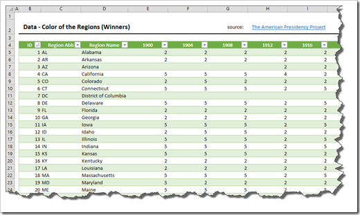
 Version 2, however, needs two data sheets organized in the same structure: the cross table has again the regions in the rows, but the columns represent the years of the elections. The worksheet [data color] contains the values used for coloring the map (the winning parties):
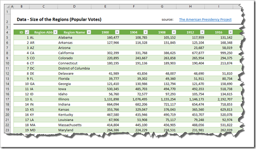
 The worksheet [data size] has the values of the size measure (the popular votes):
 If you want to use one of the templates for your own data, you have to decide first which version is best for the structure of your data.
The Features of the Workbooks
Version 1 – One data worksheet with several measures
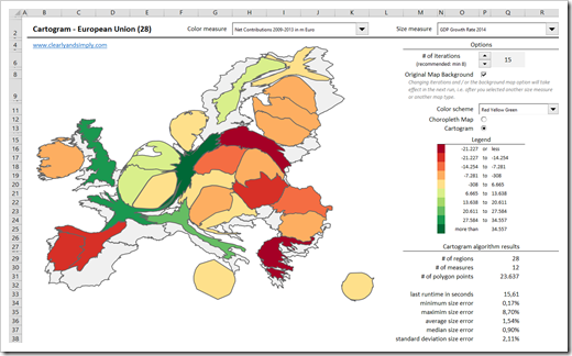
Above and right to the map, the dashboard provides a few interactive options and displays the legend and some statistics about the results of the algorithm:
- With the 2 combo boxes (drop down lists) in the top row of the dashboard, you define the measure to be used for coloring the map and the measure to be used for resizing the regions
- The spinner in the options section lets you define the number of iterations of the algorithm. Recommended minimum is 8. According to my experiences and tests, reasonable results are usually achieved with 12 to 15 iterations. The more iterations, the more precise the results, but also the longer the runtime and vice versa
- With the checkbox beneath the iterations, you can specify whether or not the original, i.e. not distorted map shall be shown in the background. This applies only if you selected the map type Cartogram, of course. If the box is checked, the map would look like this:
- The color scheme drop down provides 24 pre-defined color schemes to select from plus six dummy entries you can use for your own schemes by changing the cell colors on worksheet [color schemes]
- With the option button you decide whether you want to display a Cartogram or a standard Choropleth Map
- The legend is automatically updated depending on the selected color measure and the current color scheme
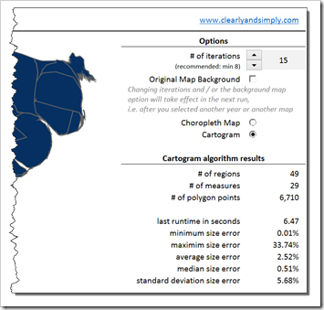
- Finally the section “Cartogram algorithm results” provides some statistics about the data and the last run of the algorithm. It shows indicators about the size of the data (regions, measures, polygon points), the last runtime in seconds and some statistics regarding the final size errors (minimum, maximum, average, median and standard deviation). The size error is the key performance indicator of the algorithm. It is defined as the difference between the desired area of the region (according to the size measure value) and the actual size of the polygon of this region in the Cartogram. The statistics allow you to evaluate how precise the results are. If you think the size errors are too high, you can increase the number of iterations and run the algorithm again (at the cost of a longer runtime).
Version 2 – Two data worksheet with e.g. years in the columns
In version 2, color and size measure are fixed and cannot be changed by the user. Also, there is no option to change the color scheme. Other than that, the dashboard provides the same input features and displays the same statistics:
 Running the Algorithm
In version 1, changing the size measure or using the option buttons will start the algorithm. Selecting another color measure or color scheme will just recolor the map. Changing the number of iterations or the background map option will not trigger the algorithm. The changes will take effect in the next run, i.e. if you select a new size measure or map type.
In version 2, only selecting another year or map type will start the algorithm. Again, changing iterations or the background map option will take effect in the next run.
During the runtime of the algorithm, the code shows its progress in Excel’s status bar at bottom left.

How to use the Templates for your own Data
Using the templates for your own data requires ore or less the same procedure as described in steps 1 to 6 of the previous article (Create your own Cartograms in Tableau). As soon as you have your data and the polygons in the workbook, you may have to change the list of measures on the worksheet [control] (e.g. if you have more measures in your data than the template), the combo boxes on the dashboard and maybe the values for scaling and positioning the Cartogram (at the top of worksheet [control]).
As long as you do not change the structure of the workbook (i.e. the order of the sheets), the table names and the named ranges, you do not have to change anything in the VBA code.
The Download Links
The Cartogram workbook for the selected statistics of the European Union (version 1 of the implementation):
Download Cartograms Excel European Union (Microsoft Excel 2010-2013, 1,163K)
The workbook with Cartograms of the results of the US Presidential Elections since 1900 (version 2 of the implementation):
Download Cartograms in Excel US Presidential Elections (Microsoft Excel 2010-2013, 453K)
The Disadvantage: Performance
Besides the time needed to set up and adjust the templates for your own data, the performance of the algorithm is the main drawback of the implementation. The runtime of the algorithm depends on the number of polygon points and iterations. On my machine, the code needs ~ 15 seconds to update the EU Cartogram and 6 to 7 seconds for the US Presidential Elections Cartogram.
This is too long for a dashboard in production in my book, but I could not find a way to further improve the performance. If you look at the VBA code, the most time consuming part of the algorithm is step 7, where the distance of each polygon point from the center of each region is calculated (and some more variables based on the distance). In my performance tests, this step took more than 95% of the entire runtime of the algorithm and I simply do not see how I could speed this up. There may be some performance potential in the other parts of the code, but since those parts only make 5% of the runtime, performance tweaks would not really pay off.
So, agreed, the algorithm is too slow for an Excel dashboard in production, but I think the results are worth waiting for a few seconds.
What’s Next?
So much for Cartograms in Excel and Tableau.
Speaking of performance issues: the performance of VBA implementations in Excel very often suffer from using the wrong way to read data from and / or write data back to the worksheet. The upcoming article will demonstrate how much the performance can be improved by using the right way of transferring data from the sheets to the VBA code and back.
Stay tuned.
Leave a Reply