Category: Spotlight Post

  • A Neural Network to solve Travelling Salesman Problems in Excel

    Artificial Intelligence in Microsoft Excel: watch a Neural Network solving a Travelling Salesman Problem

    869 words, ~4 minutes read

    Neural Network solving TSPs in Excel - IntroTerms like Artificial Intelligence, Machine Learning, Deep Learning and (Artificial) Neural Networks are all over the place nowadays.

    If you are reading Tech News, Data Science blogs or your LinkedIn feed, it will be little short of a miracle, if you don’t see one of those expressions at least once.

    This is just the revival of those techniques, though. Neural Networks, for one, have been around for many years. In the mid 1990s (!), I did some research and wrote my thesis about Artificial Neural Networks. We even had a blog post here on this topic 10 years ago: Where the rubber meets the road. For whatever reason, that article didn’t make many friends. I was always wondering why. Probably too academic and not visually appealing enough.

    Now, with the recent revival of Artificial Intelligence and Neural Networks, I decided to give it another shot. Today’s post provides an updated, improved version of a Neural Network solving Travelling Salesman Problems in Microsoft Excel.

    You always wanted to watch a Neural Network solving an optimization problem? If so, this article is for you. Either watch one of three videos provided in the post or download the Excel workbook and play around with it at your own speed. No add-in or third party software necessary. All you have to do is to enable macros.
    (more…)

  • An Alternative to the Bar Chart Race

    An alternative solution to the controversial animated Bar Chart Races in Microsoft Excel

    1,276 words, ~ 6.5 minutes read

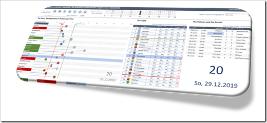
    Alternative to the Bar Chart Race - Intro

    The other day, I watched an as interesting as entertaining dispute between Andy Kirk and Andy Cotgreave about the popular Bar Chart Races: Data Viz Debate: Is the bar chart race more than just a gimmick?

    Although I truly admire Andy Kirk’s work, I am with Andy Cotgreave, here. I wouldn’t go so far to call them the “fidget spinners of data visualization”, but I find them hard to follow, especially when the speed of the animation is too fast.

    Last week, Philip Treacy of MyOnlineTrainingHub published a post and a workbook, how to do a Bar Chart Race in Microsoft Excel. Philip visualized the 2019/2020 Premier League results in an animated Bar Chart. I am a big fan of Mynda and Philip’s MyOnlineTrainingHub, which is definitely one of the best Excel websites worldwide.

    This made me think. Although I love Philip’s work, I am not a fan of the Bar Chart Race. So, how would I approach this? Today’s post provides my solution of an alternative for animated Bar Charts. As always, the post comes with the Excel workbook for free download.

    (more…)

  • A practical Example for Dynamic Storyboards

    A more practical use case for Dynamic Storyboards in Excel: support the Animation of 2-dimensional data by showing the years before and after the current year on a Storyboard

    717 words, ~3.5 minutes read

    The previous post Dynamic Storyboards in Excel showed how to create small multiples (or panel or trellis charts) for 2-dimensional data in a sequence and let the user decide dynamically, how many small multiples shall be displayed. To describe the technique, the article used a kind of funny, but pointless data set: a part of an episode of the Italian cartoon series La Linea.

    Well, creating a dynamically sized comic strip in Excel is a funny little example. But what’s the point here?

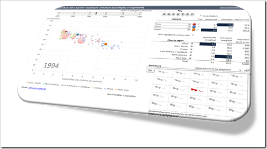
    Gapminder Replica with Storyboard IntroHere’s the point: a Dynamic Storyboard may well be worth considering for a more serious dashboard, too. For instance, a Dynamic Storyboard may support a chart which displays the data for the periods one by one in an animation. The Storyboard can be very useful by showing the data in the context of a user-defined number of years before and after the current period. This can help to better understand the development of the data over time or to discover patterns.

    Today’s post will show how a Dynamic Storyboard may support an animated chart using the example of the Gapminder Replica in Microsoft Excel, published here back in 2014. As usual, the article comes with the workbook for free download.

    (more…)

  • All Peaks of the Alps visualized in Excel

    Bluffing some of Tableau’s amazing interactive features in Microsoft Excel: an Excel Replica of All Peaks of the Alps visualized with Tableau

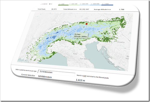
    The previous post provided a Tableau visualization of all peaks of the Alps. Peaks of the Alps - IntroI already bluffed some of Tableau’s amazing interactive features in Microsoft Excel and published the solutions here.

    The idea wasn’t mine, though, but Matt Grams’.

    Matt started the journey in 2009 (!) with his beautiful guest article Bluffing a Visual Cross-tab with Excel. I followed a few months later with Bluffing Tableau Actions with Microsoft Excel. Ever since, I posted a few techniques to replicate Tableau’s interactive options in Microsoft Excel.

    Back in 2013, I created an entire Excel replica of one of my Tableau workbooks, which was once selected as the Viz of the Day by Tableau: Bruce Springsteen Discography – A Tableau Infographic. This is the Excel replica: Bruce Springsteen Discography in Excel.

    To carry on this tradition, today’s article provides an Excel replica of All Peaks of the Alps visualized with Tableau. Truth be told, of course not replicating all of Tableau’s features, but still some interesting interactive functionality in Excel beyond the defaults.

    (more…)

  • Weighted Route Maps in Excel

    How to visualize round trips on a Route Map in Excel, including an indication of the quantities transported between the cities

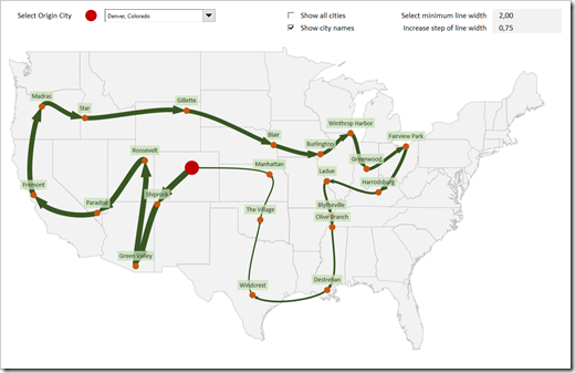
    Weighted Route MapThe recent post series “Geographical Flow Maps in Excel” (part 1, part 2, part 3) described how to visualize flows from one selected city to several target locations, showing the connections between origin and targets and indicating the flow quantity by the thickness of the lines.

    My highly esteemed colleague Joachim Schirra, outstanding SAP and Business Intelligence expert, read the articles and came up with the following question in a comment on LinkedIn:

    “Would it be possible to show a flow with branches, junctions and return flows, too?”

    Although this is a great idea, it sounds easier than it is. Truth be told, I do not have a solution. At least not yet.

    However, Joachim’s comment made me think. What can easily be achieved is the visualization of a weighted Route Map (i.e. a round trip, see image above).

    Today’s post describes how to change and enhance the Geographical Flow Map approach to get to such a Route Map. As always, the post includes the Excel workbook for free download.

    (more…)