How to create a Dynamic Storyboard of Small Charts (similar to Small Multiples, Panel or Trellis charts) in Microsoft Excel
812 words, ~4 minutes read
The article Motion Chart Excel Template used a small sequence of an episode of the Italian cartoon series La Linea to demonstrate how a chart can be animated in Microsoft Excel. I also used the same data in one of my entries to a Tableau data viz contest: Tableau’s Viz as Art Contest – My Entries.
Since it is a cartoon series, it is kind of obvious to also think about visualizing the data in a comic strip (or what I will call storyboard hereafter).
Today’s challenge is to make the size of the storyboard dynamic, i.e. let the user decide with one mouse click, how many images shall be displayed.
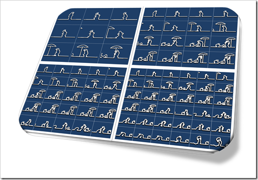
This article describes how to do this in Excel and – as usual – comes with the example workbook for free download.
The Idea
Let’s say we have a 2-dimensional data set (an X and a Y value) in a sequence, e.g. two metrics over time. Animation is a great approach to visualize the development over time as shown here: Gapminder Replica in Microsoft Excel.
That being said, you can also think about small multiples (or trellis chart or panel charts), as shown here in Matt Gram’s stellar guest post: Bluffing a Visual Cross-tab with Excel.
Now, the basic idea of today’s post is to make the size of the display dynamic, i.e. let the user decide how many small multiples shall be shown by changing one parameter.
What we want is to get from this (a 3 times 3 small multiple)
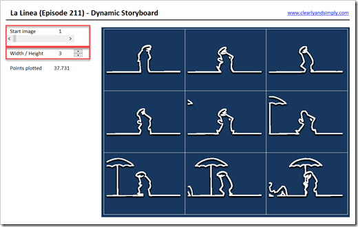 to a 4 times 4 view with only one mouse click:
 And with one more mouse click, we get to a storyboard of size 5 times 5:
 By changing the parameter “start image” (see the horizontal scrollbar in the first screenshot above at top left), the user can also decide from which image on the storyboard shall show the images.
The challenge is the word “dynamic”. Showing a fixed number of small charts could easily be achieved by simply inserting as many charts as required.
Making this dynamic is the interesting part of the idea.
The Implementation
How do we do this in Microsoft Excel? Actually, it is easier than you might think it is.
The workbook is posted for download (see below) and the calculations aren’t too complex, so I will keep this how-to section short. If you are interested in the technique, please download the workbook and have a look. If you have any questions, please leave me a message in the comment section and I will reply as soon as possible.
Here is a short description of how this is done:
- First of all, the display aren’t several charts. It is only one single XY Scatter chart
- The key is to add a vertical and horizontal offset to the data depending on the ID of the image
- The offsets are calculated in the section [Offset Matrix] on worksheet [calculation]. Just an IF function and some arithmetic math. I won’t go into the details, please have a look for yourself
- In the tab [data], this matrix is used to add the calculated offsets to the original data, if the image ID is one to be displayed on the currently selected view. A formula using an IF and an INDEX function, not really complicated. Again, please have a look at the workbook
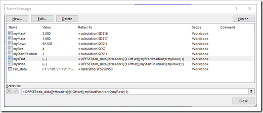
- The chart itself does not plot the entire data range on tab [data], but two named formulas (myXPlot and myYPlot) returning the images to be plotted defined by the user (start image and size of storyboard):
- Finally, there is a small VBA code snippet needed to adjust the maximum scales and the major units of the axes to make the display look right. Only 13 (!) lines of code and pretty straight forward. The sub is assigned to the spinner to can change the size of the storyboard, so it will be fired every time the storyboard size changes
I know, a very brief explanation of how this is done. But still, the workbook is posted for download in the next section, no protected sheets, no VBA passwords. If you are interested in the technique, please have a look and let me know any questions you may have in the comment section.
Download Link
Download La Linea 211 Storyboard (zipped Microsoft Excel workbook, 2.6 MB)
What for?
You may ask, “nice idea to plot a dynamic comic strip in Excel, but what for?”
Well, although I have to admit that I never used this in one of my projects (yet?), I can think of a practical example to integrate this in a serious, business dashboard. The next post will show, how this technique can support an animated dashboard in Microsoft Excel.
Stay tuned.
Leave a Reply