Author: Robert

  • My 2 Cents on the COVID-19 Dashboard by JHU

    For what it’s worth: a few remarks on the currently extremely popular COVID-19 Dashboard provided by the Center for Systems Science and Engineering (CSSE) at Johns Hopkins University (JHU)

    When the Corona pandemic started, I was tempted to build and publish a dashboard about the spread of COVID-19, too. But then I decided not to. Not only because much brighter people than me beat me to it, but also because the topic is very sensitive. People suffer and people die. Not the type of data I want to analyze and visualize. Hence, I stayed out, stayed home and wrote a few articles about something else (see my recent posts).

    Today I changed my mind. I still don’t want to create a comprehensive COVID-19 dashboard, but I would like to add my 2 cents to the definitely most popular Corona Data Visualization: the COVID-19 Dashboard provided by the Johns Hopkins University:

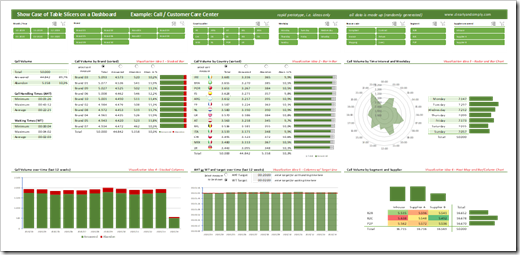
    COVID-19 Dashboard JHUThis afternoon, I read that this dashboard is currently clicked 1.2 billion (!) times a day.

    First things first: it is a great dashboard providing the most important numbers at a glance and various options to drill down into the details. I am very impressed by its features, how quickly this visualization was made available and how often the underlying data is updated. My congratulations to the data science team of the JHU.

    Having said that, I also see a few weaknesses and today’s post will discuss two of them.

    (more…)

  • Microsoft Excel Project Calendar Template

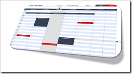
    A ready-to-use Microsoft Excel Template for a dynamic Project Calendar, displaying regular Project Meetings and Deadlines for one selected week 

    Project Calendar Template IntroAs per the subtitle of this blog (see above), Clearly and Simply is about data analysis, modeling, simulation and data visualization.

    If you are a long time reader of this blog (and I am aware there are only a handful), you know that – from time to time – I also post something about Project Management.

    I already published posts here about

    Following this tradition, today’s post provides another little piece out of my Project Management Toolbox: a ready-to-use, dynamic Project Calendar Template in Microsoft Excel. Of course, including the template for free download.

    (more…)

  • Choropleth Maps of Italy in Excel

    A Collection of Choropleth or Filled Maps of Italy in Microsoft Excel
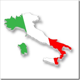
    Map and Flag of ItalyHeads-up: today’s post is dedicated to my friends and readers in Italy. You will certainly only be interested in this article, if you are working in Italy and/or with Italian data.

    If not, you can easily skip today’s post. It does not include any new ideas, it is only new wine in old wineskins: a collection of Choropleth Map techniques (already published here), applied to maps of Italy for different levels of detail.

    ClearlyandSimply is a special interest blog with only very few readers. Most of them are located in the United States, but when I am looking at the web traffic coming from Europe, Italy is always ranked among the top 3, way ahead of e.g. France or Spain.

    I do not exactly know why. I have a hunch, though:

    Back in 2014 and 2015, I helped my friend Marco Nicolucci creating Tableau visualizations of the history of the Serie A (Italian football, or calcio as you say) and the Rugby World Cup for La Gazetta dello Sport. As of today, both visualizations are still available on the Datamania site of La Gazetta:

    If the visualizations should no longer be available on La Gazetta dello Sport, you can also find copies on my Tableau Public Profile.

    So, maybe the publications on La Gazetta dello Sport drove some traffic from Italy my way.

    Also, maybe my Italian internet friend and highly esteemed colleague Roberto Mensa spread the word about my blog. You probably know Roberto. If not, you definitely missed something. Roberto is the guru for data visualization with Microsoft Excel, not only in Italy, but throughout Europe. Together with Krisztina Szabó and Gábor Madács from Hungary, he is running a website called E90E50. I highly recommend to check out the E90E50charts – Excel Charts Gallery, you will find truly amazing work there, all for free download.

    Well, wherever the traffic comes from, this post is for my Italian readers:

    A collection of 6 templates for creating Choropleth Maps of Italy in Microsoft Excel. All of them are ready to use. Simply download the workbook(s) you like, replace the dummies by your own data and you are good to go.

    (more…)
  • Heat Maps with Individual Color Scales in Excel

    How to create Heat Maps in Microsoft Excel using individual Color Scales to support the analytical insights into the distribution of the data

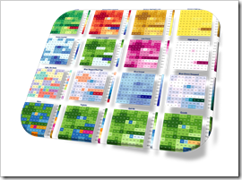
    Heat Maps with individual Color Scales IntroIn his brilliant guest post Analytical Color Scales for Heat Maps, Ron Whale explained, how color scales can efficiently support the process of analyzing data.

    Applying different, thoroughly designed color schemes can help to gain deeper insights into the distribution of data, to identify outliers, to focus on special points of interest, to find similar groupings and more.

    In a nutshell: switching between color scales of a Choropleth or Heat Map helps you to understand your data.

    Whilst Ron was developing his great palette of color schemes for using them on a Choropleth Map, they are equally helpful for a much simpler visualization technique: a Heat Map of a table (or range) of numbers.

    Microsoft Excel does provide a built-in feature to create a Heat Map on a range of numbers: Conditional Formatting. However, this is limited regarding the configuration of the color scales and it does not provide the option to easily switch between color schemes for supporting the data analysis process.

    Today’s post provides a technique to overcome this shortcoming of Excel: a VBA-based solution to easily apply any given color scale to an Excel range with only two mouse clicks. As always, the post comes with the workbook for free download.

    (more…)

  • Analytical Color Scales for Heat Maps

    More sophisticated Color Scales to increase the analytical insights provided by Heat Maps or Choropleth Maps – a Guest Post by Ron Whale

    The workbook posted with the recent article Geographical Flow Maps in Excel (Part 3 of 3) provided new color scales, I never published before. Truth be told, I did not develop these schemes. Ron Whale did. Ron generously agreed to share them here and he is even kind enough to explain the scales, their use cases and the value they add to analytical Heat Maps in today’s guest post. Enjoy.

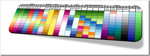
    Analytical Color Scales IntroJust a few months ago, I found this website and discovered a great Choropleth mapping spreadsheet. I really like the color mapping schemes that have been developed. As I worked through the program and played with the mapping colors, I began to understand that the colors could be used to highlight additional data details in the map.

    So, I came up with a number of special purpose color schemes designed to enhance specific aspects of the data and added them in with some of the original color scales. As the color schemes grouped into different visual purposes, I named the new colors to better describe the type of data that would be highlighted when using that scale.

    I thought I would share my twist on the color scales and will explain my thoughts about the different scale types below.

    (more…)