How to use Table Slicers as interactive Filter Controls on a Microsoft Excel Dashboard
Filtering data by one or several criteria is certainly one of the most common and important activities in data analytics. Adding visual filters to a dashboard is a built-in feature in Tableau and Power BI and as such a walk in the park.
But what if you need interactive filter controls on a dashboard in Microsoft Excel?

Sure, you can use data validation lists, form controls or ActiveX controls as interactive dashboard objects to set a filter or at least make a selection. You could also write some VBA code to let the user filter data by directly interacting with cell ranges or chart elements. All viable options, but either limited in functionality or a lot of effort to implement.
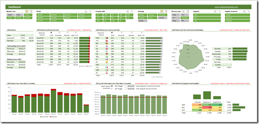
Wouldn’t it be nice if you could simply use the slicers, which have become a very popular way for facilitating the filter process on Pivot Tables? In other words, wouldn’t it be nice to create a dashboard like this in Microsoft Excel?
A Microsoft Excel dashboard with a variety of views (numbers, tables, charts), all filterable using the visual filter controls above the views (the slicers).
You guessed it, right? It is possible. And even better: it is very simple and straight forward to implement. No VBA, no limitation to Pivot Tables or Pivot Charts, no Power Query, no DAX formulas. Just good old Excel.
Today’s article explains the basics of the technique, describes the process of the implementation step-by-step and – as always – provides the example workbooks for free download.
The Core Parts of this Technique
Here is what you need to know in order to understand how the technique is working:
- slicers are not only available for Pivot Tables, but also for Excel Tables
- slicers do not have to live on the worksheet where the table is located. They can be copied (or cut) and pasted to other worksheets and will still filter the table they have been created for
- the function SUBTOTAL aggregates data of the visible rows only, i.e. unlike SUM or AVERAGE, SUBTOTAL excludes filtered or hidden rows from the aggregation
- SUBTOTAL can also be used to detect whether or not a row (more precisely: a specific cell in a row) is visible or hidden, i.e. whether a data record (row) meets all filter criteria or is filtered out
Step-by-Step Instructions
Step 1 – Add a Helper Column to your Table
In order to be able to slice and dice the data as we like, we need to know for each row in the data whether it is currently filtered out or not. Therefore we need a calculated column providing this information based on all set filters.
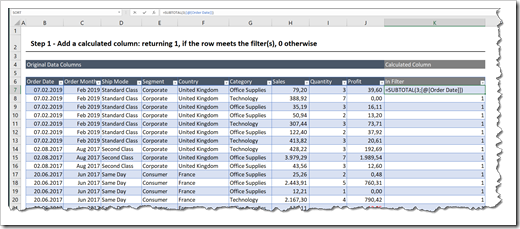
To get there, add a calculated column to your table (called [In Filter] in the example below) and insert the following formula:
=SUBTOTAL(3,[@[Column Header]])
where [Column Header] is a column of your raw data.
In this example, we choose the column [Order Date]:

The formula performs a COUNTA (function number = 3 of the function SUBTOTAL) on the cell in the specified column [Order Date] of the current row. The formula returns 1, if this cell (and row) is visible (i.e. it meets all filter criteria) and 0 otherwise.
Important: please note that the SUBTOTAL refers to the specific cell only, not to the entire column, i.e. the second parameter of the functions reads [@[Order Date]] and not [Order Date]. In other words, in row 7, only the cell B7 is passed as the second parameter to the SUBTOTAL and not the entire column B7:B10006.
Two additional things to keep in mind when writing this formula:
- Select a column which is entirely filled with data, i.e. all cells in this column have a value, no blanks. If you don’t have such a column in your data, add another helper column with a constant (like 1) or a running index (like an ID: 1, 2, 3, ….) and refer to this second column in the SUBTOTAL function
- Use 3 as the first parameter of the SUBTOTAL function, i.e. COUNTA. If you are referring to a column containing numbers or dates only, function number 2 (COUNT) would work, too. However, using 3 will work in any cases, i.e. with texts and numbers
Step 2 – Insert the Slicers
You certainly know how to do this, so let’s keep this short: activate a cell inside the table, go to Table Design|Insert Slicer and select the dimensions you want to use for filtering.
Step 3 – Add the Calculations
Add another worksheet for all aggregations and calculations needed for the views on the dashboard.
For an aggregated overview like the totals and averages of Sales, Quantity and Profit, you simply use SUBTOTAL with function number 9 instead of SUM and SUBTOTAL with function number 1 instead of AVERAGE:

Thereby, the results will only include the values of the rows meeting all filter criteria.
For breaking down the aggregations by one or more dimensions, a simple SUBTOTAL is not sufficient. However, since we inserted the helper column in step 1, a SUMIFS-function will do the job. E.g. for showing the sum of [Sales] by [Ship Mode], the formulas would look like this:

The SUMIFS sums the column [Sales] based on two conditions:
- first condition: [Ship Mode] equals the value in column B (Standard Class, Second Class, etc.)
- second condition: the value in the helper column [In Filter] equals 1, i.e. the data row meets all filter criteria
It goes without saying that – if needed – you could use the functions AVERAGEIFS or COUNTIFS, etc. accordingly.
Step 4 – Set Up the Dashboard
Add another sheet as the dashboard and create the views based on the results in the ranges on the [Calculation] sheet, either by directly linking to or by using the results as the data series of your charts.
Step 5 – Copy the Slicers to the Dashboard
Go back to the data tab (where your table lives), copy or cut all slicers, go to the dashboard sheet and paste them in. No worries, the reference of the slicers to the table will still be valid.
Finally configure the settings and the formatting of the slicers as you like and resize and position them on your dashboard as you may think fit.
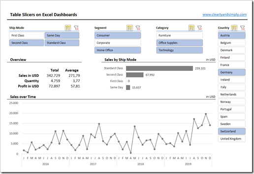
That’s it. Here is an image of the result in our example:

Disadvantages
Truth be told, the approach also comes with a few downsides and limitations:
- If you are working with a huge table, the calculations on a row by row basis in the helper column may slow down the performance of the calculations
- For whatever reason, timelines are only available for Pivot Tables, not for tables. This means you cannot use a timeline with the technique described above. You may already have or – if not – create an aggregated field in your data (e.g. only month and year of a date field) and provide a slicer to let the user filter the data by month(s) and year(s), but this is not as user-friendly as a timeline on a Pivot Table
- Last, but not least, you cannot filter more than one table with the same slicer. Setting the report connections in a way that one slicer filters different data sources is working for Pivot Tables only. If your dashboard displays results from different tables, you would have to merge them into one table, e.g. using Power Query first, before you can use the technique described here
Despite those disadvantages, I still think this is an interesting technique to add more and better filtering features to Excel dashboards.
Download Link
If you are interested in the workbooks, here is a link to a zipped folder including the Excel workbooks:
Download Excel Dashboard with Table Slicers (2 zipped Excel workbooks, 2.4MB)
More new posts shall hopefully come soon, so please stay tuned.
Leave a Reply