A Set of Choropleth Map Templates for Microsoft Excel
 The dashboard of Lithuania at a glance used a county based map of Lithuania to visualize the geographical distribution of the population by color intensity: the darker the color, the higher the value.
Very often, this type of geographical visualization is called thematic map, heat map or statistical map. The less known, but correct expression however is Choropleth Map.
The idea of how to create Choropleth Maps with Microsoft Excel – as brilliant as it is simple – is the brainchild of Tushar Mehta, Microsoft Excel MVP. I simply “borrowed” his idea and code and put it to effective use on the Lithuanian Dashboard.
Many readers of Clearly and Simply have been interested in this technique, but unfortunately I was not allowed to provide an unlocked workbook of the Lithuanian Census Dashboard (see comments on Lithuania at a glance). That’s why I thought it might be a good idea to write this post including a couple of templates for Choropleth Maps with Microsoft Excel for free download.
The Definition
According to Wikipedia
“a choropleth map (Greek χωρα + πληθαίν:, ("area/region" + "multiply") is a thematic map in which areas are shaded or patterned in proportion to the measurement of the statistical variable being displayed on the map, such as population density or per-capita income.”
The Technique with Microsoft Excel
In his article Conditional Colors of Shapes, Tushar provides a very thorough and clear step-by-step tutorial, including a template with a map of the United States for free download. Thus, I am limiting myself to describe only the basic concept:
- Organize an editable map, i.e. a map where every region is one freeform shape or a group of freeform shapes
- Assign a name to every shape
- Assign a name to the cell range with the data to be visualized for every region
- Create a mapping table, assigning every data cell name to the according freeform shape name
- Create a color range table to define the fill color of a region / shape according to the data value
- Copy Tushar’s code to your workbook and adopt it according to the cell ranges of the mapping table and the color range table in your workbook. With every worksheet_calculate (or any event you may choose), the VBA code loops through the mapping table and assigns the fill color to every region according to the data.
As I said, Tushar’s idea is as brilliant as it is simple.
The Templates for free download
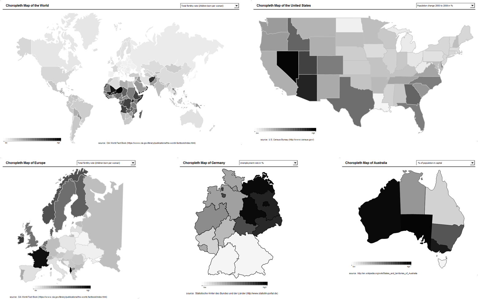
In order to save you some time and effort, I pulled together a couple of common maps and created Choropleth Map templates with Microsoft Excel:
- The World by country
- The United States by state (without Alaska and Hawaii)
- Europe by country
- Germany by state
- Australia by state / territory
For reasons of simplicity I packed all templates into one zipped folder:
Download Choropleth Map Templates (Microsoft Excel 2003, zipped 838.4K)
The templates are Microsoft Excel 97-2003 format, but they should work with Excel 2007 as well.
The disadvantages
Choropleth Maps are a popular visualization of data with a geographical dimension. However, there are a couple a drawbacks coming with this kind of visualization:
- No visualization of development over time
- No information on exact values (unless you are implementing tooltips including the data)
- Very limited direct comparability of the regions
- Possible perception problems with regards to the size of regions (e.g. Rhode Island on a US map)
- Possible misinterpretation because the size of a region may have a greater impact on the user’s visual perception than the intensity of the fill color
- Requirement of real estate on a dashboard
The conclusion
Choropleth Maps are a commonly used and very interesting way of visualizing data with a geographical dimension. They provide a quick overview at a glance of how the data is distributed across the regions.
Due to the disadvantages mentioned above, however, I strongly recommend to carefully consider whether or not a Choropleth Map is the best visualization for your purposes, especially if you are using it on a dashboard with limited real estate. I can’t claim that I am using Choropleth Maps very often. If I do so, I usually implement an additional visualization like a bar chart (see dashboard of Lithuania at a glance).
Last, but not least
Many thanks to Tushar for sharing this brilliant idea, the how-to tutorial and the file for free download.
Update (1) on
Thursday, July 25, 2013
I recently
received an email from my reader Dave who found and fixed quite a few errors in
the World Map:
- Removed
Iceland from Denmark - Removed
Greenland from Canada and made it a part of Denmark - Sweden
had two parts, one of which was actually part of Denmark. Removed it from
Sweden and added it to Denmark - Removed
the eastern half of Terra del Fuego from Great Britain and added it to
Argentina - Added
Northern Ireland to Great Britain - Added
French Guyana to France
I updated
the workbook for download now (see download link above).
Many thanks
go to Dave for being so attentive and for providing the corrected map.
Update (2) on
Thursday, July 25, 2013
This week I
received another email from Daniel asking for a World Map with a color scale
other than grey shades. I took a palette of color schemes from a later
Choropleth Map post and built it into the World Map template. I thought some of
you might also be interested:
Comments
122 responses to “Choropleth Maps with Excel”
Robert, this is great. I have been looking for something like this for last few weeks. I already have the worldmap, thanks to you (remember the olympic medal one you did…).. but this is pretty cool…
Excellent job again Robert…
I was just working on your dasboard templates for a project in Romania…
Thanks also for the Sparklines gallery. I have no time to work on it, but will tryto post a last release this week.
Take care
Hi Robert, I wish to thank you for your accurate and easy-to-use how-to.
I’ve made a Choropleth Map of Santa Fe province (Argentina), and it works very fine.
Hi Robert,
Thanks for the great maps. I wish I had found them earlier. I had been experimenting with a wmf worldmap but your maps look much better. In my application I used shades of red to white for below average values and shades of white going to blue for above average values which works well until you print the maps in black and white.
how did you do that?
can you help me please?
U Khadka,
thanks for your comment. I would assume, Anton used a similar approach as I did here:
http://www.clearlyandsimply.com/clearly_and_simply/2009/06/multicolored-choropleth-maps-with-excel.html
Use 2 different color ranges (red to white and white to blue) and add a formula to calculate whether the data is above average or below.
Anton, if my assumption is wrong and you used a different technique, I would be happy if you could chip into our discussion and elaborate on your approach.
may i use this for my dashboardzone website? Please email me at dashboardzone “A T” gmail dot com
My advice for free maps :
* the best ones (7 500 maps) : http://www.d-maps.com
* you can also build your own map (i.e.: sales territories), using the following trick :
http://www.youtube.com/watch?v=5QJzU1JmljQ
* If you need an additional administrative map, send a raster version (gif, jpeg…) of what you need to BeGraphic.com webmaster. Because to get a dynamic choropleth map, you also need to set up BeGraphic Lite (free download on http://www.begraphic.com , that includes “Sparklines for Excel”).
When you download the map, take the WMF format and put the file inside :
C:\Program Files\BeGraphic\BeGraphic\Content\Maps
When you will use BeGraphic, there are only two functions to use :
1. BeGraphic / Insert / Geographical map
2. After having selected a specific shape / freeform
1. Excel 2007 (in our ribbon) : BeGraphic / Set parameters
2. All other versions of Excel (from 2000 to 2010) :
Right click / BeGraphic parameters
Please download the latest version (we update BeGraphic every week to insert users’ recommendations… so first desinstall the old version) and tell us which new function you would like to see inside BeGraphic.
You can add a tooltip to each region by adding:
ActiveSheet.Hyperlinks.Add myShape, “”, “”, _ ScreenTip:=”some text” & some_variable
under myShape.Fill.ForeColor.RGB = myColorCode
in the CheckColor macro
It’s a hack as you cant add a tooltip to a shape – instead you add a blank hyperlink with a tooltip.
Excel 2007 has some sort of bug where a few of the shapes don’t show the tooltip – if you right click the shape, and go to properties, the shapes that won’t show the tips have Lock Text greyed out – who knows what’s going on there. 2010 works fine.
Alex,
many thanks for your comment and idea.
You may be interested in the latest post on Choropleth maps (Spice Up Your Choropleth Maps with Excel) where I used a similar approach for adding tooltips to the map.
I faced the same problems with Excel 2007. Good to hear that the issue is fixed with Excel 2010.
And I saw your new article(s) as well after I had commented.. Great, great job.
This is the answer to an “indirect comment”.
Over at http://nuclearphynance.com, rakato asked:
Anybody know how to change the color to show gradation in red for <0 and gradation in green for >0 for the world map?
You need two additional columns on the worksheet control for the RGB values (in the original version using only grey shades, red green and blue are all the same) and select the colors you want (from red to green).
Furthermore you have to change the formulas to calculate the steps of the thresholds. To make it easier for you, I uploaded an example:
Choropleth World Map Red Green (969.5K)
I hope this will be helpful.
Dear Robert,
Sorry for not answering earlier.
This is indeed what I have done. In addition I have played with placing colour coded labels on the graph thus adding a second metric to the map. I am planning to investigate other combinations of mini graphs and maps or of colouring the border and inside in differennt colours if I can find the time.
we love you
not really;0
wwwwwwwwwweeeeeeeeeee love u loz nromg
Absolutely awesome work….thank you very much.
How do you change the color to the US map? I want to be able to change the gray scale to something more vibrant. How do I go about doing this?
Ben,
you have to change the values in the RGB column (column E of the Control sheet). Have a look at the post
Multicolored Choropleth Maps with Excel
The workbook provided there includes 4 different color scales (blue, brown, red and grey).
If you are still looking for another color scheme, you could use
Color gradient generator
or any other tool to create the scale you want. I am sure Google will help you to find alternatives.
Sorry to drag up an old post but I would really appreciate some expert advice.
I want to use a choropleth map to show when a Country receives some training material. I have a list of dates by Country and would like for Countries who have the material to be a certain colour, Countries who will receive in the next month another colour, in a month after that another colour etc?
I’ve tried in vain to use the world map as a base and convert to dates rather than numbers but keep getting debug errors.
Anyone who can advise if this is possible and some input on the steps I would be really grateful!
Thanks
Will
Will,
no sweat. I will set up an example for you how to do this later today and post a download link here. Do you need it for the world map or for another map, e.g. the US?
Robert,
Thank you so much! World map would be great – one of the thresholds needs to also handle if there is no date; i.e. 0 could be black. This would be where we don’t know when course materials are ready.
Thanks again Robert.
Will
Will,
have a look at this model:
Download Training Material Delivery Map (941.5K)
The color scale is not very effective at the moment, but you can easily change this to whatever you need on the worksheet [Control].
Is this what you are looking for?
Robert,
Wow this is great – thanks so much. It’s great how you can drag the bar to see how the world develops as materials are delivered (hopefully my actual data will be as easy!). I have multiple modules I would like to show so on the front page (one at a time) I would like a drop down list where I can select course 1, course 2, course 3 so need to add to the data page. Sorry is there a few steps you can outline on how I would get the select of module to feed onto the control page and the map?
Thanks again!
Will
Will,
good to hear that the workbook does what you wanted it to do.
Inserting an option to select from several courses is a piece of cake. You do not have to change much. More data columns, a simple combo box and INDEX formulas will do the job. I will send you an enhanced version by email soon.
Fantastic – thanks!
Hi Robert,
Thank you so much for sharing this! Your map is an incredible resource.
I have been using your template, and I was wondering if there is any way to have a different image appear on the map in the top right corner every time you change the metric (so a different image would be linked to each metric). If I were to use the template map you provided as an example, when you select “population” as the metric, a small image of a group of people or something along those lines would appear in the top left corner of the map. And then if you selected fertility rate as the metric, an image of a baby would appear in the top right. Is there any way to go about doing this? I am just trying to make my map more visual for presentation purposes, but I am not very familiar with macros in Excel and am afraid to go in and change things myself without guidance. Any help would be much appreciated.
Thank you 🙂
Susie,
thanks for your comment and your very kind words.
Yes, this is possible. Of course you need some extra VBA, but not really complicated. The trick is to insert all images and call a VBA sub (hooked to the combo box) which is setting only the selected one to be visible and hides all others.
A picture says more than 1,000 words, right? So I pulled together a little example workbook here:
Download show_images_after_selection.xls (696.5K)
The choropleth map is not included, but the workbook shows how to get what you are looking for. I tried to keep it as simple as possible.
Let me know if you have any questions.
Hi Can you quickly send me a Europe map with RED and green and dummy data like you did for the uS this is incredible
Hi Robert,
It’s amazing with these choropleth maps. I’ll for sure be using these. Right now I’m mapping the two lette country format we use to the three letter country format you use.
I’ve noticed som irregularities in the world map. For instance Iceland exists on the map but is a part of Denmark? However Iceland is an independent country. Also on the map Greenland is a part of Canada? Greenland is still a part of Denmark, but I’m thinking it might be a good idea to make Greenland independent, considering the size and geographic position of the island. If there are other irregularities I can’t tell.
Christian,
thanks for your comment and the heads up. Your observations are absolutely right.
Some stupid mistakes I made when I grouped the shapes of the inserted map. My bad. I am sorry for the confusion.
However, it is very easy to fix these mistakes on your own. Simply ungroup the shapes, regroup them correctly, assign the correct shape name and you are good to go.
Hi guys,
I am looking for a choropleth map based on sales Region i.e North America,South America, Europe, Middle east, Russia, Asia Pacific. Any Help would be greatly appreciated..
Parag,
thanks for your comment.
You can have a look at Wikimedia Commons and check if you can find a map which suits your requirements there. Or you adapt the World Map posted in my article above: group the regions (i.e. Canada and USA to North America, etc.), assign shape names to the new groups and adjust the lookup tables in the model.
Hi Robert,
Thanks for your help, I was able to use the map and tweaked it for my use. I have another question..Is there a way to have different colors show up on the same map based on the sales volume. Also I am using the same map for about 45 different metrics.
Thanks for your help,
Parag.
Parag,
of course you can use different colors on the map. All you have to do is to change the RGB values on the worksheet [control]. Please refer to my reply to Ben’s comment above (January 25, 2012).
With regards to using the same map for more than one metric: I have done this too in the workbook posted for download. This technique (an INDEX formula to get the values of the selected metric) also works for more than 5 metrics.
Robert,
Thanks for your prompt response…I tried to use that approach but cant seem to figure it out. I ll briefly explain what I am looking for and maybe you can help me.
Region Sales Color on the map
North America – 195 – Red
Europe – 140 – Blue
Russia – 110 – green
so on and Need it for 45 different products and cost. I cant seem the figure out the RGB values that would remain consistent with every metric.
Thanks
Parag,
I am not sure I fully understand what you are looking for. Do you mean you want to have a different color for each sales region like North America, etc. and then visualize a selected metric with different hues of that color (i.e. a dark red for a large number in North America and a dark blue for a large number in Europe, etc.)? Is this what you are looking for?
If so, I think you have to adapt the VBA in order to select the correct color scheme based on which sales region (i.e. shapes) is processed (i.e. colored by VBA). Since the approach described above is using the same matrix assigning values to colors for all shapes, I do not think you can get what you want without changing the code.
Robert,
Yeah I am looking for exactly that and therefore I dont think just changing the RGB works. If you could help me with the Code I would really appreciate it.
Thanks for all your help.
Parag,
I will try to create an example and post it here, maybe today or later this week.
Parag,
I set up a workbook meeting your request of different colors for different regions (I used different colors for the continents on the world map).
However I do not recommend using this visualization. The different colors may be a nice effect, but they are misleading and make the choropleth map harder to read and to interpret the results.
Why? As long as you are using the same scale (value bins) across the entire map, the same value would e.g. be color coded with a dark red on one continent and a dark blue on another continent. One of the major disadvantages of a choropleth map is the fact that they do not support a direct comparison of values. Using different colors on different continents makes this even worse.
Since I do not recommend it, I will not post the workbook for download here. If you want, I can send it to you by email, but I would ask you to think twice before using it. I do not think it is a good idea.
Robert,
I understand using different colors is misleading but for some reason thats what the project requires me to do.
If you can email me the Workbook, I would really appreciate it.
Thanks for all your help and responding promptly
Robert, could you post a European map with red instead of grey (in terms of shades)? that would be great. Thanks, Bart
Bart,
you can use the existing workbook template of Europe and simply replace the RGB long values in column E on worksheet [control] by a red color scheme. The article Multicolored Choropleth Maps with Excel, for instance, provides a workbook with a red, green, blue and grey color scale:
Multicolored Choropleth Maps with Excel
Simply copy the values from there to the worksheet [control] of the template provided above.
Hi Robert, great work!
I have a question regarding a cholorpleth I am establishing, I am getting a OFF BY ONE error, where the map drawn element is being colored by the previous data’s values, and am having a mind cramp figuring out why, any suggestions?
Example: a State in my Map has a data series with 1,0,0
the state above it has a data series 4,5,6
When I select to view the states first data set in color:
it yields the color for 4, the previous states value.
Thanks
Collin
cjphelps@gmail.com
Collin,
thanks. I would assume there could be a problem with the range names: either there is an issue in the lookup table assigning the range names to the shape names or there is a problem with the range names on the data worksheet (i.e. the wrong names for the cells where the selected data is).
If this doesn’t solve your problem, you can send me your map by email and I will have a look.
Can someone please tell me, how do I add more regions/countries to the map..??
Hi Robert,
Can someone please tell me, how do I add more regions/countries to the map..??
It would be great if you can provide a new file with all the updated countries and regions.
The current file only has 190 countries, whereas today we have more than 230 countries.
How can we add these countries to the map..??
Rahul,
I don’t think it would make much sense to add new shapes / countries to the World Map provided in the download link above. I think it is easier and faster to create your own new map from scratch.
Have a look here:
Build your own Choropleth Maps with Excel
and/or here:
Create Excel Choropleth Maps from Shape Files
Robert — Can you please tell me what I am doing wrong trying to add Greenland as a separate item? I have UNgrouped it from S_CAN, called the single item S_GRL, added D_GRL and S_GRL to the Name/Autoshape Control Table, and Added a Greenland line to the Data tab. Yet doing those things now results in a VBA debug. I suspect that I’m missing some step in doing this but can’t tell what. Thanks, Bill
Bill,
I suspect you did not define the name D_GRL in the corresponding row and column K on the data sheet. I will send you a workbook by email in a minute.
Hi Robert,
I am sure I’ll preach to the choir when I say this work is amazing.
I have a quick question. Would you be able to have a list of what each country-shape is named in the world-map? (i.e. S_IDN = Indonesia, S_ARG = Argentina) I am trying to link them to some country level data and it would help tremendously if I could refer to a list instead of searching manually.
Thank you in advance!
Emil,
the abbreviations of the countries are already in the workbook posted above (column D of sheet “Data”). Just insert “S_” before the first character and you have the shape names.
Robert,
So sorry, my mistake. Must have missed that when I migrated the map to a different workbook.
Thank you for your extremely(!) quick reply.
Robert, Thank you SO much for this… I used your choropleth map for the USA.. do you have one for Canada, showing provinces, that snaps into the USA portion of it?
Barbara,
thanks for your comment. Unfortunately I do not have a map for Canada available, but you could easily produce your own by following the instructions in one of the following posts:
http://www.clearlyandsimply.com/clearly_and_simply/2009/08/build-your-own-choropleth-maps-with-excel.html
http://www.clearlyandsimply.com/clearly_and_simply/2012/12/create-excel-choropleth-maps-from-shape-files.html
Or you simply follow Tushar’s step-by-step in his original article.
Let me know if you encounter any issues.
Robert,
I noticed that in the world map file that Iceland is colored as part of Denmark. When I select the Iceland object and look at the name by Formulas -> Define Name it says “Freeform 21”.
Thinking this might the issue I tried to change the name to “S_ISL” but I get told that name is already defined somewhere. Can you tell me where and how I could fix this error so that Iceland is colored separately?
Thanks
Dave,
thanks for your comment. I admit there are a few issues with the World Map (e.g. Iceland and Denmark or Greenland as a part of Canada) and I know I should fix the problems and update the map. It is on my list, but I couldn’t find the time yet. Sorry for the confusion.
The Denmark / Iceland problem is easy to fix. The data row and the name for Iceland are already there, but the two freeforms are grouped and the group’s name is S_DNK, that’s why Iceland is treated as a part of Denmark.
How to fix the problem:
1. Show the Selection Pane (Home Ribbon, Find & Select, Selection Pane)
2. Find the shape S_DNK in the Selection Pane and rename the 2 freeform shape names of this group to S_DNK and S_ISL
3. Click on the group Denmark / Iceland in the map and ungroup it
4. Select another KPI from the combo box to update the map
That’s it.
Robert — I know that I am (again) missing something very simple but can not determine what. I am trying to change the country codes that you have in your examples for Montenegro. You are using the code of CG for the shape and data names, where I am trying to change them all to MNE. I have changed the name of the shape image to S_MNE, I have changed the mapename to shape table on the Control tab for the county to D_MNE and S_MNE, I have changed the country code on the data tab for the country to MNE. What I can not seem to do is to change the named range on the date tab from D_CG to D_MNE. It just does not want to take it (keeps going back to CG). So, what obviously simple step or operation am I missing.
Thanks, Bill
Bill,
I suspect you tried to overwrite the existing name in the name box (left to the formula bar). This will not work. Go to the Name Manager (CTRL-F3) and rename the named range there.
Robert – Thanks – that is the part that I was missing (editing the name manager).
Robert, this is really excellent stuff you are posting in here. Keep up the good work! I have a question about creating a world map. Apologies for not figuring this out myself but I’ve spend the last 2 days on this without any luck. I’m trying to create a world map with 3 different ‘topics’. The ‘topics’ should be named ‘fixed cameras’, ‘mobile cameras’ or ‘fixed and mobile cameras’. For both the ‘topics’ ‘fixed cameras’ and ‘mobile cameras’ they can either be ‘supported’ (which I would like to make dark green) or ‘not supported’ (which I would like to make red). For the third topic ‘fixed and mobile cameras’ I would like to have 4 different statuses: Both fixed and mobile supported (dark green), only fixed supported (light green), only mobile supported (orange) and non supported (red). Hope this makes sense and you are able to help me with this. An example workbook would save my life! Thanks in advance for your help Robert! Regards Bouke
Bouke,
thanks for your comment. This is no problem. All you need are two different color scales and a slight variation of the main sub. I will send you an example workbook by email in a minute.
Robert — Could you please also send me the example that you did for Bouke — what I am trying is similar but not exact (although his example may have other uses). What I am trying to do is to use differnt patten fills on the country shapes as well as the RGB colors — in other words, each country/shape would have an RGB color assigned as well (possibly) as a pattern fill based on table data. Is this something that could be done with the tables/macros? Thanks for the ideas. I am not sure if there would have to be two tables (one for RGB and one for the patterns) or not. Bill
Bill,
this is possible of course and I will pull together an example workbook and send it to you. However, I wouldn’t recommend fill patterns on a Choropleth Map. I doubt you will see much on a map with fill colors.
Robert — Thanks for the suggestion and the ideas, I like how you adusted the Control Thresholds to control the colors/patterns and the button to reload the table.
One question/variation – can you suggest what is needed to be able to control the foregroud and background for the pattern fill — it looks like it is only using while (background).
Ultimatly, what I am trying to create is a map where the country shapes will have a background RGB of either white or yellow (as an example) based on the data AND the countries “could” have a pattern (single color foregound most likely) based on other country data – overlaid on top of the white or yellow backgound of the shape.
Thanks Again, Bill
Bill,
I will send you a workbook later today or tomorrow, but again, I do not recommend what you are planning. Hues of the background color for one metric and the patterns for another metric? I do not think you will be able to see anything on this map anymore. As I said, I will send you an example by email and you can decide for yourself, but I strongly recommend against this approach.
Dear Robert,
I was using the gray chloropleth map for the past week for my work, and I just saw the colored chloropleth map. THANKS A WHOLE BUNCH. This is going to help me out a lot!
Thanks,
A person you’ve helped
Thank you a lot for this! I had no idea this was possible but it will help in my current role.
I don’t know if I dare try to do one of the UK myself (with different counties or PO Box areas). How long do you estimate it would take and how simple is it?
Thanks so much for the maps!
Tom
Tom,
Phil Quinn once posted a Choropleth Map of England by counties (only England, not the entire UK) on his blog, but I think his article isn’t online anymore. Anyway, I managed to find the workbook in my documents and posted it for download here:
Choropleth Map England by Counties (399.5K)
You can create your own map of the United Kingdom by counties using e.g. one of the maps posted on d-maps.com or a map from Wikimedia Commons.
The set-up isn’t too complicated as soon as you understood the concept of this approach. You do not have to change the VBA code. You only change the named formulas (“D_XXX”), the table mapping the range names to the shape names and finally assign the names to the shapes of the map. Assigning the shape names is the time-consuming part, but this is a one-time effort and I think you should be able to create a map of the UK by counties within an hour or two.
Robert,
Your time lapse choropleth excel file with the delivery dates is phenomenal and provides some extremely amazing insight!
I’m working on a project where I would like something similar however there are two different criteria.
One is monthly progression by year, and the other is simply a change in percentage month by month over time (rather than delivery date).
Is this possible?
Shwe,
thanks for your comment. I am not sure I understand your request correctly, but if the only problem is the fact that you need more than one criteria, you could use exactly the same technique I used in the workbooks I posted for download in the article:
A simple INDEX formula to fetch the relevant data based on e.g. the target value of e.g. a combo box and MIN and MAX formulas to create the thresholds according to the selected data.
If I am misunderstanding your question, you may send me your workbook be email and I will have a look.
Hi Robert,
Thank you for sharing this great work ! Not only does it work well, but it’s designed in a way that makes it easy to modify/build on (I took less than 2 hours to read and being able to modify to have fixed thresholds/variable number of colors).
The page states it’s free to download. Can you please confirm we can freely adapt to build our own dashboards ?
Best regards,
Pierre
Pierre,
thanks for your comment. All content on this blog (including the workbooks for download) is published under a Creative Commons License (see button and link on the left side of the blog). You are free to use the content for your own work as long as you agree to the terms stated there.
Please be advised that this article was the very first one on this blog describing Choropleth Maps with Excel. I highly recommend also reading the articles describing the improved, faster version of the technique:
Faster Choropleth Maps with Microsoft Excel
and the ones with more features like
Spice up your Choropleth Maps with Excel
and
Fast Choropleth Map with Enhanced Features
Thank you very much Robert
The file ‘Download Choropleth Map World Color Scales’ is just excellent. It helps a lot guys like me :). Thank you again for your excellent work
Hello all,
I need a map representation of Vodafone India 23 circles.
How to make the map of it use in this macro. Please suggest
And also how to make values in front on map permanently rather than cursor movement.
Asit,
to build your own Choropleth Map have a look at Tushar’s original article:
Conditional colors of shapes
and/or read the how-to blog posts here:
Build your own Choropleth Maps with Excel
Create Excel Choropleth Maps from Shape File
If you want to display the values on the map, you have to add a textbox for each region on the map, position it manually in the center of the region on the map and link the textbox to the cell containing the corresponding value.
Hi Robert,
Your excel and skills are amazing! I’m writing my thesis and I need european union map with colour scale. Could you help me?
I tried use map for Europe, but there is just grey scale and there is no Cyprus on the map.
I really need it asap 🙁 Could you help me? I would be very grateful. I was trying find some good software but there is not existing. Just yours amazing Excel with choropleth maps.
Please, help me.
Ewa,
have a look at this:
Download Choropleth Map Europe improved (275.7K)
Robert, you should get the Nobel!
Thank You very much for your help! 🙂
Thank You
very helpful material.
Robert,
First off, thank you for sharing this template!
Second of all – Wondering if you have any desire to do what I would imagine to be a rather tiny freelance project, building a simple U.S. chloropleth map for a project I’m working on. I don’t know Visual Basic and some of the changes I’d like to make to your free template are beyond my capabilities. I would anticipate maybe 1-2 hours of your time, for which I’d gladly compensate you at market rates! (Or, to make a donation to the charity of your choice if you prefer.)
Any chance I can convince you?
Gabrielle,
sure. Just send me an email with a short description of what you need (you find the email link at the top of the blog) and I will have a look and come back to you as soon as possible.
I love this project; its allowed me to do so much with my datasets and limited knowledge of VBA.
I have run into a problem though, while a smaller EMF/WMF/EPS file worked fine when I ungrouped into freeform shaped, when I have tried to ungroup larger maps with more shapes (From UK postcodes area, to UK postcode sectors) I have run into problems, the EMFs wont even start to ungroup, and WMF files loose sections of the map and distort when ungrouping.
I am hoping this is just a limitation of my computer rather than excel; would you have any idea how to help or is there anything I or you can do (If you would be willing to help!).
I’d love to get started on better maps, but can’t get anywhere! (I’ve been up all night trying and now have to go to work on little sleep!) eep. Would love to hear back!
Thanks
Sam
Sam,
it’s true, the whole process of ungrouping EMF files can be cumbersome depending on the EMF file you are using. Especially getting the names of the regions assigned to the shapes is usually a big problem, if you are trying to plot a map with a couple of thousand regions (i.e. when assigning the names manually isn’t an option anymore).
I have a map of the UK by postcodes ready to use. I will send it to you by e-mail in a minute.
Robert,
First of all, thank you so much for your map. This is beyond amazing.
I have a quick question though;
on the map sheet, is it possible to assign a cell so that it displays full country name upon click? on at least the shape name so that I can just Vlookup it to show the full name?
This feature would be very very very much appreciated.
Thank you
Tony
Tony,
have a look at this article:
Spice up your Choropleth Maps with Excel
Robert,
Thank you for the great articles.
When I applied the msg popup code from Argentina’s map to the world map, I had trouble with the grouped shapes.
It turned out that with each subshapes named with numerical suffix, vba doesn’t know what to do. But It worked like a charm with all the numbers removed.
Thank you soooo much for all your help and knowledge.
Tony
Hi Robert,
Thanks for this great article. I’m relatively new to this more advanced Excel material and was wondering if you could possibly help me with something. I’m trying to map values for 25 countries and have cross-hatching instead of grayscale. I was thinking of having 3-5 different categories for certain ranges of values, and having one additional for “no data”. Do you have any ideas how to do this?
If you’re willing, I could send you a description of what I’m looking for and my data file and I’d be happy to donate a bit of money to a charity of your choice or paypal you some reimbursement.
Christie,
sure, send me your workbook with the data and a description of your requirements by email (see the link at the top of the blog) and I will see what I can do.
Is there any way I can have the abbreviated state names on the map with the value from the data tab?
HK,
unlike the standard shapes (rectangles, circles, etc.), you cannot assign text values to freeform shapes in Excel. So, you have to add one textbox for each country / state to the worksheet, add the name or abbreviation of the country / state to it and position it in the center of the states (on top of the freeform shape). You could do that by VBA, but since the state names aren’t changing, it is a one-time effort and you could also do this manually. If you have only one map you are working with, doing it manually probably doesn’t take much longer than writing the VBA code.
Dear Robert,
thank you so much for sharing this very comprehensive template which I am putting to use for analytic world maps for NGOs.
Hi, I loved playing around with your worksheet and think it’s great. I was wondering though, if I wanted to add places like Hong Kong, Macau etc would it be possible?
Would love to hear back, thanks!
Nelema,
I am not planning to provide updates or enhanced versions of the map templates. However, if you have a svg or emf file including the regions you want, you can create your own map. Have a look at this article, for instance:
Build your own Choropleth Maps with Excel
Hi Robert,
Excellent work! This is my third time coming back to this site.
Just one comment, your world map does not have Brunei! It is a pretty important country and part of the TPP that is being discussed in world trade today!
Jubinell,
thanks for your comment. I agree, the workbook is not perfect and some states are missing. However, the Choropleth articles here are more about presenting the technique itself and less providing a 100% correct template.
If you want to update the World Map, please have a look at
Build your own Choropleth Maps with Excel
or
Create Excel Choropleth Maps from Shape Files
almost perfect world maps for what i was looking for – great ability to quickly put other values in and get colourings. countries don’t seem to line up exactly though and i can’t seem to easily get them to be perfect. Have you done an update with countries aligned? Very noticeable gap USA to Mexico for example – and can’t quite seem to line the whole world up when moving.
Mike,
there actually may be some smaller distortions during the procedure of ungrouping an EMF file to freeform shapes, but I can’t reproduce what you are describing. I just opened the World Map in Excel 2016 and there is no noticeable gap between USA and Mexico.
If your version of Excel distorts the map, you may want to create your own version from scratch following the instructions e.g. in this article:
Build your own Choropleth Maps with Excel
Thanks Robert,
I just tried on the PC version of excel and it lines up perfectly as you said – there is a noticeable gap on my mac… i’ll just use the PC for now and have a read of your link.
Appreciate the quick reply. I’ll have a play with it now.
Hi Robert,
This is excellent and somethign I have been looking for for a long time. Apologies if someone has asked this but if I wanted to group countires together (e.g. all of Europe, or for example Canada and US to form ‘North America’) what steps do I need to take?
Thanks again, this is a life saver!
Thanks,
Jon
Jon,
first group the shapes (e.g. S_USA and S_CAN) and give that group a new, unique name, e.g. S_NA. Then insert a data row somewhere inside the data table and assign the name D_NA to the according cell of this new row in column K. Finally go to the control sheet, insert a row somewhere in the range which assigns the names to the shapes and assign S_NA to D_NA.
If you then run the algorithm (by selecitng another measure), USA and Canada will be colored according to the data you inserted in the data row added in step 2.
Hope this helps.
Thanks very much, extremely good of you!
Hi this is great but when I try to add Turks and Caicos as their own country– I update the Data and control sheets for TUC (abbreviation I gave) and copy pasted and island renamed S_TUC… it keeps failing to update saying “Method ‘Range of object’Global’ failed”
Christie,
did you also add the name D_TUC to the data sheet and the assignment of D_TUC to S_TUC on the control sheet? If this doesn’t fix the issue, you can send me your workbook by email and I will have a look.
Thanks Robert,
Is there a way to have multiple world maps that work independently in the same workbook? I can not seem to work out the change to the VBA to allow for 3 world maps. Trying to create a dashboard with different levels of geography highlighting – each changing with their own drop down.
Appreciate any/all help.
Todd,
yes, this is possible, but you need some considerable enhancements of the workbook:
1. Make 2 copies of the existing map on worksheet [World Map] and resize / position them as you like
2. Make sure all shapes have unique names, i.e. instead of the shape S_USA, you would then have e.g. S_USA_1 on map 1, S_USA_2 on map 2 and S_USA_3 on map 3
3. Triplicate the drop down (combo box) and assign a target cell to them on sheet [Control]
4. Triplicate the data table on sheet [Data], i.e. one data table for each map
5. Adjust the named ranges along the same lines as already done with the shapes, e.g. instead of D_USA, you would then have D_USA_1, D_USA_2 and D_USA_3
6. Make sure the INDEX formulas in “Selection” column of the data tables use the correct target cell of the corresponding drop down
7. On the [Control] worksheet you then need 3 named ranges for MapValueToColor (MapValueToColor_1, MapValueToColor_2, MapValuetoColor_3) and 3 named ranges for MapNamedToShape
8. Adjust the Minimum and Maximum formulas right to the new named ranges for MapValueToColor to refer to the corresponding data ranges
9. Finally go to the VBE and triplicated and adjust the For Next loop in the sub UpdateMap.
Replace this part:
For Each myCell In Range(“MapNameToShape”).Columns(1).Cells
CheckColor Range(myCell.Value), “MapNameToShape”, “MapValueToColor”
Next myCell
by this:
For Each myCell In Range(“MapNameToShape_1”).Columns(1).Cells
CheckColor Range(myCell.Value), “MapNameToShape_1”, “MapValueToColor_1”
Next myCell
For Each myCell In Range(“MapNameToShape_2”).Columns(1).Cells
CheckColor Range(myCell.Value), “MapNameToShape_2”, “MapValueToColor_2”
Next myCell
For Each myCell In Range(“MapNameToShape_3”).Columns(1).Cells
CheckColor Range(myCell.Value), “MapNameToShape_3”, “MapValueToColor_3”
Next myCell
I didn’t try, but I think this should do the job.
Robert, THANK YOU! This is fantastic. I really appreciate the help.
Hi Robert,
First of all, your excel templates are outstanding!! Thanks for sharing them with the community! I was able to highly leverage your way of creating a choropleth map according to my business needs. I included 5 colour schemes and up to 8 metrics and things are working smoothly.
Though, I would have one little call out regarding your colouring ‘method’. My data is looking at the population and GPD per capita of several countries. Though, I also have a metrics looking at sales data within each country and obviously some countries don’t currently have sales/stores. Thus, I find it a little misleading when it colours these countries (lightest colour in my case) as it visually seems they do have sales data.
Is there a way to make the country shapes with no data at all transparent and colour its border black/white (depending on the background) instead? So it would basically treat these shapes with no data differently than the rest…
Would appreciate your help on this!
Sven,
you are absolutely right, regions without data should be shown in a different color instead of visualizing them as if the value would be zero. I recognized this, too, but in my defense, you are referring to an article which is already more than 8 years old.
Have a look at the first paragraph of this more up-to-date article and at the work-book provided for download there:
http://www.clearlyandsimply.com/clearly_and_simply/2017/06/us-choropleth-map-by-county-per-state.html
Please be advised that this workbook is using an improved version of the Choropleth Map algorithm described here:
http://www.clearlyandsimply.com/clearly_and_simply/2012/09/faster-choropleth-maps-with-microsoft-excel.html
I hope this will be helpful.
Thank you so much for the great resources!! I work with international data quite a bit, and restricted in what I can share with clients so interactive excel dashboards are extremely useful.
I know nothing about VBA, is it possible to update the world map with South Sudan, Brunei, Hong Kong and Macao, and the island nations/tax havens like the Cayman Islands and St. Kitts for some of the data I work with??? I can provide a full list and ISO codes of all world data if needed.
Also, the ISO codes used in the control shapes/data sheets are not the the universal standard, making it difficult to index and update with other data sources (ie: Montenegro MNE (CG), Romania ROU (ROM), Serbia SRB (SR), Taiwan TWN (TAI), Timor-Leste TLS (TMP), Zambia ZMB (ZWB)).
It be incredibly helpful to resolve these for international data people, especially with the “date” mapping project you provided in a previous comment. Thank you so much again!!!
Jennifer,
I know. there are some countries missing on the map. I do not have the time to update the map, but you could do this on your own with the help of one of the following posts:
Build your own Choropleth Maps with Ex-cel
or
Create Excel Choropleth Maps from Shape Files
Regarding the ISO codes: the abbreviation column on the data worksheet does not play a role in the technique of coloring the countries on the map. If you need to change the values in this column, you can do this right away and the code will still work. Having said that, do not change the values on the control worksheet, because this is the mapping of the named ranges on the data worksheet to the shapes of the map.
Thank you for the quick response! I am attempting to build an updated world map of all countries… having a few issues with the conversion due to groupings of islands and multiple paths and shapes per country, so working on cleaning those up now. Will share if I can get it to work =)
Thanks again!
Is it going to work with MS EXCEL 2013.Also how to define our own rgb to all shapes
Pradeep,
of course this works with later versions of Excel, too (which you can easily test by simply downloading the workbook). With regards to defining different color scales: have a look at the optimized version provided in this article:
Faster Choropleth Maps with Microsoft Excel
Many thanks, it really helped me a lot.
Hello Chandoo, yes this is great.
Robert is pretty good at this.
You can import a map drawn with Autocad to excel page.
Or you can import a map in eps format on your excel page. (Ps: I can recommend that you review the inkjet software.)
Robert,
thanks alot for these awesome choropleth maps and keeping up with the comments.
Im trying to create a zip-code-based map to visualize my sales activities in the region of munich (bavaria) and surrounding areas. I came across mapshaper.org but wasnt really able to put all things togehter.
Lets say my data file looks something like that:
ZIP-code;sales;stake
80333;1000€;50%
81379;500€;25%
80639;500€;25%
How do i manage to visualize these datas the propper way?
Thanks much
Dustin
Dustin,
the following blog post provides Choropleth Maps of Germany by ZIP-codes (PLZ2 and PLZ5) in Excel for free download:
Create Excel Choropleth Maps from Shape Files
If you need the greater Munich area only, you have to take out all shapes you do not need, adjust the input data range and recreate the shape index. This shouldn’t take too long.
I hope this helps.
I liked the macro when I downloaded the map template, however, one thing is not clear from looking at the code. Obviously it is important to decide on which Geography to use before writing your macro to populate the map. However, it is not clear to me how to add the (for example, I would want a Canada Map with each province representing a shape file that macro populates based on data). I wanted to maybe add a map capability to one of my own Excel analytics templates in my store: https://sellfy.com/cool-number-crunching-template
Tom,
thanks for your comment. First, you are commenting on a 11-years old blog post here. In the meantime, I have done a lot of improvements and variations and published my results here. You should check out and browse through the category Choropleth Maps of this blog and you will find a lot of additional information how to create filled maps in Excel.
As for your specific question: the code is only colouring shapes on a worksheet. The mapping of values to the shapes is done in a cell range named MapNameToShape.
If you want to have a different Choropleth Map (like Canada in your case), you need to insert the map as freeform shapes, name the shapes and adjust the mapping of values to shapes.
To get you started, have a look here:
Build your own Choropleth Maps with Excel
and/or here:
Create Excel Choropleth Maps from Shape Files
and, if you have Excel 365, especially here:
Optimized Choropleth Maps in Microsoft Excel
I hope this helps.
NOW I get it. It was how to create the shapes for each State or province (in my case) that I was missing from the macro. This is done by hand (not macro code in this case). Great, I will do some reading about building the maps. Great resource. Thanks and happy number crunching out there. Stay safe.