Multicolored Choropleth Maps with Excel

The Pop, Soda or Coke Visualization with Microsoft Excel
Multicolored Choropleth Map - click to enlargeThe previous post discussed Choropleth Maps in general, briefly described how to implement them with Microsoft Excel and provided a couple of templates for free download.

The post was focused on the classic version of a Choropleth Map, visualizing the measurements of a statistical variable in different geographical regions on a map by color intensity: the greater the measurement, the darker the color.

The classic version is limited to one variable. This follow-up post describes how to enhance a Choropleth Map in order to visualize more than one variable by using several colors and includes the visualization of “The Great Pop vs Soda Controversy” as an example for free download.

What is a multicolored Choropleth Map?

You may ask:

What exactly is meant by “multicolored”? Isn’t it the character of a Choropleth Map to have different colors?

Sure, a classic Choropleth Map visualizes the proportion of the data per region by different colors. But usually it is one color in different intensities (e.g. different shades of grey). And it is limited to one variable (e.g. population).

If you want to display more than one variable at the same time, i.e. add another dimension, you need more than one color.

What is it good for?

A very good example for a Choropleth Map using different colors is the visualization of election results. Most of the US presidential election maps I have seen, did not use different shades of the colors. They simply used blue or red to indicated who has won the state. However, if you want to have a visualization also indicating how many votes (in %) the winner of the state received, you need a multicolored map. The color (blue or red) represents the party and the color intensity represents the percentage of votes of the winner in each state (the darker, the higher).

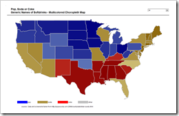
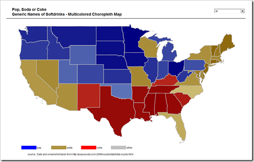
In order to have more than two different colors in the example of this post, I used another data set: The results of a poll asking US citizens “do you say pop, soda or coke?”. The map visualizing the survey results here is county based and shows all the details. However, it would be a lot of laborious work to do this with Excel (more than 3,000 counties) and I do not have an editable map with US counties available. Thus, I simply consolidated the data and created a Choropleth Map by state:

Multicolored Choropleth Map - click to enlarge

Agreed, by far less detailed than the original, but the map still shows the overall results as well: pop in the north, coke in the south, soda in the south west, Florida, New England, etc.

Here is the template for free download:

Download Pop Soda Coke Choropleth Map (Microsoft Excel 2003, zipped 167.6K)

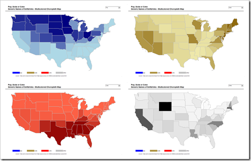
Using the drop down list on top of the map allows you to decide whether you want to see the total results (i.e. the winners, see the screenshot above) or the results per generic word:

4 Choropleth Maps - click to enlarge 

How to?

The technique to implement a multicolored Choropleth Map with Microsoft Excel is pretty much the same as the one used and described in the previous post.

The following changes are necessary for a multicolored Choropleth Map:

  • Add another column to the table that assigns names to shapes (cell range name “myMapNameToShape”). This new third column calculates the “winners”, i.e. the generic word with the maximum of the votes for each state. More precisely a combination of MAX and MATCH returns the position of the maximum (1: pop, 2: soda, 3: coke, 4: other).
  • While looping through all states in the VBA Sub “UpdateMap”, one additional line of code writes the maximum position for the actual state to the cell range named “myActMaxPosition”.
  • Add another cell (K12 on worksheet “Control”) to calculate the color range to be used: If the user selected a specific generic word from the combo box, the formula in K12 returns the user input (1: pop, 2: soda, 3: coke, 4: other). If the user selected “All”, the formula in K12 fetches the value of “myActMaxPosition” (see the previous bullet point).
  • Finally the RGB color scale in “myMapValueToColor” is determined according to the result of cell K12. If the user selected “all”, a state where most people voted for “pop” is colored using the blue scale, a state where “soda” received the most votes is using the brown scale, etc.

That’s it.
Comments

6 responses to “Multicolored Choropleth Maps with Excel”

  1. Dave Hammer Avatar
    Dave Hammer

    Hello, these are all excellent posts on mapping and I appreciate you putting the files online. I’m doing some mapping right now by County and Congressional District. Some Folks at Wikipedia have supplied some excellent .svg maps with proper labels (County name, FIPS code, Cong. District etc.)making for easy data connections in programs like Visio 2007 or something fancier, but I’m hitting a roadblock with Excel.
    Counties: http://upload.wikimedia.org/wikipedia/commons/a/a1/USA_counties_FIPS_text_addressable.svg
    Congressional Districts: http://upload.wikimedia.org/wikipedia/commons/2/24/US_Congressional_districts.svg
    They’re easily imported into Excel as an enhanced metafile and then “ungrouped” to create an excellent map – but all the data associated with the shapes is lost during this process. When opened with programs like Inkscape, all this data attached to each shape is present, but during the “ungrouping” it’s all lost, which requires someone to manually rename each shape. I did some looking on how to import .svg files into Excel, but had no luck – I thought you or some of your readers might have an idea on how to simplify this – I’m sure it’s possible, but apparently beyond me.

  2. Robert Avatar

    Dave,
    thanks for your comment and for sharing the download links. Excellent maps. I think I have an idea of how to solve this problem, but I have to ask for your patience.
    I am working on this and as soon as I find a solution, I will post it here.

  3. Denis Avatar

    For maps in Excel, a must see : GraphiMap downloadable at
    http://www.deixsys.com

  4. Thomas Avatar

    Robert,
    as you use SfE from Fabrice, you may also know BeGraphic, the free Excel addin for innovative graphics.
    It includes for free 16,000 maps (data-driven choropleth maps), but also Sparklines for Excel (usable as micro-dashboards above the map), infographics, dynamic diagrams and gauges (most of these dataviz have been asked by users).
    The free download can be done here :
    http://www.begraphic.com/download.html

  5. Lee Avatar
    Lee

    Robert,
    Could I ask a favor and have you explain what each setion of values on the Control tab does?
    Also, if I wanted to show a metric by state by month, or the month in which a metric was highest by state; do you have an template for that?
    Thank you,
    Lee

  6. Robert Avatar

    Lee,
    thanks for your comment.
    Here is a short explanation of the worksheet Control:
    B4:B8: the input list of the drop down (combo box) on the dashboard
    C4: the target cell of the combo box
    B12:E61: the color values (RGB colors in long integers) for 50 shadings of 4 different colors (from very light blue to very dark blue, from very light brown to very dark brown, etc.)
    G12:G61: calculates a range of even steps from the minimum to the maximum, based on the re-sults in cells I12:I14
    H12:H61: a simple INDEX formula which returns the long integer color code based on the “actual position” (cell K12)
    I12:I14: calculates the maximum value, the minimum value and the width of a step to get in 48 steps from the minimum to the maximum.
    J4: a cell used by the VBA: the code steps through all states and gets the “winner beverage” from column O (see below) for each state. This value is an input of the formula of K4 (see below) and only needed, if you selected “All” in the dropdown.
    K4: a simple IF formula to handle the option “All”. If “All” is selected, it takes the value from J4, otherwise it uses the target value of the dropdown. See also my explanation of cell J4 above.
    M12:N61: a mapping table, assigning the named ranges (like D_AK defined in column Q on the data worksheet to the names of the shapes (like S_AK) on the dashboard. This is needed for the VBA code.
    O12:O61: the calculation, which beverage has the highest value in each state, using MATCH and MAX
    I hope this explanation will help you to understand the mechanism.
    On to your other questions:
    1. If you have data on a monthly basis, you could still go with the template provided above. All you have to do is adding another input control (a combo box or a spinner) to select a certain month and use an INDEX formula to get the appropriate data for the selected month in column Q on the worksheet data. How this formula would look like depends on the way your input data is structured.
    2. I am not sure what you mean by “a month in which a metric was highest by state”. Choropleth Maps are not made for showing data over time (one of the major disad-vantages of these maps). Of course you can show data for one month, but how would you display a month where the metric was highest on a state? I do not think a Choropleth Map would be a way to visualize this. Well, maybe I simply do not understand your requirement here.
    Anyway, I hope my comment will be helpful.

Leave a Reply

Your email address will not be published. Required fields are marked *