• Weighted Route Maps in Excel

    How to visualize round trips on a Route Map in Excel, including an indication of the quantities transported between the cities
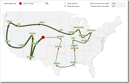
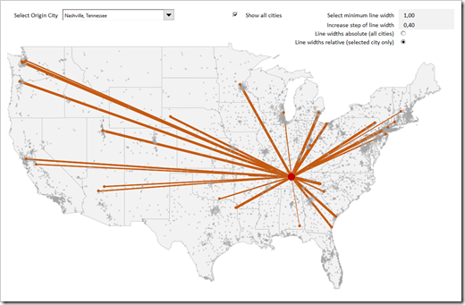
    Weighted Route MapThe recent post series “Geographical Flow Maps in Excel” (part 1, part 2, part 3) described how to visualize flows from one selected city to several target locations, showing the connections between origin and targets and indicating the flow quantity by the thickness of the lines.

    My highly esteemed colleague Joachim Schirra, outstanding SAP and Business Intelligence expert, read the articles and came up with the following question in a comment on LinkedIn:

    “Would it be possible to show a flow with branches, junctions and return flows, too?”

    Although this is a great idea, it sounds easier than it is. Truth be told, I do not have a solution. At least not yet.

    However, Joachim’s comment made me think. What can easily be achieved is the visualization of a weighted Route Map (i.e. a round trip, see image above).

    Today’s post describes how to change and enhance the Geographical Flow Map approach to get to such a Route Map. As always, the post includes the Excel workbook for free download.
    (more…)

  • Geographical Flow Maps in Excel (Part 3 of 3)

    Final part of a 3 parts series on how to create a Geographical Flow Map in Microsoft Excel

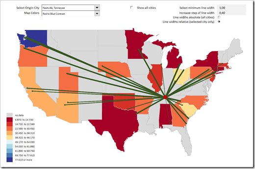
    Flow and Choropleth Map in ExcelThis is the third and final part of our series on how to create a Geographical Flow Map in Microsoft Excel and it will be a relatively short article (at least by my standards).

    Why? Because the technique of how to visualize flows on a map in Excel was already covered in part 1  and part 2. Today’s post will simply enhance that visualization with a technique which has been covered in many blog posts here throughout the last 10 years: adding a so called Choropleth or Filled Map. Check out the category Choropleth Maps to see what has already been published about this topic on this blog.

    To cut a long story short, this article will only briefly explain the idea and how to configure the colors used on the Flow and the Choropleth Map. As usual, the example Excel workbook is provided for free download.

    (more…)

  • Geographical Flow Maps in Excel (Part 2 of 3)

    Part 2 of a 3 parts series on how to create a Geographical Flow Map in Microsoft Excel

    Flow Map IntroWhilst the workbook and explanations provided in the first post laid the foundation for a Geographical Flow Map in Excel, the visualization was very limited in its usability. It only visualized the flow or movement from one city to several endpoints, but not any measure or value which is moved like shipped quantities, USD, persons, or something similar.

    Today’s post removes this limitation by visualizing a measure by the thickness of the lines between the cities: the thicker the line, the larger the measure and vice versa.

    As always, the post comes with the example Excel workbook for free download.

    (more…)

  • Geographical Flow Maps in Excel (Part 1 of 3)

    Part 1 of a 3 parts series on how to create a Geographical Flow Map in Microsoft Excel

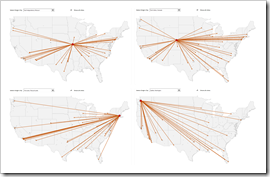
    Geographical Flow Maps in Excel - IntroA Geographical Flow Map visualizes the physical route or flow of material, people, money, information, etc. from a starting point to several endpoints.

    Flow Maps do certainly not belong to the visualization types in daily use. But it is definitely helpful to have such a template in your toolbox in case you may need it one day.

    Today’s article is the first of a 3 post series about how to create Geographical Flow Maps in Excel.

    This first part lays the foundation with a workbook setting up the data, the calculations and the chart by using standard Excel features only, i.e. no VBA. As always, all three posts will come with the according Excel workbook for free download.

    (more…)

  • Filter Excel Dashboards with Table Slicers

    How to use Table Slicers as interactive Filter Controls on a Microsoft Excel Dashboard

    Filtering data by one or several criteria is certainly one of the most common and important activities in data analytics. Adding visual filters to a dashboard is a built-in feature in Tableau and Power BI and as such a walk in the park.

    But what if you need interactive filter controls on a dashboard in Microsoft Excel?

    Filter Excel Dashboards with Table Slicers Intro

    Sure, you can use data validation lists, form controls or ActiveX controls as interactive dashboard objects to set a filter or at least make a selection. You could also write some VBA code to let the user filter data by directly interacting with cell ranges or chart elements. All viable options, but either limited in functionality or a lot of effort to implement.

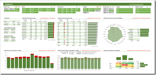
    Wouldn’t it be nice if you could simply use the slicers, which have become a very popular way for facilitating the filter process on Pivot Tables? In other words, wouldn’t it be nice to create a dashboard like this in Microsoft Excel?

    A Microsoft Excel dashboard with a variety of views (numbers, tables, charts), all filterable using the visual filter controls above the views (the slicers).

    You guessed it, right? It is possible. And even better: it is very simple and straight forward to implement. No VBA, no limitation to Pivot Tables or Pivot Charts, no Power Query, no DAX formulas. Just good old Excel.

    Today’s article explains the basics of the technique, describes the process of the implementation step-by-step and – as always – provides the example workbooks for free download.

    (more…)