2 Alternatives to avoid cluttered Line Charts: a Band Chart and an interactive Line Chart highlighting one selected data series when hovering over
804 words, ~4 minutes read

A Line Chart is definitely the best way to visualize the development of a continuous metric over time for several categories. That being said, Line Charts easily get cluttered and even may become useless, if you have many categories. Now, what is “many”? In my humble opinion Line Charts are already hard to read if they show more than 6 to 8 data series. But what if you have way more than 6? Like all countries in Europe or all states of the US?
And then what? No worries, there are alternatives. Adding an interactive feature to your chart can solve the issue.
Today’s post describes two alternative options for Line Charts with many data series: an interactive band chart (without VBA) or a line chart highlighting one data series when hovering over (empowered by VBA). As usual, the article comes with the workbooks for free download.
Microsoft Excel’s Standard Line Chart
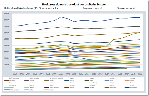
Let’s say we want to visualize the development of the real Gross Domestic Product per capita over time for all countries in Europe. In general, a Line Chart is the first choice, but with 38 countries/regions, the Excel standard Line Chart will look like this:
 A totally cluttered display with no chance for the user to assign the regions to the lines by color. Not much to discuss here, I think. The chart doesn’t show anything and is totally pointless.
So, what to use instead?
There are different alternatives. I am usually taking advantage of interactive charts: either a Band Chart or a Line Chart highlighting one data series when hovering over the plot area with the mouse.
Option 1 – A Band Chart (no VBA)
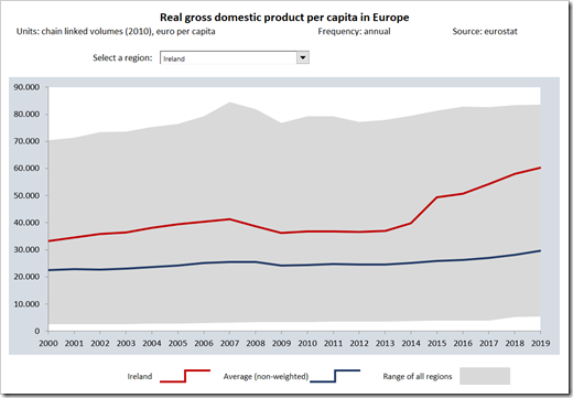
A Band Chart is basically a standard line chart enhanced with a shaded area in the background to visualize the range between the minimum and maximum values: You select one country using the form control combo box above the chart. The chart plots the selected region and the average of all regions as lines and the range between minimum and maximum values as a grey background.
The beauty of this approach: it is a very simple and easy-to-understand technique, quickly implemented, and there is no VBA necessary. If you want to know more about this chart type, please refer to the post An Underrated Chart Type: The Band Chart.
Option 2 – Highlighting one Data Series when Hovering over the Chart
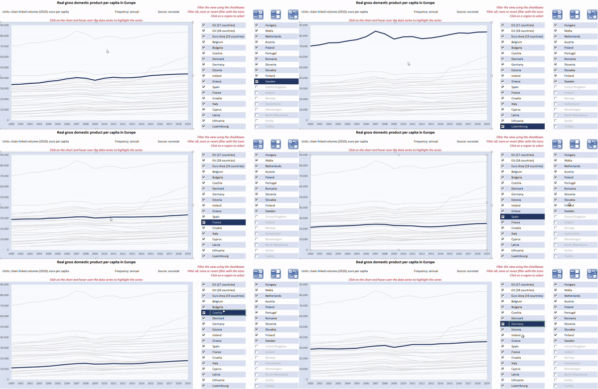
If you don’t mind having some VBA code in your workbook, you can also use an interactive chart to highlight a data series by hovering over the plot area. To give the user even more options to analyse the data, the view also allows to filter the data and to select a series by clicking into a worksheet range with a list of all regions.
Here is how this would look like:

The interactive features:
- activate the chart (clicking on it) and hover over the plot area to highlight one data series
- alternatively, you can select one data series by clicking on a region/country name in the table right to the chart
- filter the view by using the control buttons next to the region names
- select all, select none or revert the selection by clicking on one of the icons above the table
The implementation:
- the hovering-over functionality is exactly the same as already used for displaying Customizable Tooltips on Excel Charts. If you are interested in the details, please refer to that post
- filtering the view is done by formulas on the worksheet [Calculation] without VBA. The formulas may look complex at first sight, but they are actually pretty simple. I won’t go into the details
- selecting all, selecting none and reverting the selection is managed by 3 very simple VBA subs. Please refer to the module modFilter in the VBA project
- finally, selecting a country by clicking into the cell range with the list of region names is managed by the event-driven sub Worksheet_SelectionChange event in the worksheet object of the sheet [Chart]. The sub checks, if the user selected one of the region names on the sheet and if so, updates the cell [myCurrentDataSeries] accordingly
Agreed, these explanations are very brief. However, the workbook and VBA code is open, so if you are interested in the details, please have a look for yourself. If you have any questions, please post them in the comment section below and I will answer as soon as possible.
Download
If you are interested, here are the workbooks used in this article for free download:
Download Band Chart GDP per capita (zipped Excel workbook, 27K)
Download Highlight one selected Series Line Chart (zipped Excel workbook, 86K)
Stay tuned.
Leave a Reply