Category: Visualization

  • Spice up your Choropleth Maps with Excel

    6 (+1) tips how to mitigate some of the disadvantages of Choropleth Maps in Microsoft Excel
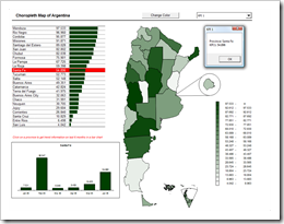
    Spiced Up Choropleth MapWe already had a couple of articles on Choropleth Maps, either using Microsoft Excel or Tableau. To be honest, I was really surprised how well these posts were received by our readers. The workbook provided for download with the first article Choropleth Maps with Excel is still in undisputed first place of all downloads here on Clearly and Simply. Thus, there was quite an avalanche of posts and comments on this topic and – despite the fact that I promised to stop posting on Choropleth Maps several times before – I announced at the end of the latest article that I am having left one ace up my sleeve regarding Choropleth Maps. Here it is and it will definitely be the last one:

    Already back in September last year, Lavih sent me an email including a map template of Argentina based on Gabriel’s implementation using transparencies. With the first email Lavih asked me for an easy way to let the user change the basic fill color of the map. Over a couple of weeks we emailed back and forth and together we developed some ideas on how to improve Choropleth Map visualizations with Microsoft Excel, far beyond only changing the basic fill color.

    Today’s post provides 6 (+1) tips on how to spice up your Choropleth Map visualizations using Microsoft Excel, as always including the workbooks for free download.
    (more…)

  • Software Project Dashboards – Episode 3

    How to create a Microsoft Excel dashboard to monitor the progress of a software development project (part 3 of 3)

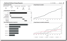
    Dashboard Software Change Requests - click to enlarge This article is the last part of a 3 posts series on software development project dashboards with Microsoft Excel. Episode 1 of the series discussed a software defect statistic dashboard, Episode 2 talked about a test progress and test success dashboard. Today’s post focuses on monitoring change requests, one of the biggest threats to complex software projects.

    Change requests (CR) raised already during the development of the software lead to additional time and cost needed, threaten the project plan and the budget, bear the risk of additional defects and lead to an instable baseline of the software to be tested by Quality Assurance. That’s why you should definitely keep an eye on the development of change requests throughout the development phase of your software project.

    Today’s post provides a minimalist dashboard for monitoring and reporting the actual status of change requests and their development over time. As always including the Microsoft Excel workbook for free download.

    (more…)

  • Software Project Dashboards – Episode 2

    How to create a Microsoft Excel dashboard to monitor the progress of a software development project (part 2 of 3)

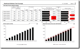
    Dashboard Software Test Progress - click to enlarge This is the second part of a 3 post series on software development project dashboards with Microsoft Excel. Episode 1 of the series discussed a dashboard to monitor the software defect statistics. Today’s article addresses to another very relevant facet in a software development project: The progress and success of testing.

    Testing as the process of validating and verifying quality and suitability of the developed system is at least as important as the number of defects detected. Actually, it goes without saying that testing is the prerequisite of finding software defects. Having said this, it probably would have been better to start the series with this part, but I recognized this too late. My bad.

    Anyway: Today’s post provides a minimalist dashboard to monitor test progress and test success within a software development project. As always including the Microsoft Excel workbook for free download.

    (more…)

  • Software Project Dashboards – Episode 1

    How to create Microsoft Excel dashboards to monitor the progress of a software development project (part 1 of 3)

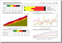
    Software Development Defect Dashboard - click to enlarge When it comes to manage software development projects, you have to monitor a lot of different quantitative and qualitative metrics in order to  answer the main question:

    “Where are we?”

    As in any other project you have to take care of the usual suspects in project controlling like the completion rate of tasks, the milestones and quality gates, the budget adherence, etc. In software development projects, however, there are a couple of very important specific additional facets to be monitored closely:

    1. The actual status and the trend of software defects
    2. The test progress, test coverage and test success
    3. The actual status and the development of change requests

    Today’s article is the first of a 3 post series on how to create minimalist, dynamic software project dashboards with Microsoft Excel; this time a software defect monitor dashboard including the Microsoft Excel workbook for free download.

    (more…)

  • Bluffing a Visual Cross-tab with Excel

    How to create a Tableau lookalike cross-tab chart with Microsoft Excel

    Matt Grams, author of Bullet Graphs for Excel: A Simple Way? is kind enough to contribute another guest post here on Clearly and Simply, this time discussing how to create cross-tab charts with Microsoft Excel.

    Cross-tab Chart - click to enlargeTrellis charts. Panel charts. Visual cross-tabs. Cross-tabs. Variations of small multiples. Whatever you want to call these charts, one thing seems clear to me: Tableau offers aesthetically restrained yet beautiful implementations.

    So how about constructing a visual cross-tab with similar aesthetics in Excel? Today’s post describes the how-to, including an Excel workbook with detailed explanations for free download.

    (more…)