3 different workarounds to create choropleth maps with Tableau
 With Tableau Software it is really easy to overlay your data on a dynamic map even without having latitudes and longitudes in the underlying data. However, Tableau does not (yet?) natively support choropleth maps.
We had a couple of posts regarding choropleth maps using Microsoft Excel here on Clearly and Simply. However, creating such solid filled maps to visualize your own data is on the list of wishes of many Tableau users as well (see here for instance).
There is a common workaround for this (described in the Tableau manual as well), using polygon data of the regions to create choropleth maps. Though, this approach needs a lot of additional data in the data source. That’s why I was looking for an alternative. I had a very simple idea, far from being optimal, but still a different approach and much easier to implement and use. Two weeks back, I sent my workbook as a sneak preview to Giedre, a really passionate Tableau aficionado from Vilnius, Lithuania and she was polite enough to make me believe, she would like my approach. In her reply to my email she sent me her brilliant solution of this challenge, much easier and by far better than everything I would ever be able to come up with.
Although she has a blog of her own (add-knowledge), Giedre was kind enough to share her idea with us and she wrote the main part of today’s post. Giedre just started her blog together with some friends recently and there aren’t many posts for the time being. Nevertheless I highly recommend to visit add-knowledge and check from time to time what she will be coming up with. I am looking forward to it!
Today’s article discusses all 3 workarounds of how to create choropleth maps with Tableau: the polygon approach, my simple simulation and Giedre’s brilliant idea using custom shapes. As always, including Tableau packaged workbooks for free download.
Tableau’s built-in choropleth maps
 As already described in the introduction to this post, Tableau does not offer a functionality to visualize your own data with a choropleth map. However, on the map options card you can choose from a selection of predefined data layers with US census information. This census data is shown as a choropleth map and you can visualize your own data e.g. as circles on top of this map. A useful additional feature, however, limited to the given US census data.
The challenge
The challenge is easy to describe: Find an easy-to-use workaround to create a choropleth map in Tableau based on your own data.
Workaround 1 – the usual suspect: using polygons in your data source
 The usual suspect and intensively discussed workaround for choropleth maps in Tableau is using polygon data of all regions in the data source. This approach is described in the Tableau manual and discussed on Tableau’s forum.
Very nice choropleth maps, no doubt about it. However, from my point of view, there a two drawbacks coming with this solution:
- You need to organize the polygon data for the regions you want to use on your map. To be honest, I never found the required data for the region I needed.
- You need a lot of additional data in your data source. For a map of the lower 48 United States shown in the dashboard above, for instance, you need 7,137 data rows. For a US map by ZIP codes the approach would already require more than 5.7 million data rows. The workaround might be ok for a map with only a few regions, but – in my humble opinion – it is not feasible for data based on counties or even ZIP codes.
That’s why I was looking for an easier way and here is my approach:
Workaround 2 – my simple idea: consider a spherical cow or a squared region
 You may have heard of a classic joke on theoretical physicists called “the spherical cow”. There are lots of different variants of this joke, here is the version published on Wikipedia:
“Milk production at a dairy farm was low so the farmer wrote to the local university, asking help from academia. A multidisciplinary team of professors was assembled, headed by a theoretical physicist, and two weeks of intensive on-site investigation took place. The scholars then returned to the university, notebooks crammed with data, where the task of writing the report was left to the team leader. Shortly thereafter the farmer received the write-up, and opened it to read on the first line: "Consider a spherical cow in vacuum…”
Funny and a bit absurd. But since it is so easy to come to results by trial and error with Tableau, why not apply this absurd idea to the challenge of finding a workaround for choropleth maps?
 The idea is simple: Add the area of the regions (states, counties, etc.) to your data source, drag the area field to the size shelf in Tableau and use whatever shape you may find appropriate (circles, squares, diamonds, crosses).
If you use this little trick with a data source based on the lower 48 United States, you will receive something like the map shown in the screenshot left. Compelling? Not really. You get the big picture, but this is far from a visualization close to a real choropleth map. The shapes of the states are too inhomogeneous and everything else than close to a square, a circle or a diamond. Thus, we see too many overlaps of the states and gaps in between. A first approach, but not satisfying at all.
 What about data based on a higher level of detail, e.g. a county based data source? Let’s have a look on two selected counties in Arkansas (see left): Well, the shape of Drew County is pretty close to a square, whilst Pope County isn’t at all. However, since we have more than 3,000 counties in the United States, the overlaps and gaps will probably not have a great impact on our visualization. So let’s give it a try. Here is a look at a county based choropleth map with Tableau, considering square counties:

And here is a screenshot of four different maps visualizing the well known example of the “Great Pop vs Soda Controversy” using circles, squares, diamonds and crosses:

Agreed, these are no real, clean choropleth maps, but you get the big picture and all you additionally need is the size of the areas in your data source.
The advantages: Easy and quick implementation and no bloating of your data source.
The disadvantages: Nothing more than a simulation of a choropleth map, i.e. overlaps and gaps between the regions and only applicable for a higher level of detail. The more regions you have and the more homogeneous their shapes are, the better the visualization will be and vice versa.
A workaround, no more, no less. It does not produce a real, clean choropleth map. But it is easy to implement, the data (area in square kilometers or square miles) is publicly available for almost every country and it does not blow up your data source.
Here are the links to the Tableau Packaged Workbooks for free download:
Download US Simulated Choropleth Map (Tableau Packaged Workbook, 274.8K)
Download Pop Soda Coke by Counties (Tableau Packaged Workbook, 415.5K)
To open these workbooks you need Tableau 5.0 (14-days free trial) or the free Tableau Reader.
As I said, this was my simple approach, but please don’t go away, the best is yet to come. In the following part of this article, Giedre describes her great solution based on custom shapes:
Workaround 3 – a better idea: using custom shapes
 This approach makes use of custom shapes to create neat-looking maps in Tableau. The shapes are created using the free online photo editor pixlr and then assigned to represent different map regions in Tableau.
Depending on the number of regions or states on your map, making and mapping the shapes may turn out to be a lengthy process, but is definitely worth the time if you frequently use the same maps for various projects.
Part One: Make the Custom Shapes
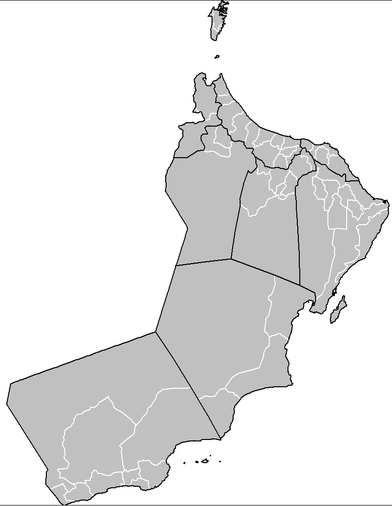
First of all, find a map you'd like to use for your project – ideally one without any arrows, labels or place names. The map used to make this workbook is this image from Wikimedia Commons.
Open the map in pixlr and prepare yourself for a possibly time-consuming and redundant process. All of the states, regions, or whatever you are mapping, will have to be saved as separate images. To achieve this in pixlr, follow these steps:
- Start out with the largest region (in this case, Texas). Use the wand tool to select and copy it.
- Create a new file. In the “New Image” dialog, check both boxes and make note of the width and height parameters of the image (in our case this is 252 x 247px)
- Paste the copied region into the newly created file and save it in PNG format.
- Select another region and copy it. Create a new image file, but uncheck the box “Create Image from Clipboard” and instead put in the width and height parameters that were used when creating the shape for the largest region in step 2.
- Repeat steps 3 and 4 for every state on the map. Continue to save the images in the same folder.
Note: To avoid the redundancy of this process, you can obviously use a script to automate this process in Adobe Photoshop/Illustrator or use another technique.
In order for everything to work flawlessly in Tableau later on, make sure that all of the shapes have
- identical size (that is why we started out with the largest region)
- a transparent background (the PNG format preserves transparency)
Finally, place the folder with all of your custom shapes in the Tableau Repository, usually located in …[your hard drive]…\My Documents\My Tableau Repository\Shapes
Part Two: Map the Custom Shapes
Now that we have the shapes, let's put them on a map. Create an Excel file that has the following columns:
- the state name (or an abbreviation that matches the name of your custom shape)
- X and Y – longitude and latitude coordinates
- a “dummy” column – leave it blank for now
Note: in the example here we use altered geographical references, i.e. the states are positioned so that the lower left-hand corner of the background image is the point (0, 0). This has no impact on the appearance of the final visualization, so feel free to use the “real” latitude and longitude values.
Don't close Excel yet. Open a new Tableau workbook, connect to the data, and set up your worksheet:
- Put AVG(X) on the Columns shelf and AVG(Y) on the Rows shelf.
- Set the map you selected back in Part One as a background map by following the step-by-step tutorial in Robert's previous post, but don't hide the axes just yet.
- Double click on the axes and set fixed major tick marks (in our case we set the marks every 10 units).
- Turn on grid lines (Format | Lines) by selecting a line type and color from the option “Grid Lines”.
- Set the state dimension as the Shape. In the Shapes legend, double click on any shape to bring up the “Edit Shape” options. The custom shapes folder you placed in your Tableau Repository should now be visible in the list of shape palettes (if it is not, try clicking the button “Reload Shapes”). Select your custom shapes and click “Assign Palette”. If necessary, adjust the Size of the shapes.
- If you prefer to work with colorful rather than grayish workbooks, set the Number of Records as the Color.
Depending on the accuracy of the X and Y coordinates in the data file, the location of some of the states might need to be adjusted. Change the X and/or Y values in Excel, save the file and hit F5 in Tableau to refresh the workbook. The gridlines will help you determine by how much one or another shape needs to be shifted.
Tip: As you fine-tune the map, mark the shapes you're done adjusting by putting a “d” in the “dummy” column in the data file. By the time you are done, the dummy column will be filled in.
When the shapes are aligned with the background image map, remove the grid lines and hide the axes. Now you should have a neat-looking choropleth map in Tableau.
Is that it? Almost.
Try putting the map on a dashboard. Chances are that the size of map on the dashboard is not identical to that of your map in the worksheet, and things won’t look so good anymore. Therefore, a final step is needed.
Part Three: Solve the Scalability Problem
This is the part where we make use of the “dummy” dimension in your data. Go back to Excel and create a new sheet in the data file. This second sheet should consist of two columns:
- dummy – fill it with “d”s or whatever the “dummy” column in the first sheet is filled with
- size – this column should contain values from 0.1 to 2.0, in 0.05 increments
Save the Excel file and return to Tableau. Edit the data connection (Data | Data Connection | Edit… ). Select the option to connect to multiple tables. You need to connect to both sheets, using inner join. In our example the join clause is
[Sheet1$].[dummy] = [Sheet2$].[dummy]
Follow these final steps:
- Move the field “size” from Measures to Dimensions, and then drop it onto the Pages shelf
- Set the Current Page to 0.95 or 1
- Set “size” as Size, and adjust the size of the shapes using the slider
Now, when you resize the map or use it on a dashboard, you will just have to change the “zoom level” by moving the slider in the Current Page shelf.
That's it!
Here is the Tableau packaged workbook for free download:
Download US Choropleth Map Custom Shapes (Tableau Packaged Workbook, 380.1K)
And here is the download link to a zipped folder containing the custom shapes used in the workbook:
Download Custom Shapes US States (zipped folder with png files, 39.5K)
A Few Final Words
Robert, thank you for letting me post here on Clearly and Simply!
Robert’s note:
Giedre, it's my pleasure. Many thanks for taking the time to write your part of this post, for all our interesting discussions, for sharing this brilliant idea, for being so passionate about Tableau and – last, but not least – for being such an avid reader here on Clearly and Simply. I am looking forward to your posts on add-knowledge and I do hope to welcome you back as a guest author here as soon as possible.
Our conclusion
This post described 3 different workarounds of how to create choropleth maps with Tableau. Each of them is coming with its own advantages and disadvantages. I am sure you will try for yourself and make your own decision, but to save you some time, we pulled together an evaluation of the pros and cons of each approach:

Go and figure out which one meets your requirements best. Our recommendation, though, is clearly and simply the custom shape approach. It needs a little bit more time for the initial set-up, but usually you are doing this only once for the country / region you are working for. After creating the custom shapes once, using this approach to build choropleth maps with Tableau is a piece of cake.
The Outlook
I already promised a couple of times to stop posting on choropleth maps now, but I am still having one ace left in my sleeve regarding maps with Microsoft Excel. I am sorry, but I can’t let that one go, so I am planning one more post on this topic during the next weeks.
Stay tuned.
Leave a Reply