How to create a Tableau lookalike cross-tab chart with Microsoft Excel
Matt Grams, author of Bullet Graphs for Excel: A Simple Way? is kind enough to contribute another guest post here on Clearly and Simply, this time discussing how to create cross-tab charts with Microsoft Excel.
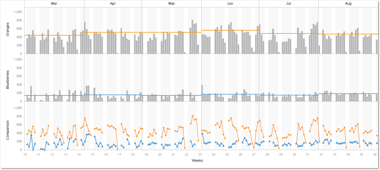 Trellis charts. Panel charts. Visual cross-tabs. Cross-tabs. Variations of small multiples. Whatever you want to call these charts, one thing seems clear to me: Tableau offers aesthetically restrained yet beautiful implementations.
So how about constructing a visual cross-tab with similar aesthetics in Excel? Today’s post describes the how-to, including an Excel workbook with detailed explanations for free download.
Nothing new under the sun
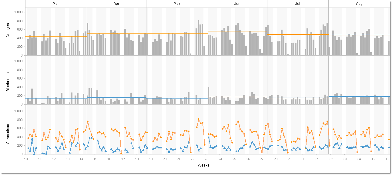
Good documentation of making panel charts in Excel has been available for a while on expert sites such as Process Trends and PTS. Not having read or absorbed much of the available material, though, I merrily and other times not so merrily went down a path that produced the visualization hoped for, yet lead to a complex structure comprised of 16 individual charts. Hardly “clear and simple”, and even worse, the structure became mismatched on the Y-Axis under certain data conditions because the Y-Axis width lacked consistency among the charts.
Y-Axis width
The approach’s major shortcomings had no apparent remedy until I saw a short tutorial on add-knowledge, part of which involved giving a custom number format to an axis. Might a custom number format on the Y-Axis be a backdoor way to set the Y-Axis width? The question led (of course) to PTS. The documentation on PTS explains the custom options well, and a little testing confirmed you can have a measure of control over the Y-Axis width if, for instance, you add a number of leading spaces with the “?” character. This backdoor technique gave consistent alignment, and reduced the number of charts I had originally opted to use.
Layers and the Drawing Toolbar
The final structure consists of three charts for background formatting, boundaries, and labeling. Above these sit three more charts containing the primary row graph data. Only one data row appears in the image below.
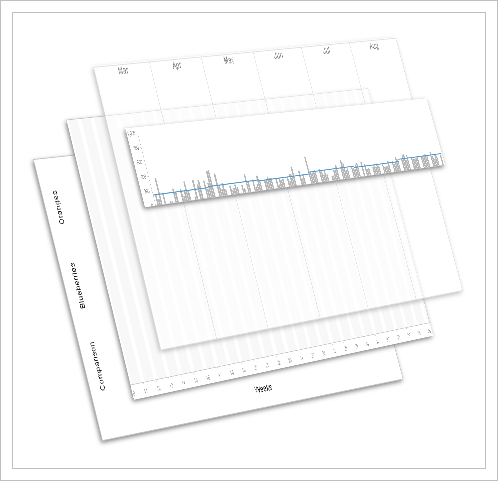
The free download includes cross-tab samples as well as worksheets outlining most of the methods used to generate the charts:
Download Bluffing Visual Cross Tabs (Excel 97 – 2003, 768.5 K)
If you decide to make a similar structure, then whether you are moving, copying, assigning chart order of appearance, pasting, resizing, verifying chart height and width, etc., you may find the Drawing Toolbar and its “Select Objects” option to be indispensible and a time-saver.
You can find the chart with the alternating background colors for weekends and weekdays already discussed at Chandoo.org, although the chart used here is not quite the same.
The finished cross-tab example worksheets have password protection, since chart appearance otherwise becomes distorted when you select a chart area. The password for each worksheet appears below each chart.
No legend?
You may have noticed the charts have no legends. Consider that an opportunity and challenge to make your own legend and add some interactivity to the chart. For inspiration, check out Robert’s showcases or read up on dynamic charts at PTS.
Excel is only bluffing
Well, although I definitely hope in the future to use these Excel charting methods to generate visual cross-tabs in Excel, and even though the next time I try to make them, it won’t take nearly as long, Excel is only bluffing when compared to the ease of implementation and capacity for data exploration inherent in Tableau. Who knows when Excel will come out with a good visual cross-tab option, if ever; I’d bet Fabrice Rimlinger could do it before Microsoft ever does.
Caveats
You may find this workbook does not always employ best practices. For instance, see any of Robert’s charts (the sparklines showcase, for instance) for great data set-up, where the workbook includes a Data worksheet and a separate Control worksheet. You certainly may find other areas needing improvement. And, as with many tasks in Excel, you can find more than one way to accomplish the same task, but I hope you see this as another way to “bluff” an aesthetically acceptable visualization in Excel.
The original
I suppose not including a Tableau workbook here would be akin to going to the Sistine Chapel but never having a view of the ceiling.
So here you go: Same data, same cross-tab visualization. This time however done with Tableau:
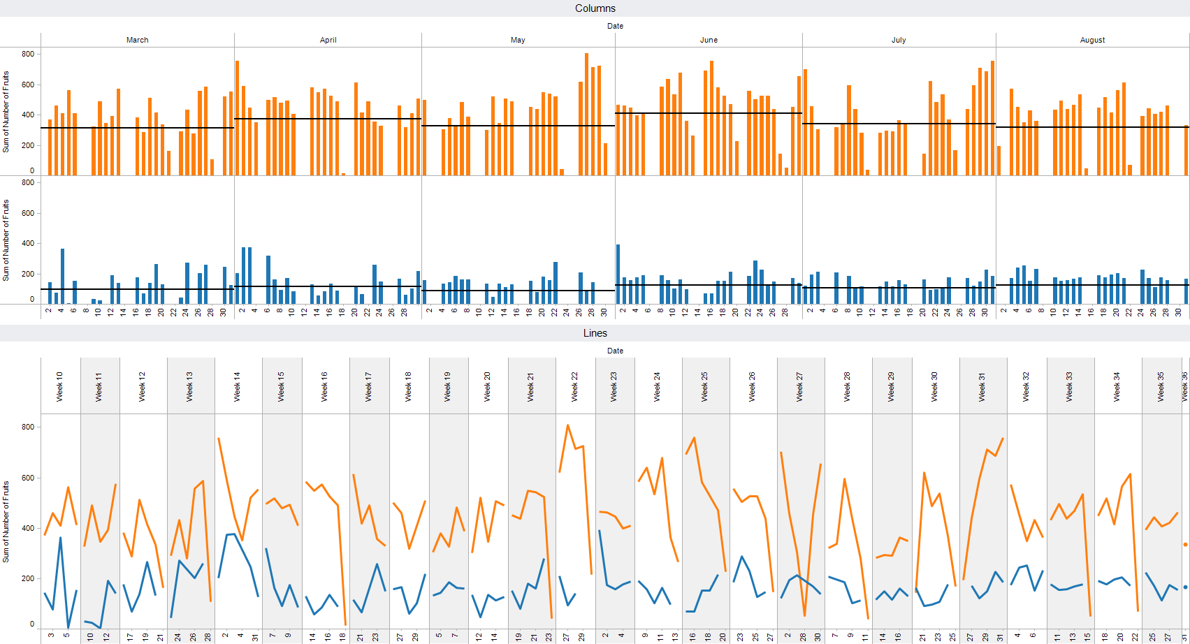
And here is the Tableau packaged workbook for free download:
Download Cross Tabs with Tableau (Tableau Packaged Workbook, 61.6 K)
By the way: creating this chart with Tableau took less than 10 minutes.
Robert: thank you again for the opportunity to post on “Clearly and Simply”.
Robert’s note: Matt, it is my pleasure. A big thanks for another excellent post. I greatly appreciate your contributions here.
Comments
6 responses to “Bluffing a Visual Cross-tab with Excel”
Hi
Nice post. I think you can make a bunch of improvements on the Tableau version.
Click here for the workbook
or here for an image.
What did I do?
1. Hide the titles on the worksheets
2. Change both sheets to have Weeknumber and Day as columns
3. Uncheck Hide Empty Columns, in order to make things align correctly
4. Hide the x-axis in the Columns bar
5. Hide field labels for columns on the Lines sheet
I like what you did in your post – hope you like my little tweaks!
Cheers
Andy
Sorry, here’s a better version of the workbook.
Andy,
I am the one to blame. After Matt sent me his beautiful guest article and Excel workbook I suggested adding a Tableau workbook as a reference. Matt was kind enough to agree, but unfortunately I was in a hurry and I just jotted down a rough-and-ready Tableau workbook without thinking about possible improvements. My bad. I promise to take more time and provide better solutions from now on.
I like your solution a big deal. A considerable improvement to my slapdash workbook. Many thanks for sharing.
Robert
This is terrific. Thank you for compiling and sharing the workbook.
Hi, very nice post … really inspiring! Lars
Hi,
Nice chart!
Wouldn’t want to maintain it but it looks great!