How to create optimized Choropleth Maps in Excel with a higher resolution and without distortions using Excel 365
Inspired by an idea of my internet friend and highly esteemed colleague Leonid Koyfman, the post US Choropleth Map by County per State – a 4th Option described and provided an Excel workbook with a Choropleth Map of the United States including a second map showing a magnified view of one selected state.
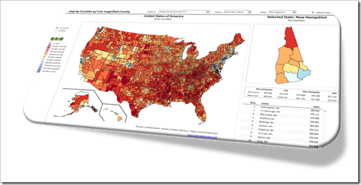 The code and technique itself worked fine.
However, there was one major disadvantage: during the process of creating the map in Excel, the shapes were slightly distorted. The zoomed map of one state still looked good for e.g. Texas or California, but definitely not for smaller states like Rhode Island or Connecticut.
Today’s post provides a solution to overcome this issue: a way to create a Choropleth Map in Excel without distortions, displaying all counties accurately, no matter at which zoom level. As always, an example workbook is provided for free download.
The Problem
The posts Build your own Choropleth Maps with Excel and Create Excel Choropleth Maps from Shape Files described how to set up a maps in Microsoft Excel using SVG or ESRI Shape files. The files were converted to EMF format first. The EMF was then inserted into Excel and ungrouped to shapes, which then can be color coded based on your own data using the algorithm provided in this article: Faster Choropleth Maps with Microsoft Excel.
Although this worked well in general, the process of ungrouping the EMF slightly distorted the shapes.
This didn’t matter for a map of the United States by county, because the distortions weren’t visible at this zoom level:
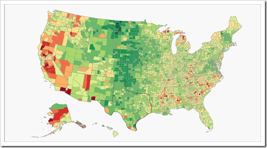 However, when zooming into the map or when magnifying selected states, the distortions turned into a problem.
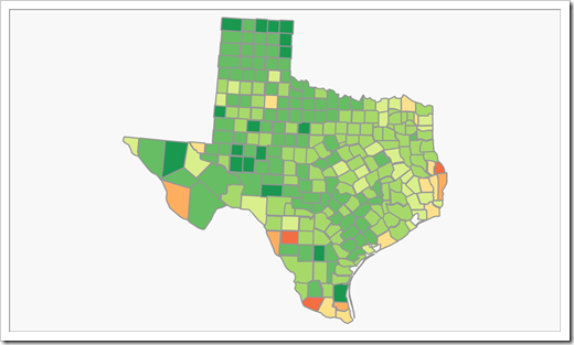
Larger states with a lot of counties still looked good, even in the magnified version:
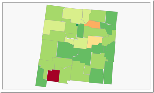
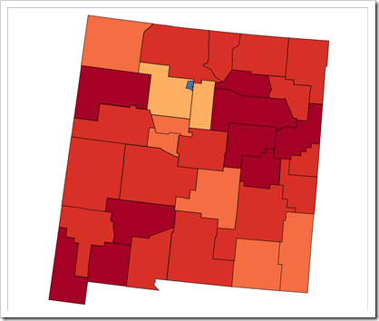
 Other states, however, already made the problem visible, like in the case of New Mexico:
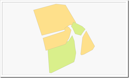
 Finally, the smaller states with only a few counties definitely did not look good anymore, like Rhode Island:
 The New Version
In the new version of the Choropleth Map for the US by counties with one magnified state (download link see the end of the post), the problem does not exist anymore.
No distortions on the magnified map of e.g. New Mexico:
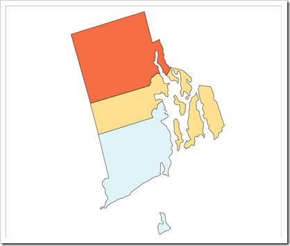
 And even the smaller states like Rhode Island look fine, now:
 The “Secret” of the New Version
Actually, there is absolutely no secret. It is just a new version of Microsoft Excel. With Microsoft Excel 365, you can directly insert an SVG file as an image. Simply go to Insert|Pictures, browse for the SVG file and insert it.
Next, select the picture and in Graphics Format, click on Convert to Shape or click on Group|Ungroup.
 Excel will display a warning message and you have to confirm by clicking on “Yes”:
 Depending on the SVG file you are using, the shapes may still be grouped one or more times.
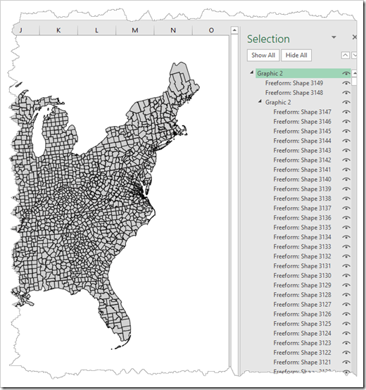 Just display the selection pane (ALT-F10), select the groups and ungroup one after the other until there is no group left.
If you then zoom the worksheet to the maximum level of 400%, you will see that there is absolutely no distortion of the shapes:
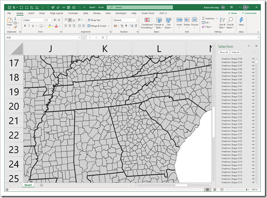 That’s it. From this point on, all other necessary steps are just as already described here: Build your own Choropleth Maps with Excel (step 4 and following).
With the new feature in Excel 365 to directly import an SVG file as a picture, the process of creating a Choropleth Map in Excel is not only much easier and faster than before, but also produces much better results.
By the way, I already used this for creating Choropleth Maps of Italy in Excel.
Important Remark for Users of earlier Versions of Microsoft Excel
I am not 100% sure about Excel 2019, but I do know that this option was not available in Excel versions 2016 and earlier.
Here is the good news for users of earlier versions, though: Excel 365 is only required to create the map. Once you have the shapes in Excel, the algorithm for Faster Choropleth Maps with Microsoft Excel is also working in all earlier versions of Excel. And so is the workbook provided for download in the next section.
Download Link
Download US Map by County one magnified State (zipped Excel Workbook, 2.8MB)
Many thanks go again to Leonid Koyfman for this idea and all of his invaluable contributions to my blog over the years. Thanks, Leonid. Much appreciated.
Stay tuned.
Leave a Reply to Microsoft Excel Recalc Or Die Cancel reply