A Collection of Choropleth or Filled Maps of Italy in Microsoft Excel
 Heads-up: today’s post is dedicated to my friends and readers in Italy. You will certainly only be interested in this article, if you are working in Italy and/or with Italian data.
If not, you can easily skip today’s post. It does not include any new ideas, it is only new wine in old wineskins: a collection of Choropleth Map techniques (already published here), applied to maps of Italy for different levels of detail.
ClearlyandSimply is a special interest blog with only very few readers. Most of them are located in the United States, but when I am looking at the web traffic coming from Europe, Italy is always ranked among the top 3, way ahead of e.g. France or Spain.
I do not exactly know why. I have a hunch, though:
Back in 2014 and 2015, I helped my friend Marco Nicolucci creating Tableau visualizations of the history of the Serie A (Italian football, or calcio as you say) and the Rugby World Cup for La Gazetta dello Sport. As of today, both visualizations are still available on the Datamania site of La Gazetta:
If the visualizations should no longer be available on La Gazetta dello Sport, you can also find copies on my Tableau Public Profile.
So, maybe the publications on La Gazetta dello Sport drove some traffic from Italy my way.
Also, maybe my Italian internet friend and highly esteemed colleague Roberto Mensa spread the word about my blog. You probably know Roberto. If not, you definitely missed something. Roberto is the guru for data visualization with Microsoft Excel, not only in Italy, but throughout Europe. Together with Krisztina Szabó and Gábor Madács from Hungary, he is running a website called E90E50. I highly recommend to check out the E90E50charts – Excel Charts Gallery, you will find truly amazing work there, all for free download.
Well, wherever the traffic comes from, this post is for my Italian readers:
A collection of 6 templates for creating Choropleth Maps of Italy in Microsoft Excel. All of them are ready to use. Simply download the workbook(s) you like, replace the dummies by your own data and you are good to go.
Let’s start with the basic ones.
Choropleth Map of Italy by Regions (Regioni)
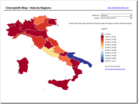 Download Map of Italy by Regions (zipped Excel workbook, 713K)
Choropleth Map of Italy by Provinces (Province)
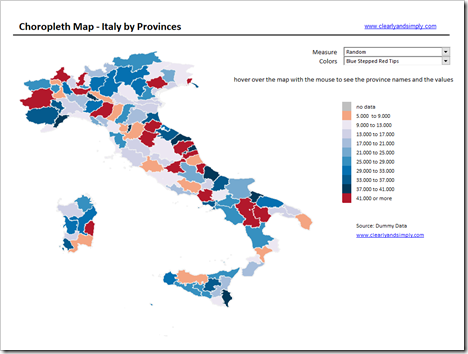 Download Map of Italy by Provinces (zipped Excel workbook, 7.6MB)
Choropleth Map of Italy by Communes (Comuni)
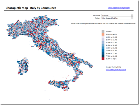 Download Map of Italy by Communes (zipped Excel workbook, 28MB)
8,100 Communes plotted as freeform shapes in Excel. You probably guessed it: this bloats the file size. Please note that this workbook is a 28MB download.
Now on to the more sophisticated ones:
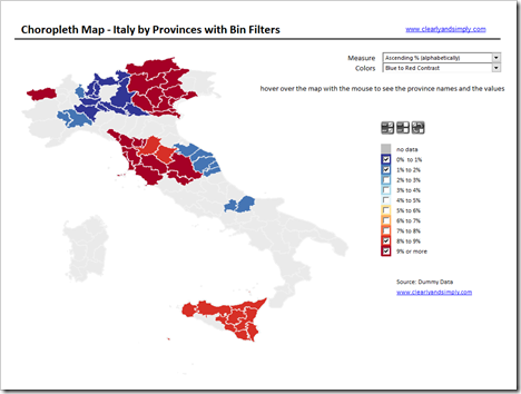
A Choropleth Map of Italy by Provinces with the Option to filter the View by Bins
This version enhances the map of Italy by provinces with the option to filter by bins, i.e. the user can decide whether provinces in a certain bin (value category from to) shall be color-coded or not. The icons above the legend let you easily select all, select none or inverse the selection.
 Download Map of Italy by Provinces with Bin Filters (zipped Excel workbook, 7.6MB)
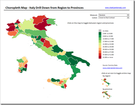
A Choropleth Map of Italy with a Drill Down Option from Region to Provinces
This version uses a map by regions and one by provinces sitting on top of each other. You can either drill up and down between the geographical hierarchies for the entire map using the icons at bottom right or for one or more selected regions by directly clicking on the map. Clicking again gets you back to the other hierarchy level.
 Download Map of Italy Drill Down Regions to Provinces (zipped Excel workbook, 8.5MB)
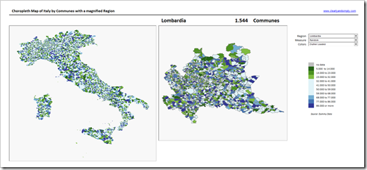
A Choropleth Map of Italy by Communes with a Detailed View of one Region
The last one is an enhanced version of the map by communes. The user can select one region in a combo box (drop down list) and will see a magnified view of the communes of this region right to the entire map of Italy.
 Download Map of Italy by Communes magnify one region (zipped Excel workbook, 30MB)
This is based on the map by communes, so again: please mind the file size of 30 MB.
A few Shortcomings and one Advantage
There are a few shortcomings you should be aware of:
- The workbooks with Italy by communes are huge (30 MB)
- Updating the maps by region or provinces are reasonably fast. However, updating a map by communes takes 20 to 30 seconds on my machine. You can reduce that significantly if you remove the updating of the tooltips in the code. In any case, the workbooks for maps of Italy by communes are probably too slow for a dashboard in production
- The maps I used to create the workbooks did unfortunately not include the change of provinces in Sardegna, i.e. the maps for provinces are not reflecting the administrative reform of 2016
All that being said, there is also one advantage of creating the Choropleth Maps in Excel: It automatically creates a filled map of freeform shapes based on your data. Whatever workbook you are using, you can easily select all shapes, group them, copy the group and e.g. paste it into PowerPoint or Word or wherever you want. So, especially the map by communes may not become part of one of your Excel models in production, but you can still use it to create a filled map for e.g. a PowerPoint Presentation.
Wrapping Up
That’s it. All techniques used in the workbooks above have already been published here, either for the United States or Germany. Check out the category Choropleth Maps of this blog, if you are interested in the details.
Even without reading all those technical how-tos, you now have the templates for Choropleth or Filled Maps of Italy without going through the tedious process of creating the maps.
I hope this helps.
Stay whole and stay safe, especially these days.
And also, stay tuned.
Leave a Reply