Bullet Graphs for Excel: A Simple Way?

A guest post by Matt Grams discussing an alternative solution of creating bullet graphs with Microsoft Excel

Bullet Graphs - click to enlargePreamble:

We proudly present the first guest post here on  Clearly and Simply: Matt Grams describes a very interesting alternative approach of creating bullet graphs in Microsoft Excel without using VBA.

When you need one or more horizontal bullet graphs in an Excel spreadsheet, what do you do if…

  1. you work exclusively in Excel 2003 or earlier, 
  2. you don’t want to use a 3rd party add-in,
  3. you want your spreadsheet to be free of VBA, and
  4. your bullet graph must have a professional appearance?

Faced with this scenario of apparently limited options, you’re sure to come across Charley Kyd’s tutorial at ExcelUser. Attempting to build a bullet graph with this method was a useful exercise for me, but the approach left me flustered at the complexity of the data arrangement and chart set-up. If making just one bullet graph was that hard, what are you going to do when you have multiple bullet graphs to implement? Furthermore, not having the bullet graph data values in a single row was far from ideal.

This post describes an alternative and simpler approach of how to create bullet graphs with Microsoft Excel, including step-by-step tutorials and an example workbook for free download.

Chandoo’s sports dashboard tutorial

A breakthrough for me in seeing the potential Excel has as a visualization tool was reading Chandoo’s tutorial regarding bar charts; it’s a simple technique, yet full of possibilities. Might not a similar method be used for bullet graphs?

The first go I had at this approach resulted in the creation of two charts, one dropped on the other by means of dragging and aligning one chart over a second. First, a stacked bar chart had the “good/average/poor” values, and used a thin sliver in the data to indicate the red “target” line. Next, a second bar chart added the “actual” values, and was dragged to fit over the stacked bar chart. The end result met the initial criteria, but the method lacked a certain degree of elegance.

Stacked Bar Chart with a Secondary Axis
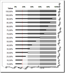
Multi Row Bullet Graph - click to enlarge Playing with the Excel’s charting engine produced another realization: if you put the “actual” value of the bullet graph on the Secondary Axis, you can have your bullet graph contained in a single chart.

Here are the download links to two detailed step by step tutorials of how to create a single and a multiple row bullet graph:

Download How to create a bullet graph in a single row with Excel (pdf, 185.9K)


Download How to create a bullet graph in multiple rows with Excel (pdf, 291.7K)

Robert bulletproofs the bullet graph data set-up

The data I worked with to generate the bullet graph values involved a fixed set of criteria where I had no concerns about having to make certain data parameters flexible. After reviewing this bullet graph method, Robert applied his insight and skills, so that if your bullet graph demands a “more general” approach, the graph has a series of calculated “dummy data” to ensure maximum flexibility for the graph.

Here is a workbook for free download, including examples of the discussed techniques:

Download Bullet Graphs Simple (Microsoft Excel 2003, 89.5K)

Much more could be said on the nuances of the subject, but this should be enough to get you started.

Robert: thanks for the opportunity to post on your blog and for making the graph more robust. There’s still so much to learn from your previous posts, but please keep coming up with new ones!

Robert’s note:

Matt, many thanks for all our interesting and inspiring discussions regarding this topic, for taking the time to write this post and how-to tutorials and – last, but not least – for sharing your ideas and work with us. I would be more than happy to feature further guest posts from you here on Clearly and Simply.
Comments

13 responses to “Bullet Graphs for Excel: A Simple Way?”

  1. Jon Peltier Avatar

    You can simplify your technique. After you assign the Actual series to the secondary axis, you can remove the secondary axis. Either select the axis and delete it, or go to Chart menu > Chart Options > Axes tab, and uncheck its box.
    The Actual series remains in the secondary axis group, so it isn’t stacked on the other series. Since there’s no secondary Y axis, the Actual series is plotted against the primary Y axis. Using only one axis means you don’t have to make sure the two axis scales are in synch.

  2. jeffrey Weir Avatar

    Hi Matt. This is a great work around, and an excellent post. However, I’m not sure that multiple bullet graphs are the way to go whenever your quantitative scales don’t differ.
    It’s worth noting that in Stephen Few’s paper that you link to, any time he uses multiple bullet graphs, the quantitive scales differ. For example, at the top of page 2, there’s 5 bullet graphs per example and each one has a different quantative scale (i.e. different target bands).
    I imagine this is a concious choice on Stephen’s part, becaues if the quantitative ranges are all the same as in your example, then a bar graph – with some kind of background formatting to denote the (shared) qualitative ranges – would probably be a better choice…because this would eliminate the white space between the different series.
    That white space is needed when the quantitative bands all have differing scales. But when there is a shared scale across all indicaters, then it doesn’t serve any visual purpose. Edward Tufte (and probably Stephen Few) would likely label this white space as a ‘distracting grid’.
    Looking forward to seeing more posts from you on this blog.
    Regards
    Jeff

  3. jeffrey Weir Avatar

    Then again, maybe Stephen Few would say that the white space is needed, and that my bar graph idea is not a good one, because we are not meant to compare seperate qualitative indicators directly anyway. In the comments at http://www.perceptualedge.com/blog/?p=217 Stephen says:
    A bullet graph is designed to display a single measure only. When multiple bullet graphs are displayed on a dashboard, the magnitudes of values in separate bullet graphs are not meant to be compared. This fact is visually reinforced by the fact that each has its own quantitative scale.
    But then again, Stephen then says:

    When several bullet graphs share a common quantitative scale, such as percentage of target, their magnitudes are meant to be compared. Even when bullet graphs have independent quantitative scales, they are designed such that their qualitative states can be rapidly determined and compared when useful, which is often the case in performance monitoring.

    So I’m not sure what he would think of my above comment.
    Regardless, I think he’d want seperate quantitative scales on each series…even if the axis were identical. Otherwise we havent met his design spec for a bullet graph.
    To clarify, I’ve posted a question on Stephen’s blog re this over at http://www.perceptualedge.com/blog/?p=217 – although I believe he’s still on holiday at present.
    Cheers
    Jeff

  4. Chandoo Avatar

    Very good tutorial Matt. I like the concept of bullet charts, but often feel annoyed by lack of simple option to make them using popular analytic tools (read excel). I read Charley’s technique and now yours. Both are very good. May be we are not far from one of us taking this method and converting it in to an add-in… 🙂

  5. David Onder Avatar

    This is yet another wonderful description of the power of Excel charts and how we can bend them to our needs. For those a little confused by the range specifications, I took the 2nd implementation from Robert and made the low, average, and high values their actual values and changed the formulas to match. That way I can show the range values and hide all of the calculations. Thanks so much for this tool.
    David

  6. Andy Holaday Avatar

    Thanks for this great post. I too have looked at other techniques for making bullet charts but this is the simplest to implement and manipulate, and it is more flexible to boot.

  7. Matt Avatar
    Matt

    Jon: thanks for noting this “tweak” on the technique. One of the drafts I sent to Robert earlier this year in the beginning of our conversation included a bullet graph and instructions using the method you describe, but that graph and its .pdf instructions were not included in the post. It’s been a while, so I can’t be sure, but I believe the reason I was partial to the approach that keeps the secondary axis was how it allowed all the data values to be in the same “percentage” format if you’re working with only “percentage” values. Again, this approach to bullet graphs is full of nuances, and there’s definitely more than one way to build the graphs.
    Jeff: regarding multiple bullet graphs when the quantitative scales don’t differ, and white space between the graphs, I should clarify that what I was hoping to accomplish with the approach was a way, not to follow the bullet graph design spec to the letter, but rather to generate bullet graphs such as the ones found in Robert’s dashboards (made via Fabrice’s sparklines) http://www.clearlyandsimply.com/clearly_and_simply/2009/03/you-cant-start-a-fire-without-a-spark-2.html
    or dashboards made with BonaVista microcharts (see pg 11). http://www.perceptualedge.com/articles/visual_business_intelligence/dd_for_rapid_monitoring.pdf
    It’s also interesting how in Few’s “Information Dashboard Design”, the 7 bullet graphs on pg 177 have some white space, while the 3 bullet graphs in the dashboard on pg 199 have none.
    Chandoo: thank you for all the good tips coming from your blog.

  8. Jeff Weir Avatar
    Jeff Weir

    Hi Matt. Thanks for the info dashboard design references…I see what you mean. The example on page 199 was what I was thinking about when I wrote my original comment that if the quantitative ranges are all the same as in your example, then a bar graph – with some kind of background formatting to denote the (shared) qualitative ranges – would probably be a better choice.
    Stephen Few replied to my question re this on his blog by saying “When all of the measures share the same quantitative scale and the same qualitative ranges (for example, the same ranges of good, satisfactory, and poor performance), there is no real reason to use bullet graphs. I think it would usually work best to use a single bar graph with continuous qualitative fill colors in the background. This would make it obvious that the measures belong together and can be compared in all respects.”
    But as you point out, he also endorses on page 177 the use of bullet points as you have done them on your tutorial.
    Good stuff.
    Regards

  9. xtasy Avatar

    Hi,
    I recently discovered the world of data visualization when I was asked to work on a dashboard at my workplace. Since then I have been scouring the web for information and can’t seem to get enough of Stephen Few, Edward Tufte and the likes. Anyways, I got down to developing a sample dashboard to see what features I am able to incorporate without any add-ins and seemed to hit a speed bump when it came to creating bullet charts, until I came across Ron Person’s, Balanced Scorecards and Operational Dashboards with Microsoft Excel in which he describes one method which I was able to implement. One limitation, it only works for vertical bullet graphs.
    Robert, I will email it to you in case you want to make it available here.
    Cheers

  10. Loranga Avatar
    Loranga

    Step 20 in the Single row tutorial:
    “The Target area is a very thin line, so you won’t have much space to select its data series”
    You can just select the chart and then use up and down arrow on the keyboard to cycle through the series.

  11. YFNDentonista Avatar

    Have y’all seen the Freeware bullet graph app from Aculocity?
    http://www.aculocity.com/BulletGraph.aspx
    This is a super-quick way to make a bullet graph, and they actually answered questions about it!

  12. Jon Howlett Avatar

    Hello All.. I was hoping for a bit of help with a bug I have encountered when changing some values in Robert’s downloaded bullet chart workbook (link above )
    For example, if I change the actual and target values in cells B6 & C6 to 1200 and 1050 respectively in the sheet labelled ‘Bullet graph more general’, the resultant actual value in the bullet graph displays incorrectly.. approx a 1,700 value instead of 1,200.
    I’ve narrowed it down to the formula in R6 & S6 (dummy 1 and dummy 2) but can’t work out what the correct formula need to be in these two cells to ensure the actual value displays in the bullet chart correctly when changing values.
    Any help would be much appreciated !

  13. Robert Avatar

    Jon,
    the trick I used to align the scales of the 2 axes (the formulas in cells R6 and S6 and according dummy data in the chart as you assumed correctly) only works if the target value is within the poor-average-good range. If the target is above this range, the trick fails: the axes do not have the same scale and the actual value (on the secondary axis) does not fit to the scale of the visible axis. To overcome this, you can simply delete the secondary horizontal (value) axis. However, if the target value is above the colored range, it will automatically increase the good range.

Leave a Reply

Your email address will not be published. Required fields are marked *