Take Care of Customer Care

A Showcase: 5 steps of Performance Dashboard Design
Dashboard Customer Care Using Key Performance Indicators (KPIs) in Customer Care management is a prime example of Performance Dashboards. Call Center Managers usually monitor the performance of their Customer Care with an extensive list of different metrics and KPIs visualized on one or several real-time dashboards. On a higher level and in a more condensed form the numbers are also reported to the Top Management on regular intervals, usually at least weekly.

Against this background, this post describes 5 steps of designing an Executive Customer Care Performance Dashboard, including an example file for free download.

Step I: Define the metrics: the Key Performance Indicators (KPIs)

Even a condensed Customer Care Dashboard for Top Management will include quite a number of different KPIs. For simplification the following showcase is restricted to a small selection of the most relevant metrics:

  • Service Level in %

The service level is an indicator of quality considering how quickly calls are handled. Let’s assume the target is to answer an incoming call within 30 seconds. Thus, a 60% service level means that 60% of the calls are answered within 30 seconds.

  • Availability in %

The availability is defined as the ratio of handled calls to incoming calls. An availability of 80% indicates, that 80% of all incoming calls are answered by an agent.

  • Customer Satisfaction

Based on the results of regular surveys, the quality of the Customer Care is rated by the customers. In our example, the scale is representing the German school grade system (1 = excellent, 2 = good, … 6 = insufficient)

As mentioned, these KPIs are only a very small selection, but they do belong to the TOP 10 when it comes to measure the quality of Customer Care. Even the selection being small, it will be sufficient for this little showcase.

Step II: Define the Time Scale

In an environment as dynamic and volatile as Customer Care, the focus should be on monitoring the most recent development. Of course you have to emphasize on the actuals of the current / last week. With regards to the development over time, it is probably sufficient to limit the data series to the last 12 weeks. When you are talking about Customer Care, the question “how did we perform in August last year?” is not the most important one.

Step III: Define the Interactive Features

For the design of an analytical dashboard (allowing filtering the data, drill-downs, etc.) the decision about the interactive features definitely needs a very careful consideration.

This example, however, is not an analytical dashboard. We are talking about a reporting and monitoring tool, displaying the actual status at a glance without requiring further drill-downs or filtering. Thus, the only interactive feature we need is a way to select the actual week respectively the week to be displayed, like a calendar element or a simple spin button to “walk” through the weeks.

Step IV: Draw a Dashboard Mockup

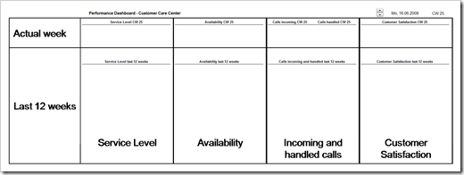
Knowing the metrics, the time frame and the necessary interactive features, we are now ready to scribble a mockup of our dashboard. 4 metrics and 2 different dimensions of time (snapshot of actual week and development over the last 12 weeks) suggest a matrix-like organization as shown in this screenshot:

Dashboard Mockup - click to enlarge

Step V: Define the Visualization

Next and final step in the process of designing the dashboard would be the decision about the visualization to be used.

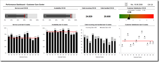
  1. The Actuals
    • Service Level and Availability
      Bullet graphs are definitely the best way of visualizing a single quantitative metric compared to a given target, especially if it is a target to exceed. More information on bullet graphs here and how to create them with Microsoft Excel here.
    • Incoming and handled calls
      We already visualized the ratio (availability, see above), hence simply displaying the raw numbers will be sufficient here.
    • Customer Satisfaction
      For the visualization of the average school grade in the customer survey, we use a color scale from green to red with different symbols displaying the actual value and the target.
  2. The last 12 weeks
    • Service Level and Availability
      In most cases, the best chart type for visualizing trends over time is a line chart. In this case, however, we need to see at a glance in which week the actuals have been above or below a given target. Therefore we are using a combination of column (actuals) and line (target) chart.  A column “breaking through the line” is an intuitive visualization of reaching the goal. On the other side of the goal line, the gaps between the actuals and the red line show how far we have been from our target in these weeks.
    • Incoming and handled calls
      By definition, the number of handled calls is always less or equal than the number of incoming calls. This is the perfect usecase for a thermometer-like column chart, i.e. one column (handled calls) inside another column (incoming calls).
    • Customer Satisfaction
      German school grades (1: excellent; … 6: fail) rather the according goal is a not-to-exceed-target. Therefore a column-line combination chart might not be the best choice, because a column “breaking through the line” indicates an achievement of the target. In our example we are using a line chart instead: the red line visualizes the target, the dots indicate the values of the weeks. This way it is easy to see the good weeks (dot below the red line) and the bad ones (dot above the red line) as well as the 12-weeks-trend at a glance.

That’s it. This was my explanatory description of a dashboard design process along general lines.

The Implementation

After finishing the 5 steps of the design process we know the metrics, the time scale, the interactive features, the structure and the visualization. “All” you have to do now is to take your favorite visualization software and to implement the dashboard.

I used Microsoft Excel for this showcase, not because I think Excel would be the best for the job, but in order to enable as many readers as possible to download the file and see the dashboard working.

Here is a screenshot:

Dashboard Customer Care - click to enlarge

And here is the Microsoft Excel workbook for free download:

Download Performance Dashboard Customer Care (Excel 97 – 2003, 234.5K)

All numbers and target values shown in this screenshot and used in the example file are made up.
Comments

22 responses to “Take Care of Customer Care”

  1. Jon Avatar

    This is a nice template. Great blog!
    Regarding the customer satisfaction charts, would there be any drawbacks to flipping the two charts’ measurement axes and putting a grade of 1 (excellent) on the right and top, respectively? This would seem to create a more consistent visual approach between all four KPIs.

  2. Robert Avatar

    Jon,
    a very interesting idea, I haven’t thought of this. Thanks for your input.
    From my point of view there are two sides of that coin. On the one hand, I agree, scaling all axes on the dashboard in the same way (right/top is good, left/bottom is poor) is more consistent with the visualization of the other three KPIs. On the other hand I am always trying to avoid reversed scales for value axes. When looking at a chart, my intuition tells me ‘left/bottom = small, right/top = high’. If you reverse the scales, you would have to read the axes labels first in order to interpret the chart correctly.
    I think your suggestion is a very good alternative for the chart visualizing the actual week, because the red-green-scale background supports the visual perception. But I am not sure with regards to the line chart of the last 12 weeks.
    What do you think?
    All this is the fault of the weird German school grade system. ‘The smaller, the better’ is a bit absurd and I am having no clue where this came from. Though we have a different system during the last 2 years of high school (15 = excellent, 0 = insufficient).

  3. Robert Avatar

    Jon,
    on second thought there might be an alternative which overcomes the weaknesses of both approaches: What if we label the axes using the names of the grades instead of the numbers?
    I created 2 alternative solutions:
    The first one simply reverses the value axes (as you suggested):
    Download dashboard_customer_care_center_reversed_scale.xls (234.5K)
    The second one also reverses the value axes, but displays the name (excellent, good, etc.) instead of the numbers as axis labels:
    Download dashboard_customer_care_center_alternative_labeling.xls (237.0K)
    Let me know what you think.

  4. Jon Avatar

    Those versions look clearer to me, especially the 2nd version. It connects the graph and the conclusion directly, shortcutting the mental translation from bar -> number grade -> meaning. Nice.

  5. Robert Avatar

    Jon,
    thank you very much for your feedback. I agree: I think the version with the names displayed on the axes is the best one.
    There is only one shortfall: At short notice, I was taking the easy way and used simple text boxes for the axis labels. Therefore I had to fix the axis scales, because the labels on the axis would not change if the axis would scale automatically.
    This is no problem with the bar chart (always displaying the full scale from 1 to 6), but I also fixed the scale of the Y-axis of the line chart from 1 to 4, in order to have a better visualization of the variances from week to week. This could cause a problem if the average customer satisfaction rating would be worse than adequate (4).
    I assume there is a chart hack to create a dummy series labeled with the grade names and updating automatically. On the other hand: if you receive such a bad judgment from your customers (average rating worse than adequate), I guess the dot not displayed on the chart is not your biggest problem. In this case you should stop staring at your dashboard and immediately start looking for a new Customer Care Center…
    Jon, thanks again for your valuable input!

  6. Jim Avatar
    Jim

    Robert,
    this is a pretty good dashboard, keep up the good work.
    I’d like to ask you how to set 4 shading areas (see poor, average, good , gold) instead of 3 (see poor, average, good) in bullet charts. Could you point me out it, please?
    thanks

  7. Robert Avatar

    Jim,
    thank you very much for your comment and welcome to ‘clearly and simply’. I am happy to have you here.
    If you need 4 shaded areas on your bullet graph, you have to
    1. define one more input cell (the maximum value of the good area),
    2. adopt the formulas for calculating the data series of the stacked bar chart,
    3. set the fill color of the ‘good’ bars to light grey and
    4. change the fill color of the plot area to gold.
    Well, I can’t deny: I am lousy in providing tutorials. Hence I uploaded an example for you:
    Download bullet_graph_4_score_areas.xls (40.5K)
    I hope this helps. If you have further questions, please come back with another comment or send me an email using the link on the left column of the blog.
    Finally – if you don’t mind – I would like to give you a word of advice on this:
    Please be careful with the classic version of bullet graphs. In my opinion the concept of bullet graphs is simply great and they are the best way of visualizing one single value compared to a given target, much better than the gauges we are seeing almost everywhere.
    But you should make sure that your audience understands the meaning of the different background shades. The size of the ranges, i.e. what is poor, what is average, what is good, etc. has to be approved and accepted in your corporate environment. If this is not the case, your audience will not understand the meaning of the background areas and the shades are nothing else than chart junk. Don’t use it just for the sake of having it.
    If your audience doesn’t know why poor is poor and gold is gold, you still can use a simplified version of the bullet graph. Just abstain from the shaded background and only show the value as the bar and the target as the line.

  8. AlexJ Avatar
    AlexJ

    Robert, Nice work.
    I have a couple suggestions for presentation of the data, if I may.
    1. For Service Level and Availability, since they are percent measures, why not present their graphs as variance from target rather than full range 0%-100%? The expanded range would provide more clarity when reading variations. (I would not recommend the same for Incoming vs. Handled since maintaining a sense of the relative amount from week to week is important. – I think Jon and Chandoo have put forward this argument in the past). The same does not necessarily apply for percent scale displays, IMHO.
    2. It seems counter-intuitive to me to score high customer satisfaction as 1 and low as 6 – I would be inclined to measure them in the opposite fashion. I prefer to see high scores at the top of the graph, I guess.
    Thanks for a great article. I found your blog via Chandoo’s posting on PHD. I’m sure I’ll be enjoying your work.

  9. Jim Avatar
    Jim

    Robert,
    many thanks, its very nice!!
    I was thinking to another solution:
    use gray scale bands for the 4 (the gold become a lighter grey) score areas and change the Actual bar color depending which area the value falls in (i.e. poor = red Actual bar, average = yellow Actual bar, good = green Actual bar, gold = gold Actual bar).
    what about it and how could be it implemeted?
    kind regards
    PS: yes,I agree, I think to use a little color description

  10. Robert Avatar

    Alex,
    Thank you very much for your comment and the appreciation. Of course I am always eager to receive comments and suggestions from my readers. Getting new ideas and constructive criticism on my work was one of the main reasons for starting this blog. Whenever you have an idea of how to improve a post, please write a comment. I am happy to discuss with you.
    With regards to your suggestions:
    1. Using variance charts is a very good alternative. The resulting smaller scale of the value axis gives a better impression of the development over time and you have the option of emphasizing by conditional formatting (e.g. grey bars for above target, red for below target).
    I see some smaller disadvantages though:
    a. A variance chart always needs more explanation than a chart simply displaying the values. You have to make clear that the chart shows the deviations from target and you have to display the target value somewhere.
    b. In our case (percentage metric) you would have to explain how to interpret the numbers: Does the variance chart show percentage points or percentages?
    For instance: Does 20% above target mean we reached 80% compared to the 60% target or does it mean we are 20% above target, i.e. we reached 72%?
    c. In the posted version, the numbers shown for the actual week always correspond with the last number shown in the 12-week-charts. By using a variance chart you would lose this mental connection.
    As I said these are only small disadvantages and I endorse your suggestion. Perhaps it would be best to show both charts as long as you have enough real estate on the dashboard. What do you think?
    I also agree with you on the incoming and handled calls. Keeping the information about the total numbers of calls is important and the relative performance is already visualized with the availability chart.
    2. You are absolutely right. A scoring scale ‘the higher the better’ is generally much more intuitive and easier to visualize (also see my discussion with Jon in the first 5 comments to this post).
    In Germany however using the German school grade system for surveys is very popular because literally everybody is familiar with the meaning of the grades. If you are asking customers ‘Please score our services using school grades’, you do not need any further explanation of the score scale. Everybody immediately understands that you want him to give a 1 for excellent or a 6 for a total fail. This is extremely helpful, especially if you are doing the survey at the end of a Customer Care call. It is saving time and making sure, the customer understood the score scale.
    The example in the post is taken from a real project here in Germany. My client was using the school grade score and I was only in charge of visualizing the results.
    Thanks again for your input.

  11. AlexJ Avatar
    AlexJ

    Robert,
    your points are all well taken, except I would not want to show both the absolute value AND variance charts.
    Further thought: perhaps just an expanded range column chart (say, lower range start at minimum value minus 10%) would do. I think Jon has an example of an interrupted range chart on his site too. I think I may pull together a couple examples and foreward for your comment.
    On the Customer Satisfaction chart, perhaps color banding would be a good way to enhance the reader’s perception of “goodness” vs. “badness”?

  12. Robert Avatar

    Alex,
    To be honest, I do not like column charts with a value axis starting at a minimum other than zero. In my opinion a column or a bar is always perceived as the representation of the total value. I think increasing the minimum of the value axis would be misleading. If you want to emphasize on the changes over time, I would recommend using a dot chart instead of a column chart.
    I guess you have seen Chandoo’s reader poll and the following discussion on this some time ago?
    http://chandoo.org/wp/2008/10/21/reader-poll-axis-scaling-bar-charts/
    Color banding of the customer satisfaction chart is an interesting idea and could help improving the perception. Another option would be 3 additional horizontal lines (labeled with ‘poor’, ‘average’ and ‘good’). This is less intensive than color banding, but it would have a higher data/ink ratio.
    I am excited to hear that you plan to put together some examples and share them with us. If I can be of any assistance, please let me know. I am looking forward to seeing the results!
    Thanks for your input!

  13. Robert Avatar

    Jim,
    You are welcome, I am glad you liked it.
    With regards to your idea:
    In my opinion a conditionally formatted actual bar is an alternative, but from my point of view it should not be combined with the classic bullet graph. Wouldn’t it be redundant to use the shaded backgrounds and a conditional formatted actual bar? You do not add any further information to the chart with the conditional formatting. I would recommend going for one of the two alternatives.
    I pulled together an example workbook with 4 different solutions: a classic bullet graph, a simplified version without shades, a bullet graph with 4 backgrounds and a conditional formatted actual bar without background shades:
    Download bullet_graph_options.xls (75.0K)
    Let me know what you think.

  14. Jim Avatar
    Jim

    nice, a solutions showcase to choose from!
    the shaded areas version let the user know the thresholds (useful info) and compare them with the actuals (I prefer this). The traffic light shows the thresholds as the actual value changes (good if you wanna save space on the sheet).
    Kind regards

  15. Jim Avatar
    Jim

    Dear,
    because I wanna highlight the actual values, I’m having a problem setting a higher number of pixels for Actual label fonts. Setting 14 pixels and 2 decimals for displaying percetages (like 2.45%), the % symbol goes to a new line making the charts looking weird.
    Is there a way to display all the cyphers and the % symbol on a single line?
    thanks,

  16. Robert Avatar

    Jim,
    I guess you have decreased the width of the bullet graph, because in the version I posted in my previous comment it is working fine even with a font scale larger than 14. If the bullet graph shall not be as wide as in my example, you have – as far as I know – the following 2 options:
    1. Remove the data labels from the chart and use a text box linked to the target value instead
    2. Remove the data labels from the chart and display the actual value in a (merged) cell close to the chart
    Here is an example for download:
    Download bullet_graph_text_labels.xls (62.0K)
    I don’t know of a way to prevent the line feed in chart data labels with large font scales, but maybe one of our readers knows one?

  17. Jim Avatar
    Jim

    Robert, thanks for the hints!
    That represents exactly what I got scaling down the bullet chart. Is there a way to do the same with the Customer Satisfaction gauge? This time the label should move as the arrow position changes.
    BTW, I’ll see to find some info on the net and, in case, share it here.
    kind regards

  18. Robert Avatar

    Jim,
    I am sorry, but – as I said above – I don’t know how to change the size of data labels respectively how to prevent Excel from doing the line feed when using large font scales. I do neither know a chart hack nor a VBA solution. All I know are the 2 static approaches described in my previous comment.
    If you find a solution, I would appreciate if you could share it with us.

  19. paula Avatar
    paula

    Hola, excelente trabajo, pero como hago para que se refiera a meses y no a semanas?

  20. Robert Avatar

    Paula,
    many thanks for your comment.
    I guess it would be a bit lenghty to describe all the actions needed for changing the time scale to months in a comment, thus I uploaded a file for you:
    Dashboard Customer Care Center Monthly (237K)
    I hope this will be helpful.

  21. Customer Surveys Avatar

    Hello. I am happy to have discovered your blog!Thanks for posting this! I was wondering if people had tips for writing a tag line for the blog.

  22. Microsoft Excel Recalc Or Die Avatar

    More than 14 years later and this post is still worthy of study.
    Danke my friend.

Leave a Reply to Jim Cancel reply

Your email address will not be published. Required fields are marked *