Tag: excel dashboards

  • London Excel Meetup Workbooks

    The workbooks used in my presentation on “Analytical and Interactive Dashboards in Excel” at the London Excel Meetup, September 3, 2020

    233 words, ~1 minute read

    London Excel Meetup GroupEarlier today (September 3, 2020), I had the honour and privilege to give a little presentation about Analytical and Interactive Dashboards in Microsoft Excel at Tea Kuseva’s and Alan Murray’s great London Excel Meetup.

    For everyone who attended the session and anyone else interested, here are the workbooks used in my presentation for free download.

    This is the showcase of the interactive English Premier League Dashboard shown at the beginning of the session: 

    Download Dashboard Showcase Premier League (zipped Excel workbook, 2.5MB)

    And this is the workbook used to present the different tips and tricks:

    Download Analytical and Interactive Dashboards (zipped Excel workbook, 2.2MB)

    I have to admit, the live presentation and performance was a bit sloppy on my side (my apologies), so I recommend to download and dissect the workbooks to get the most out of the meetup. I think both workbooks are worth a look.

    Many thanks go to Tea Kuseva and Alan Murray for organizing the event and having me, to Carlos Barboza for suggesting me as a speaker and of course to everyone who took the time to attend the session.

    If you have any feedback or questions, please leave me a comment here or contact me by email.

    Stay tuned.
  • Filter Excel Dashboards with Slicers and Timelines

    How to use Table Slicers and Timelines as interactive Filter Controls on a Microsoft Excel Dashboard

    Filter Excel Dashboards with Slicers and Timelines (Intro)The recent posts

    Filter Excel Dashboards with Table Slicers

    and

    Showcase for Table Slicers on Excel Dashboards

    described a technique how to use Excel’s popular Slicers on tables as easy-to-use, interactive filter controls on a dashboard.

    Although the approach can quickly be implemented and is working fine, it has one major shortcoming: for whatever reason, timelines are only available for Pivot Tables, not for tables. If you have a date dimension in your data (and according to my experiences many data sets do), you can’t let the user filter by dates with a timeline on a table.

    Today’s article will describe a work-around to eliminate this shortcoming. As always, the post provides the example workbook for free download.

    (more…)

  • Showcase for Table Slicers on Excel Dashboards

    A more practical Showcase for using Table Slicers as interactive Filters on an Excel Dashboard including additional features

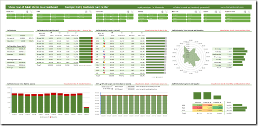
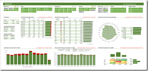
    The recent post Filter Excel Dashboards with Table Slicers was leading with the following screenshot, showing this prototype of a Customer Care Analysis dashboard:

    Showcase Table Slicers on Excel DashboardsFor instructional purposes, however, the article described the how-to on the basis of a way simpler dashboard than that.

    In the past few days I received a couple of messages from my few, but faithful readers, asking if I could publish this more complex dashboard, too.

    No sweat, here it is:

    Download Showcase Slicers on Excel Dashboards (zipped Excel workbook, 5.1MB)

    If you download the workbook, please be informed that

    • all data in this showcase is randomly and mindlessly made up and serves only for the demonstration of the techniques. The distribution of the call volumes e.g. over countries or hours of the day is totally pointless
    • this is a prototype, which I once developed for a potential client to demonstrate possible views and interactive features on a call center dashboard. This is by no means a consistent and story-telling dashboard. It is a collection of ideas. No more, no less.

    That being said, it does include a few interesting techniques. The filtering by table slicers, of course, but also

    • the option to sort table views directly on the dashboard using radio buttons above the column headers (call volume by brand and country)
    • the option to let the user decide which measure and target shall be shown on a chart (Average Handling Time or Waiting Time)
    • dynamically changing flag icons inside the table view “Call Volume by Country”

    Agreed, nothing really new under the sun and you probably have seen most of this already. But still, it may be interesting to see all these features combined with the table slicers.

    And for the records: all this is done without VBA. Just good old Microsoft Excel.

    Stay tuned.

  • Filter Excel Dashboards with Table Slicers

    How to use Table Slicers as interactive Filter Controls on a Microsoft Excel Dashboard

    Filtering data by one or several criteria is certainly one of the most common and important activities in data analytics. Adding visual filters to a dashboard is a built-in feature in Tableau and Power BI and as such a walk in the park.

    But what if you need interactive filter controls on a dashboard in Microsoft Excel?

    Filter Excel Dashboards with Table Slicers Intro

    Sure, you can use data validation lists, form controls or ActiveX controls as interactive dashboard objects to set a filter or at least make a selection. You could also write some VBA code to let the user filter data by directly interacting with cell ranges or chart elements. All viable options, but either limited in functionality or a lot of effort to implement.

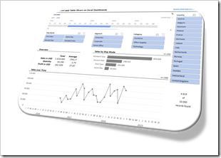
    Wouldn’t it be nice if you could simply use the slicers, which have become a very popular way for facilitating the filter process on Pivot Tables? In other words, wouldn’t it be nice to create a dashboard like this in Microsoft Excel?

    A Microsoft Excel dashboard with a variety of views (numbers, tables, charts), all filterable using the visual filter controls above the views (the slicers).

    You guessed it, right? It is possible. And even better: it is very simple and straight forward to implement. No VBA, no limitation to Pivot Tables or Pivot Charts, no Power Query, no DAX formulas. Just good old Excel.

    Today’s article explains the basics of the technique, describes the process of the implementation step-by-step and – as always – provides the example workbooks for free download.

    (more…)
  • Highlight Actions in Microsoft Excel with Multiselecting

    How to implement Highlight Actions in Microsoft Excel with the option to select more than one category (Multiselecting)

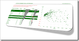
    Multiselect Highlight Actions Excel IntroClearly and Simply proudly presents another guest article: Leonid Koyfman, long-time contributor to this blog, enhances the approach to Highlight Actions in Microsoft Excel with the option to select more than one category. Leonid developed an impressively simple and elegant technique. Enjoy.

    The recent post Highlight Actions in Microsoft Excel provided a mechanism to replicate Tableau’s highlight actions in Microsoft Excel and focused on the specific use case when a selection of a row within the data table, or a bar of the “bar charts”, automatically highlighted related products on the XY scatter chart and shaded off all other data points.

    Getting closer to what can be done in Tableau, the suggested approach lacks an important Tableau functionality: multi-selection. In the Highlight Action Example in Tableau we are not limited to a single item selection. We can select multiple Sub-Categories with a mouse or CTRL-Click and this action will highlight the corresponding data points on the XY scatter chart.

    Today’s post includes a set of techniques and tricks to extend the dashboard presented in Highlight Actions in Microsoft Excel to mimic Tableau’s multiselecting feature.

    (more…)