How to use Table Slicers and Timelines as interactive Filter Controls on a Microsoft Excel Dashboard
Filter Excel Dashboards with Table Slicers
and
Showcase for Table Slicers on Excel Dashboards
described a technique how to use Excel’s popular Slicers on tables as easy-to-use, interactive filter controls on a dashboard.
Although the approach can quickly be implemented and is working fine, it has one major shortcoming: for whatever reason, timelines are only available for Pivot Tables, not for tables. If you have a date dimension in your data (and according to my experiences many data sets do), you can’t let the user filter by dates with a timeline on a table.
Today’s article will describe a work-around to eliminate this shortcoming. As always, the post provides the example workbook for free download.
Why using Slicers and Timelines on Tables in the first place?
You may wonder, why it should be worth the hassle to use Slicers and Timelines on tables for an Excel dashboard, if you could simply use Pivot Tables and Pivot Charts instead.
There is nothing wrong with building a dashboard using Pivot Tables and Pivot Charts only. However, if you want to have full control over the design and the functionality of your dashboard, Pivot Tables and Pivot Charts come with a few limitations, like the available chart types or the risk of users interacting with the Pivot Table and messing up the display by changing its layout, and others.
Using a table and additional calculations in cell ranges, however, give you full control of how your dashboard shall look like. If you want to take advantage of Excel’s incredible flexibility, table based dashboards have the egde over Pivot Tables and Pivot Charts in my humble opinion.
The Challenge
The post Filter Excel Dashboards with Table Slicers provided the following dashboard using slicers on a table as the interactive filter controls:
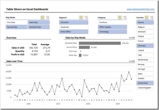 As mentioned in the introduction, timelines are not available for Excel Tables.
However, the data visualized on the dashboard above does also have a date dimension ([Order Date]) and the users of the dashboard would certainly appreciate, if not even require, to be able to filter the views by date, too.
One clumsy work-around would be to insert a standard slicer on an aggregated date column like [Order Month]:
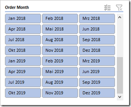 This does the job, at least somehow, but let’s call a spade a spade: this is not really a viable option. It is less user-friendly, less intuitive, requires more real estate than a timeline and the slicer may show a huge number of entries, if the data range covers several years.
So, what we are after is this:
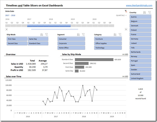 You see the timeline at top left to filter the views by date?
And yes, all calculations and charts shown on this dashboard are still based on the Excel table containing the raw data, i.e. the dashboard consists only of cell ranges and standard Excel charts. Neither Pivot Tables, nor Pivot Charts included.
The Idea of the Work-Around
Since the desired timelines are solely available for Pivot Tables, the work-around unavoidably needs to use one.
First, a helper Pivot Table is inserted, including a timeline to filter the Pivot Table by [Order Date]. Next, a formula in an additional helper column of the data table will detect for each row, whether it is in or out of the filter set by the timeline. Finally, all aggregation formulas to calculate the views will use this second helper column as an additional condition.
Too academic? I hear you. Here is a step by step explanation:
The Step-by-Step Description
Step 1: Insert a Pivot Table
Well, you know how to do that, don’t you?
Step 2: Define the Pivot Table Layout
Drag the date dimension [Order Date] to the Rows Area of the Pivot Table. Go to the rows section of the Pivot Table, right click on any item and select Ungroup. By this, you get to a list of all unique dates in the data table.
Step 3: Insert the Timeline
Click on any item of the Pivot Table, go to PivotTable Analyze and insert a timeline for [Order Date]. Now copy (or cut) the timeline, go to the dashboard, insert it and reposition, resize and format it as you like.
Step 4: Define a Named Formula
Open the Name Manager (CTRL-F3), click on New and define a new name called e.g. “myPTDateRange”. In the Refers to bar of the Name Manager, enter this formula:
=OFFSET(‘Pivot Table’!$B$5;0;0;COUNT(‘Pivot Table’!$B:$B);1)
This formula returns the range of all dates in the rows area of the Pivot Table and will automatically adjust its size, whenever you change the data and refresh the Pivot Table.
Step 5: Define a second Calculated Column in the Data Table
In the original workbook (Filter Excel Dashboards with Table Slicers), we already used a calculated helper column to detect, whether a row was visible or not (i.e. filtered or not).
Today, we add a second helper column using this formula:
=–NOT(ISNA(MATCH([@[Order Date]];myPTDateRange;0)))
Please note the double unary at the beginning of the calculation.
The formula will return 1, if the [Order Date] of this row can be found in the range myPTDateRange, i.e. in the rows section of our Pivot Table. It will return 0, if not.
The heart of this solution is the fact that the formula will return 1 only, if the date is in a visible row in the Pivot Table, i.e. for all dates filtered out, the second helper column will show 0.
So, with the first helper column we can decide whether a row is filtered out by using one of the slicers. With our new second helper column, we now know which rows are filtered out by using the timeline.
Step 6: Adjust the Aggregations and Calculations
Finally, we have to adjust all the calculations which conditionally aggregate the data based on the set filters. All formulas will now be SUMIFs, AVERAGEIFs, etc. based on at least two conditions: the values of a row will only be included in the aggregation, if it has the value 1 in both helper columns, i.e. the row applies to all filters set by the slicers and/or the timeline. Very simple and straight forward formulas, I think I do not have to go into the details.
And that’s it. May look like a lot of work, but actually takes only a few minutes.
The Disadvantages
Just like most other work-arounds, this one comes with some disadvantages, too.
At first sight, the filters on the dashboard look consistent and the user will assume they are all working on the same data underneath. But they don’t. The slicers only filter the table and not the Pivot Table. The timeline, on the other hand, only filters the Pivot Table, but not the table.
This results in two main downsides:
- If the user sets filter on the dashboard and switches to the data table, she/he will probably expect that the table is filtered accordingly. But this is not the case, if the timeline is used to filter the date
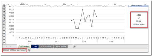
- When filtering a table, Excel displays the count of records found in the status bar at bottom left:
If the timeline is used to filter the data, this value is not accurate, because Excel shows the records found in the table, but the timeline does not filter the table. This may confuse or mislead the user.
I don’t know of an Excel native option to suppress this information in the status bar. VBA code could be used to overcome this issue, but I wanted to keep it as simple as possible. Hence, I decided to live with this and added the correct number of records found directly on the dashboard right to the line chart (see above).
Last, but not least: you always have to remember to refresh the Pivot Table after the data was changed. But this is the case for all Pivot Tables in an Excel workbook, so I don’t see this as a real disadvantage.
Download the Workbook
Download Excel Dashboard with Slicers and Timelines (zipped Excel Workbook, 876K)
Stay tuned.
Leave a Reply