How to visualize round trips on a Route Map in Excel, including an indication of the quantities transported between the cities
 The recent post series “Geographical Flow Maps in Excel” (part 1, part 2, part 3) described how to visualize flows from one selected city to several target locations, showing the connections between origin and targets and indicating the flow quantity by the thickness of the lines.
My highly esteemed colleague Joachim Schirra, outstanding SAP and Business Intelligence expert, read the articles and came up with the following question in a comment on LinkedIn:
“Would it be possible to show a flow with branches, junctions and return flows, too?”
Although this is a great idea, it sounds easier than it is. Truth be told, I do not have a solution. At least not yet.
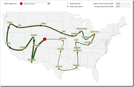
However, Joachim’s comment made me think. What can easily be achieved is the visualization of a weighted Route Map (i.e. a round trip, see image above).
Today’s post describes how to change and enhance the Geographical Flow Map approach to get to such a Route Map. As always, the post includes the Excel workbook for free download.
Why are Flow Maps with Branches a bigger Challenge?
You may wonder why I am claiming that Joachim’s idea is a much bigger challenge than the Flow Map was.
Since there is no native chart type for this in Excel, we would have to use an XY Scatter Chart with lines again and tweak the data source until we get to the view we want.
For the Flow Map, this tweak is pretty simple. Excel draws the lines of the XY Scatter Chart in exactly the same order as the points appear in the data. The trick is to duplicate each row in the data source and change the direction. In other words, we are plotting a line from the origin to the first target and another line back from the first target to the origin. Then we are plotting a line from the origin to the second target and back to the origin, and so forth. Since the lines are sitting on top of each other and have the same format and line width, the dirty little trick is not visible in the view.
So far, so good. For a fully flexible and universally working Flow Map with branches, however, the set-up of the chart source data will be way more complex. You do not know in advance, where the branches occur, how many there are in total, how many there are per city, etc.
I am not saying it is impossible, but it is a pretty complex challenge. I add this to my list of unsolved problems and will come back, if I find a solution. No promise, though.
Having said that, a Route Map is even simpler than a Flow Map, so let’s focus on this today.
The View
The view of the Route Map did not change much compared to the Flow Map, except for two things:
- the lines between the cities are now showing an arrow at the end to indicate the direction of the route
- the second check box “Show city names” allows the user to decide whether or not the names of the cities shall be shown on the map. Not really necessary, but a helpful option, from my point of view
Everything else is pretty much the same as it has been in the view of part 2 of the Geographical Flow Map series.
The Data
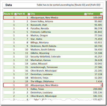
The data defining the routes is different than it has been. Instead of having a [From] and [To] column to define the flows, we now have the following four columns:
- [Route ID] is an identifier for the routes. All cities with the same [Route ID] belong to the same route
- [Path ID] defines the order of the route: the trip starts with [Path ID] = 1, the next city has [Path ID] = 2, and so forth
- [City] should be self explanatory
- [Value] is the amount of the flow (e.g. the quantity) from this city to the next location. In the example above, the tour starts in Albuquerque with 100,000 units. In Green Valley, Arizona, 4,318 units get unloaded and the remaining 95,682 units will be transported from Green Valley to Roosevelt. And so forth. You get the idea
Please note that
- it does not necessarily have to be a sequence of descending values. It can also be ascending (e.g. when picking up instead of delivering) or without any particular order
- the value of the last city does not have to be 0. It is in the screenshot shown above, but this is not required
- it does not have to be a round trip, i.e. it does not have to end in the city it started. This is the case in the example data for all routes, but it does not have to
- routes can also pass a city more than one time. That would certainly not be the shortest tour, but it is possible in general
Important: In order to make the calculations as simple as possible, the data table has to be sorted ascending by [Route ID] first and [Path ID] second. This is mandatory, otherwise the calculations will not work.
Finally, on the worksheet [geo data], there is an additional calculated column called [Data Labels]. The formula returns the name of the city, if the row belongs to the target cities. This column is used on the chart as the source range of the data labels.
The VBA Code
The VBA sub to adjust the line widths is exactly the same as already used in part 2 of the Geographical Flow Map series.
There is one additional sub called AdjustDataLabels, which inserts and formats or removes the data labels after the user changed the check box “Show city names”. It is pretty straight forward VBA code: only 32 lines, nothing to write home about. I won’t go into the details here. If you*re interested, have a look for yourself.
The Calculations
For plotting a route from point to point as an XY Scatter Chart with lines, we do not need the duplication of rows in the chart data source as we did for the Geographical Flow Map. We can simply plot the data as it is in the source data. All we have to do is to extract the cities of the selected route and calculate the according line width for each data point plotted. The formulas are very simple, mainly using IF, MATCH, INDEX and VLOOKUP. Nothing new under the sun. Have a look at the worksheet [control] for the details.
And that’s it: some changes to the data and the calculations, a code snippet we already had, a new sub to add/remove the city names and we are good to go with a Weighted Route Map in Excel. I hope you like it.
The Download Link
Download US Weighted Route Map (zipped Microsoft Excel Workbook, 873K)
Acknowledgement
Many thanks go to Joachim Schirra for his idea and the inspiration for this article. Much appreciated.
Stay tuned.

Leave a Reply