Highlight one selected item across all charts and views of an Excel Dashboard: an example and the how-to
 Very often, a dimension is displayed on more than one view of a dashboard.
Let’s say you want to analyze data of the European Union. Chances are that you will have the dimension “member state” on more than one of your charts.
If you pull these charts together into one dashboard, highlighting a selected member state across all charts is very helpful to explore and analyze the data. It supports the user to easily focus on the selected state and to identify its position in the context of all members at a glance.
Highlighting is the very simple act of selecting one item out of many (by e.g. clicking) and automatically seeing this item emphasized in all views across the entire dashboard. This is a very effective and user-friendly visualization technique and should be available on every interactive dashboard.
Today’s post shows how to implement highlighting on an Excel dashboard. As always, including the Excel workbook for free download.
The Simple Way – A Tableau Dashboard
Highlighting is a native feature in Tableau, so let’s take the easy way first and start with a Tableau workbook to show what we are talking about. Here is a Tableau dashboard visualizing unemployment rates in the European Union by country since 1990 (source: EuroStat):
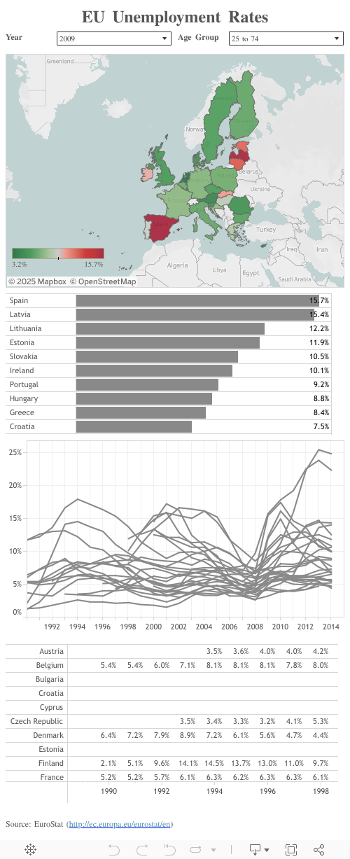
A very basic Tableau visualization with four views: a map, a sorted bar chart, a line chart and a cross table.
A so called Tableau Action (more here: The Power of Tableau Actions) ensures that a click on any data point or data series in any view highlights the selected country across the entire dashboard. Give it a try. E.g. click on a country on the map and you will see this country highlighted in the line chart, the bar chart and the cross table.
Creating this Tableau workbook from scratch took less than 30 minutes.
However, what if you need a similar functionality in Excel? A replica of this dashboard in Microsoft Excel including a comparable highlighting feature will definitely take much longer. But it is not impossible. So, let’s go the extra mile and create an interactive dashboard with highlighting functionality in Microsoft Excel.
The Excel Dashboard
Before we have a look at the final Excel dashboard, I would like to point you to 3 major differences between the Tableau way of highlighting and the approach we will implement in Excel:
- Highlighting in Tableau does not emphasize the selected item. It rather de-emphasizes all others by shading them off. In Excel we will implement this the other way round: the selected item will be emphasized and all others will stay as they are
- Highlighting in Tableau is optional. If you highlighted an item and then click somewhere else (or press ESC), the highlighting will disappear. This will be different on our Excel dashboard: highlighting will be mandatory, i.e. there will always be one country selected and highlighted
- Highlighting by clicking on a data series will be available for all views in Excel except for one: the Line Chart. This is not due to a technical restriction. You can implement this feature in Excel with VBA, too. However, not in my approach. More on this later.
So, the Excel dashboard is somehow different from the Tableau version above, but it provides a comparable highlighting feature. Here it is:
 It is in landscape format while the Tableau dashboard is portrait, but this due to the narrow layout of my blog for Tableau Public dashboards. The views (charts) on the Excel dashboard are similar to what is shown on Tableau Public above.
The Highlighting on the Excel Dashboard
The selected country is consistently highlighted in blue across all charts (and yes, it is the official blue of the European Union):
- the line color in the Band Chart and in the Line Chart
- the font color of the row in the data table (supported by a light grey fill color)
- the fill color of the bar and the font color of the axis label in the Bar Chart
- the line color of the border of the country on the Choropleth Map
The selected year is also highlighted in the relevant views :
- a vertical line in the Band and Line Chart
- the font color of the column in the data table
And finally a small highlighting bonus feature: the legend label of the Choropleth Map is highlighted in blue font color for the bin, the unemployment rate of the selected country belongs to.
The Interactive Features of the Excel Dashboard
Before we come to the technical part of the article (the how-to), let’s have a quick look at the interactive features of the dashboard:
- Select a country by
- using the drop down at the top or
- clicking on a row header of the data table or
- clicking on an axis label of the bar chart or
- clicking on a country (shape) on the Choropleth Map
- Select a year by
- using the second drop down at the top or
- clicking on a column header of the data table
- Select an age group with the third drop down at the top
- Select a color scale for the map with the drop down top right
- Scroll horizontally and vertically in the 10 rows * 10 columns data table
- Toggle between the Band Chart and the Line Chart using the radio buttons
As far as I am concerned, I prefer the Band Chart to the Line Chart (more here: An Underrated Chart Type: The Band Chart), but not everybody does, so I wanted to let the user decide what he wants to see. This is the reason, why selecting by clicking on a data series of the Line Chart is not possible. The toggling between the 2 charts is realized with a camera object, therefore you can’t select the chart and a data series of the chart. For the band chart highlighting isn’t necessary anyway, so this disadvantage affects the Line Chart only.
The different options to select a country and a year allow a more agile and efficient exploring of the data. The user doesn’t have to go to the drop downs again and again. So, the interactive features to select a country or year are certainly redundant, but very helpful.
The How-to
The dashboard uses quite a few different techniques and VBA code to realize the interactive features and the highlighting. Explaining them all step-by-step would go far beyond the scope of this post. Hence, I will only describe the basics of the techniques used for the highlighting view by view.
The Band Chart
Highlighting the data series of one item out of many is the basic concept of a Band Chart. See this article for details: An Underrated Chart Type: The Band Chart
So, no additional actions necessary for our highlighting the country.
The vertical line to visualize the selected year is created with a dummy data series and and a negative vertical error bar with a custom value:

The Line Chart
The highlighting on the line chart is implemented with one of the probably most common and most useful Excel chart tweaking techniques: an additional data series and a formula splitting the data based on a condition (the selected country in our case):

Rows 88 to 115 are the source for 28 data series of the Line Chart, formatted in a light grey. The formula fetches the data from the raw data if the country is NOT the selected country AND the data isn’t empty. Otherwise, it sets the data point to #N/A and this data point will not be plotted. Row 118 contains the data point of the selected country and will be plotted with a blue line color, i.e. highlighted.
The vertical line to highlight the year is created in exactly the same way as already described for the Band Chart.
The Bar Chart
The Bar Chart uses a similar technique like the Line Chart. One data series for all countries except the selected country and a second data series for the selected country. Setting the overlap of the bar chart series to 100% makes the chart look as if it would be only one, conditionally formatted series of bars. For more details, see this article: Color Coded Bar Charts with Microsoft Excel.
For highlighting the axis labels of the Bar Chart, I used a dirty little trick. The labels aren’t part of the chart, they are a cell range. The plot area of the Bar Chart is resized and positioned to be perfectly aligned with the cells. This is a technique I also used extensively here: Combine Tables and Charts on Excel Dashboards.
Having the axis labels in cells makes it easy to highlight them: it is simple Conditional Formatting.
The Data Table
The highlighting in the scrollable data table is simple Conditional Formatting again, checking if the value in the row header equals the selected country and if the column header equals the selected year:

The Map
Implementing a highlighting for the Choropleth Map was tricky. Unlike all other views (see above), the map already uses different fill colors to visualize the data. Hence, the fill color as the element of highlighting is not available on a Choropleth Map and we have to use something else. Here are a few options:
- the line color of the shapes (the borders)
- the weight of the lines
- adding a shadow to the shape
- shading off all other countries e.g. by making the fill color partly transparent
- finally an additional smaller map, not color coded by unemployment rates, but rather simply highlighting the selected country with a blue fill color
I tried them all and truth be told, I am not really happy with any of them. Although you would probably use only one option, I left them all in the workbook (except for the shading off option) to give you the chance to compare and decide for yourself:

I deleted the “shading off” with fill color transparency, because this distorts the color scales. Transparent fill colors do not match with the color scale shown in the legend and this would make the whole visualization misleading. That’s why I waived this option.
All of the other highlighting options have their shortcomings, too, but I do not see a better way. What do you think? Which one is the best? Or maybe you have a better idea? If so, please share it with us in the comment section.
In all other charts the highlighting was done by native Excel features like formulas, Conditional Formatting, series overlaps and error bars. No VBA included. For the map, however, we can’t avoid VBA, because the Choropleth Map is no Excel chart. It is basically just a selection of freeform shapes whose fill colors are changed by a VBA sub according to the selected data. I will not go into the details of the VBA code. The VBA project is unprotected and the code is commented. If you are interested, go and have a look.
The Map Legend
Highlighting the label of the relevant color bin is again done by simple Conditional Formatting.
That’s it. As I said, no step-by-step explanation but I hope the short descriptions above together with the Excel workbook for download (see next section) will give you a jump start into this dashboard.
The Download Link
Here is the Excel workbook for free download:
Download EU Unemployment Rates Dashboard (Microsoft Excel 2007 – 2013, 689K)
In the light of recent events:
Microsoft Excel files are actually zipped folders including XML and other files. If your Internet browser opens Windows Explorer when clicking on the download link, right click on the link instead and select “Save Target As” to download. If you are using Microsoft’s Internet Explorer, the IE will change the file extension from to .xlsm to .zip during download (don’t ask me why). Simply change the file extension back to .xlsm and you should be able to open the workbook with Excel.
What’s next?
During the development of the EU unemployment dashboard, I encountered a problem with Excel’s camera object: using many camera objects can bloat the file size of a workbook. I decided to dig deeper into this and will share what I found in the next post.
Stay tuned.
Leave a Reply