How to create highly interactive Tableau dashboards using actions: a step-by-step tutorial and an example workbook
 Even if you are creating the most basic chart with Tableau Software, the visualization already includes a great set of interactive features without the need for using special functionality: clicking on a data point highlights this point and shades off all others. Clicking on an entry in a color legend highlights all data points belonging to this category. Hovering over data points displays tooltips with all used underlying data, and so forth.
However, Tableau offers even more than that: Tableau actions. Basically, actions are Tableau’s way of sending user interactions across the workbook. The user selects a data point of one visualization and actions give you full control of what is supposed to happen on the other visualizations and worksheets.
Today’s post includes a detailed how-to tutorial on the power of Tableau actions:
- what are actions and what can you do with them,
- what types of actions are possible and
- a step-by-step tutorial on how to use actions on a dashboard
The tutorial is based on example data of the 50 most prominent summits on earth and provides a Tableau Public visualization of the final result.
The Source Data
During this summer we had two articles on Tableau dashboards visualizing FIFA World Cup statistics here and here. I am always looking for data and examples to be used in the workbooks provided with my posts. I like the idea of using sports related data, because there are tons of sports data publicly available and sport is something a lot of people are interested in.
However, this time I will not use football statistics again. I recently discovered a somehow strange, yet interesting quote:
“There are only three sports: bullfighting, motor racing, and mountaineering. All the rest are merely games.”
The origin of this quote is unclear. Very often it is attributed to Ernest Hemmingway, other people affirm it was the American writer and author Barnaby Conrad who said this.
To be honest, I don’t like bullfighting and for me there is no thrill in watching people driving around in circles. Though, I do love mountaineering. Having said this, we will use the list of the 50 most prominent mountains on earth (see definition of prominence here). The data includes the summits, the continents, the countries, the elevation, the prominence, the first climbers, the year of the first ascent, the latitude and longitude and a link to the Google Map view. The core piece of the data is taken from peaklist.org, enhanced with different information from different sources (if available at all).
The Challenge
First of all we want to create a Tableau workbook and dashboard that visualizes all information included in the data source. The dashboard could look like this:
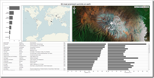 On top of that, we want to add further interactivity:
- Clicking on a continent in the top left bar chart zooms the map to this continent and highlights the summits on this continent in the data table
- Clicking on a summit on the map highlights the mountain on the map and the according row of the data table and navigates the Google Map view to this summit
- Clicking on a row or bar in the data table highlights the mountain on the map and data table and again shows the Google Map view of the selected summit in the web browser window
These requirements are a great use case for Tableau actions. The preparatory work however is creating a Tableau workbook, the visualizations and the dashboard itself:
How to set up the Tableau Worksheets and the Dashboard
First step is opening a new Tableau workbook, connecting to the data and creating the following 3 worksheets:
- On the worksheet Summits per Continent, we drag the dimension [Continent] to the row shelf, the dimension [Summit Name] to the column shelf, change the measure of [Summit Name] to CNT and sort the continents descending. With only 4 mouse clicks, we created a bar chart visualizing the number of summits per continent.
- On a worksheet called Map, we drag [Latitude] to the row shelf, [Longitude] to the column shelf and SUM(Elevation) to the size shelf. The result: a visualization of the 50 TOP summits on a World map.
- Finally, on the worksheet Summits, we use [Summit Name], [Country], [First Ascent By] and [Year] on the row shelf, SUM(Elevation) and SUM(Prominence) on the column shelf and sort descending by prominence. That’s it: a data table including two bar charts.
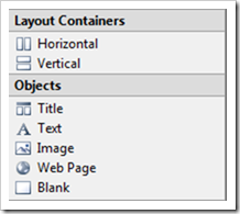 In the next step we insert a dashboard, select all 3 worksheets created in the previous step by double-clicking in the dashboard window and add a web browser element by clicking on “Web page” in the objects part of the dashboard window (see left). For the time being, we leave the URL empty. We will use this web page later to display the Google Map view of the selected summit.
Finally we arrange the elements on the dashboard by dragging and dropping and – if desired – change some colors and formats. Again, only a couple of mouse clicks are necessary to create a nice dashboard. However, the interactivity between the different dashboard elements is still missing.
This is where Tableau actions come into play:
How to use Actions on Tableau Dashboards
What are Actions?
Actions are the functionality that brings full flexible interactivity to your Tableau worksheets and dashboards. In a nutshell, actions send information across different worksheets and visualizations. If the user of your Tableau workbook clicks on a data point on any given worksheet or dashboard visualization, actions give you full control over what should happen on all other worksheets and visualizations.
Tableau provides 3 different types of actions:
- Filter Actions
- Highlight Actions
- URL Actions
For our example, we will use all three types to enrich our dashboard with the required interactive features.
Highlight Actions
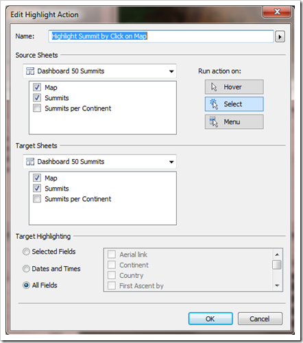
The first action is highlighting a summit on the map and on the data table if the user either clicks on a data point on the map or a row in the data table.
The step-by-step:
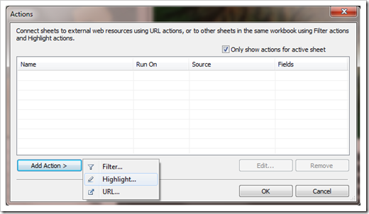
- select Edit|Actions from the main menu,
- select “Highlight” from the actions dialog:
- give the action a name
- click on “Run action on Select”,
- select Map and Summits as the source sheets,
- select Map and Summits as the target sheet
That’s it.
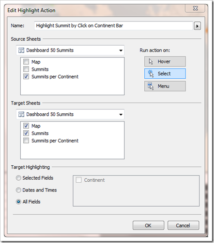
The second highlight action will highlight all summits of a selected continent on the data table, as soon as the user clicks on a bar in the Summits per Continent bar chart. The step-by-step is along the lines of the highlight action described above. The according Edit Highlight Action window looks like this:
That’s it. A couple of mouse clicks and you have great interactive highlighting across different visualizations of your dashboard.
Filter Actions
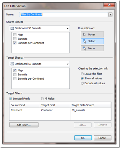
The filter action provides the following interactivity: if you click on a bar of the “Summits per Continent” visualization, the Map will zoom onto the selected continent. It would be easily possible to apply a filter on the “Summits” data table as well. However, we don’t want to filter the data table, since we already implemented another action to highlight the summits of the selected continent (see previous section).
Here is the step-by-step for adding the filter action:
- click on Edit|Actions,
- select “Filter action” from the actions dialog,
- assign a name to the action
- click on “Run action on Select”,
- select Summits per Continent as the source sheet,
- select Map as the target sheet,
- choose “Selected Fields” in the Target Filters section
- click on “Add Filter” and select the [Continent] as source and target field
This is how the according Edit Filter Action dialog looks like:
The final action is used to update the web page object with the Google Map view of a summit that is either selected on the map or on the data table.
In the first step we have to add the dimension [Aerial link] to the level of detail shelf on the worksheets Map and Summits, since this dimension is not yet used used there. Then we go back to the dashboard and
- click on Edit|Actions,
- select “URL action” from the actions dialog,
- assign a name to the action
- click on “Run action on Select”,
- select Map and Summits as the source sheets,
- click on the arrow right to the URL line and
- select the dimension [Aerial link]
The Edit URL Action dialog should look like this:
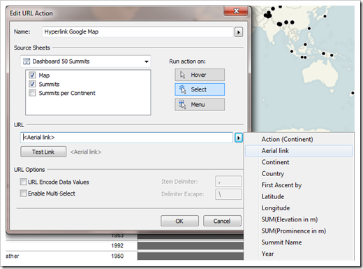 That’s it. Every time you click on a data point on the map or within the data table, the web browser object on the dashboard will show the according Google Map view.
Two Remarks on the URLs in the Source Data
- The URLs of the Google Map view are included in the source data. For an optimal visualization of the view, you have to make sure, that the URLs include the string “&output=embed”. Otherwise the Google Maps logo, the Google menus, etc. will take a considerable part of the real estate of the web object.
- Since we have the latitude and longitude in our data as well, we do not necessarily need the dimension [Aerial link] in the source data. We could use a calculated field as well. The formula would look like:
“http://maps.google.com/maps?ll=”+
STR(FLOAT([Latitude]))+
“,”+
STR(FLOAT([Longitude]))+
“&spn=.3,.3&t=k&hl=en&output=embed”This calculated field creates the Google Map URLs from the latitude and longitude automatically. Though, there is one drawback you should be aware of: the URLs in the source data include optimized lat/long span for each summit. The calculated field, however, uses a hardcoded span of 0.3 / 0.3 (or whatever you choose). Thus, you will see the summit in the web object on the dashboard, but the zoom factor may not be optimal in every case.
The Dashboard on Tableau Public
Due to the limited space on my blog, the visualizations are one below the other and I took out the columns [First Ascent by] and [Year] from the data table. However, if you have Tableau Desktop available, you can download the workbook and it should be a piece of cake to turn the dashboard into the visualization shown in the section “The Challenge” of this post.
Acknowledgments
Many thanks go to Giedre Aleknonyte and Joe Mako, who were kind enough to review my Tableau workbook prior to publishing and – as usual – gave extremely valuable inputs for improvement.
If you don’t know Giedre: have a look here or here. If you are taking part in this year’s Tableau Customer Conference, I highly recommend to visit her presentation there.
If you don’t know Joe, you probably never visited the Tableau Software Forums. Joe is one of the most active members there, with an impressive number of almost 1,000 posts so far. If Tableau will ever put something in place like a Most Valuable Tableau Professional, I’ll bet you, Joe will be one of the first experts to be nominated.
Tableau how-to tutorials on Clearly and Simply – your opinion?
Today’s post is somehow a new type of article here on Clearly and Simply. It is the first to provide a detailed how-to tutorial on a standard functionality of Tableau Software.
Previous articles described workarounds for missing functionality (like Choropleth Maps with Tableau or Animate cumulative data with Tableau), provided some visualization examples (like FIFA World Cup Statistics with Tableau or Tableau Replica of Curtis Steiner’s 1,000 Blocks) or discussed special effects (like Week in, week out, Tableau).
What do you think? Do you want to see more Tableau how-to tutorials? Or do you think this type of articles are redundant because everything is already described in the Tableau Manuals, the Tableau Online Help and the Tableau Training Videos?
If you have a minute, please leave me a comment and let me know what you would prefer.
What’s next?
In November last year, Matt Grams contributed a beautiful guest article on how to bluff a Tableau lookalike visual cross-tab chart with Microsoft Excel:
Bluffing a Visual Cross-tab with Excel
Trying to emulate Tableau visualizations and functionality with Microsoft Excel is an interesting and informative approach: it not only improves the quality and functionality of your Excel workbooks and models, but also forces you to explore Excel’s enormous flexibility and helps to improve your Excel skills.
Having said this, the next post will describe a way to bluff some of the Tableau action functionality described in this post with Microsoft Excel. As always including the Excel workbook for free download.
Stay tuned.
Leave a Reply