Category: Visualization

  • Heat Maps with Individual Color Scales in Excel

    How to create Heat Maps in Microsoft Excel using individual Color Scales to support the analytical insights into the distribution of the data
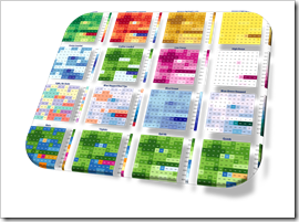
    Heat Maps with individual Color Scales IntroIn his brilliant guest post Analytical Color Scales for Heat Maps, Ron Whale explained, how color scales can efficiently support the process of analyzing data.

    Applying different, thoroughly designed color schemes can help to gain deeper insights into the distribution of data, to identify outliers, to focus on special points of interest, to find similar groupings and more.

    In a nutshell: switching between color scales of a Choropleth or Heat Map helps you to understand your data.

    Whilst Ron was developing his great palette of color schemes for using them on a Choropleth Map, they are equally helpful for a much simpler visualization technique: a Heat Map of a table (or range) of numbers.

    Microsoft Excel does provide a built-in feature to create a Heat Map on a range of numbers: Conditional Formatting. However, this is limited regarding the configuration of the color scales and it does not provide the option to easily switch between color schemes for supporting the data analysis process.

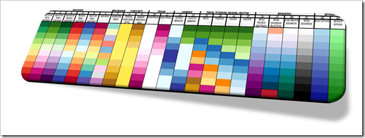
    Today’s post provides a technique to overcome this shortcoming of Excel: a VBA-based solution to easily apply any given color scale to an Excel range with only two mouse clicks. As always, the post comes with the workbook for free download.
    (more…)

  • Analytical Color Scales for Heat Maps

    More sophisticated Color Scales to increase the analytical insights provided by Heat Maps or Choropleth Maps – a Guest Post by Ron Whale

    The workbook posted with the recent article Geographical Flow Maps in Excel (Part 3 of 3) provided new color scales, I never published before. Truth be told, I did not develop these schemes. Ron Whale did. Ron generously agreed to share them here and he is even kind enough to explain the scales, their use cases and the value they add to analytical Heat Maps in today’s guest post. Enjoy.

    Analytical Color Scales IntroJust a few months ago, I found this website and discovered a great Choropleth mapping spreadsheet. I really like the color mapping schemes that have been developed. As I worked through the program and played with the mapping colors, I began to understand that the colors could be used to highlight additional data details in the map.

    So, I came up with a number of special purpose color schemes designed to enhance specific aspects of the data and added them in with some of the original color scales. As the color schemes grouped into different visual purposes, I named the new colors to better describe the type of data that would be highlighted when using that scale.

    I thought I would share my twist on the color scales and will explain my thoughts about the different scale types below.

    (more…)

  • Weighted Route Maps in Excel

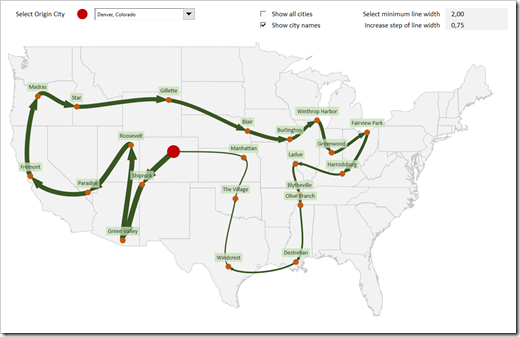
    How to visualize round trips on a Route Map in Excel, including an indication of the quantities transported between the cities

    Weighted Route MapThe recent post series “Geographical Flow Maps in Excel” (part 1, part 2, part 3) described how to visualize flows from one selected city to several target locations, showing the connections between origin and targets and indicating the flow quantity by the thickness of the lines.

    My highly esteemed colleague Joachim Schirra, outstanding SAP and Business Intelligence expert, read the articles and came up with the following question in a comment on LinkedIn:

    “Would it be possible to show a flow with branches, junctions and return flows, too?”

    Although this is a great idea, it sounds easier than it is. Truth be told, I do not have a solution. At least not yet.

    However, Joachim’s comment made me think. What can easily be achieved is the visualization of a weighted Route Map (i.e. a round trip, see image above).

    Today’s post describes how to change and enhance the Geographical Flow Map approach to get to such a Route Map. As always, the post includes the Excel workbook for free download.

    (more…)

  • Geographical Flow Maps in Excel (Part 3 of 3)

    Final part of a 3 parts series on how to create a Geographical Flow Map in Microsoft Excel

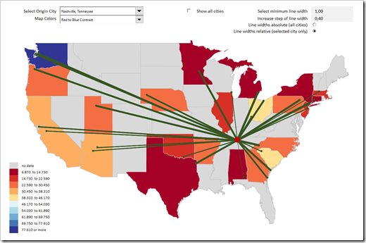
    Flow and Choropleth Map in ExcelThis is the third and final part of our series on how to create a Geographical Flow Map in Microsoft Excel and it will be a relatively short article (at least by my standards).

    Why? Because the technique of how to visualize flows on a map in Excel was already covered in part 1  and part 2. Today’s post will simply enhance that visualization with a technique which has been covered in many blog posts here throughout the last 10 years: adding a so called Choropleth or Filled Map. Check out the category Choropleth Maps to see what has already been published about this topic on this blog.

    To cut a long story short, this article will only briefly explain the idea and how to configure the colors used on the Flow and the Choropleth Map. As usual, the example Excel workbook is provided for free download.

    (more…)

  • Geographical Flow Maps in Excel (Part 2 of 3)

    Part 2 of a 3 parts series on how to create a Geographical Flow Map in Microsoft Excel

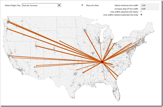
    Flow Map IntroWhilst the workbook and explanations provided in the first post laid the foundation for a Geographical Flow Map in Excel, the visualization was very limited in its usability. It only visualized the flow or movement from one city to several endpoints, but not any measure or value which is moved like shipped quantities, USD, persons, or something similar.

    Today’s post removes this limitation by visualizing a measure by the thickness of the lines between the cities: the thicker the line, the larger the measure and vice versa.

    As always, the post comes with the example Excel workbook for free download.

    (more…)