Category: Visualization

  • Choropleth Maps with Tableau

    3 different workarounds to create choropleth maps with Tableau
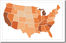
    Choropleth Map with Tableau - click to enlarge With Tableau Software it is really easy to overlay your data on a dynamic map even without having latitudes and longitudes in the underlying data. However, Tableau does not (yet?) natively support choropleth maps.

    We had a couple of posts regarding choropleth maps using Microsoft Excel here on Clearly and Simply. However, creating such solid filled maps to visualize your own data is on the list of wishes of many Tableau users as well (see here for instance).

    There is a common workaround for this (described in the Tableau manual as well), using polygon data of the regions to create choropleth maps. Though, this approach needs a lot of additional data in the data source. That’s why I was looking for an alternative. I had a very simple idea, far from being optimal, but still a different approach and much easier to implement and use. Two weeks back, I sent my workbook as a sneak preview to Giedre, a really passionate Tableau aficionado from Vilnius, Lithuania and she was polite enough to make me believe, she would like my approach. In her reply to my email she sent me her brilliant solution of this challenge, much easier and by far better than everything I would ever be able to come up with.

    Although she has a blog of her own (add-knowledge), Giedre was kind enough to share her idea with us and she wrote the main part of today’s post. Giedre just started her blog together with some friends recently and there aren’t many posts for the time being. Nevertheless I highly recommend to visit add-knowledge and check from time to time what she will be coming up with. I am looking forward to it!

    Today’s article discusses all 3 workarounds of how to create choropleth maps with Tableau: the polygon approach, my simple simulation and Giedre’s brilliant idea using custom shapes. As always, including Tableau packaged workbooks for free download.

    (more…)

  • Background Image Maps with Tableau

    Tableau discovers the world – more detailed maps by using background images and a little trick in Microsoft Excel

    © Gerd Altmann / pixelio.deTableau Software offers a very easy way of overlaying data on a map, even without requiring the geographical references (latitude and longitude) in the data source. It automatically identifies field names in your data that are appropriate for visualizations on a map, like state or county and generates the according latitudes and longitudes.

    If you are using data of the United States, Tableau provides a very high level of detail (state, county, zip code area) and displays the boundaries and names of the regions on the underlying map. You can even enhance the visualization with a choropleth map showing a variety of predefined US census data.

    For other counties of the world, however, Tableau does not (yet?) provide this level of detail. In a data source of Germany, for one, Tableau automatically identifies the 16 states and shows the state boundaries on the map. But that’s it. Higher levels of detail like counties (Regierungsbezirke, Landkreise, etc.) or even zip code areas are not available.

    Of course, the folks over at Tableau Software have been smart enough to implement a very easy workaround to overcome this: Tableau provides an option to overlay the data on any given image, e.g. on a picture of a map. Prerequisites for this workaround are a picture of the map and the latitudes and longitudes in the underlying data source. Usually both are easy to find and download somewhere on the Internet. Sometimes, however, the geographical references in your data do not exactly fit to the areas on your map image and Tableau’s visualizations will not be located exactly in the center of the according region.

    Today’s post describes this problem using data based on German zip code areas and provides a how-to-tutorial, a Tableau packaged workbook and a little bonus track for my friends in Lithuania.

    (more…)

  • Bullet Graphs for Excel: A Simple Way?

    A guest post by Matt Grams discussing an alternative solution of creating bullet graphs with Microsoft Excel

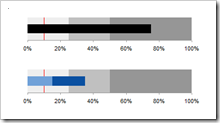
    Bullet Graphs - click to enlargePreamble:

    We proudly present the first guest post here on  Clearly and Simply: Matt Grams describes a very interesting alternative approach of creating bullet graphs in Microsoft Excel without using VBA.

    When you need one or more horizontal bullet graphs in an Excel spreadsheet, what do you do if…

    1. you work exclusively in Excel 2003 or earlier, 
    2. you don’t want to use a 3rd party add-in,
    3. you want your spreadsheet to be free of VBA, and
    4. your bullet graph must have a professional appearance?

    Faced with this scenario of apparently limited options, you’re sure to come across Charley Kyd’s tutorial at ExcelUser. Attempting to build a bullet graph with this method was a useful exercise for me, but the approach left me flustered at the complexity of the data arrangement and chart set-up. If making just one bullet graph was that hard, what are you going to do when you have multiple bullet graphs to implement? Furthermore, not having the bullet graph data values in a single row was far from ideal.

    This post describes an alternative and simpler approach of how to create bullet graphs with Microsoft Excel, including step-by-step tutorials and an example workbook for free download.

    (more…)

  • Build your own Choropleth Maps with Excel

    Amendment #6 to Choropleth Maps with Excel: a workaround to transfer the names of regions from a svg file into xls

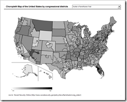
    Choropleth Map USA by Congressional Districts - click to enlarge

    In a comment on Multicolored Choropleth Maps with Excel Dave Hammer pointed to a couple of excellent maps on Wikimedia Commons in svg file format (scalable vector format). Dave wanted to use these maps to create choropleth maps with Microsoft Excel, but he hit a roadblock with regards to the texts (names of counties or districts) associated to the shapes in the svg file: after ungrouping the map in Excel, the shapes were available, but the associated names were gone. In his example (counties or congressional districts), it would be a lot of laborious work to assign the names to the shapes manually. And it would be error-prone as well.

    Actually there is a workaround to let Excel do most of the work. This post describes this workaround and provides a template of a choropleth map of the United States by congressional districts for free download.

    (more…)

  • Choropleth Map Template USA by Counties

    Amendment #5 to Choropleth Maps with Excel: a Map Template for the United States by Counties

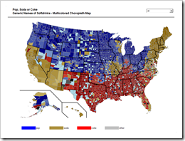
    Pop Soda Coke by US Counties - click to enlargeIn a comment on Multicolored Choropleth Maps with Excel Dave Hammer wrote

    “… I'm doing some mapping right now by County and Congressional District. Some folks at Wikipedia have supplied some excellent .svg maps with proper labels […] but I'm hitting a roadblock with Excel. […] They're easily imported into Excel as an enhanced metafile and then ‘ungrouped’ to create an excellent map – but all the data associated with the shapes is lost during this process. […]”

    Actually there is a way of converting .svg files (scalable vector graphics) into Microsoft Excel without losing the data associated to the shapes. The next post will describe a detailed how-to tutorial, but I thought you might be interested to see the results in a sneak preview. This post offers free downloads of choropleth maps of the United States by county, in the classic and the multicolored version.

    (more…)