Category: Visualization

  • Better Chart Tooltips with Microsoft Excel 2010

    Create Tableau lookalike Chart Tooltips on your Microsoft Excel 2007/2010 Charts
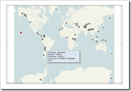
    Better Chart Tooltips with Microsoft Excel 2010Let’s call a spade a spade: Microsoft Excel’s chart tooltips are lame.

    When talking about tooltips I refer to textboxes that appear when hovering over a data point of a chart with the mouse.

    Excel’s chart tooltips show by default the name of the data series, the point (e.g. the category) and the values. There is no built-in feature to change anything about them except for turning the tooltips off in Excel’s options.

    However, chart tooltips are a great interactive feature. They give the user the opportunity to easily explore the data and get additional information about selected data points on the chart.

    Have a look at Tableau as a benchmark. Tableau allows you to display any information in the tooltips (i.e. any given dimension or measure), to format them and to replace the field names by whatever you choose. There is even much more. For instance: my highly esteemed Tableau blogging colleague Andy Cotgreave showed on the outstanding blog of the data studio how to add conditional formatting to tooltips and even how to implement pseudo bar charts inside of a tooltip. Fantastic work, Andy.

    Back to Microsoft Excel. Can we do at least something similar in Excel? Let’s stay humble. I am not dreaming of great formatting features or even the fabulous things Andy did with Tableau. I am talking about just some nice and meaningful tooltips displaying more information than the Excel default does. Is this possible?

    Yes, it is.

    Today’s post shows how to improve Microsoft Excel’s chart tooltips using a textbox and some VBA. As always, providing the Excel 2007/2010 workbook for free download. 

    (more…)

  • The History of FIFA World Cup Host Elections

    FIFA World Cup Host Elections since 1930 – the applicants, the winners and some additional statistics visualized using Tableau Software

    © Rainer Sturm / pixelio.de

    Most of the Tableau related articles here on Clearly and Simply include how-to-tutorials or workarounds. Today’s post is different.

    In the light of recent events, today’s article will be straitened to a very simple, yet hopefully interesting visualization: The FIFA World Cup Host Elections over the course of time. The applicants, the withdrawals, the winners and additional interesting statistics of the football associations in the applying countries, like the number of players, the number of clubs and the officials.

    As always including the visualizations for direct access using Tableau Public and the option to download the workbook.

    (more…)

  • Animate Cumulative Data with Tableau 6

    Create a motion chart and animate cumulative data using the new functionality “Show History” of Tableau 6

    © Pixel King / pixelio.deThe article Animate cumulative data with Tableau described a workaround to visualize the history of data on the page shelf of Tableau’s version 5. The example provided in that post showed the growth of Walmart since 1962 on a map of the United States.

    The workaround included a custom SQL statement in the data connection to create a second date field to be used on the page shelf.

    The workaround did the job, but it came with a couple of serious disadvantages:

    • SQL knowledge needed to create the Custom SQL statement
    • Additional time needed to set up the data connection
    • Extremely slow performance: executing the SQL query after opening the workbook took between one and three minutes
    • Impacts on other data analysis and visualizations due to the artificially bloated data source

    As I already said at the end of the original article: A workaround. No more, no less.

    All that belongs to the past. With Tableau 6 you can easily animate cumulative data on the page shelf using the new feature “Show History”. Today’s post includes a how-to tutorial and the Tableau workbook for direct access here and for free download.

    (more…)

  • Bluffing Tableau Actions with Microsoft Excel

    Selected techniques to emulate a Tableau lookalike dashboard using Microsoft Excel, including some interactive features similar to Tableau Actions

    Actions - Clapperboard ExcelThe recent post described the power of Tableau Actions. Tableau actions allow you to add context and user-defined interactivity features across your workbook. If the user clicks on one of your visualizations, Actions give you full control over what should happen on other worksheets or visualizations. Setting up a Tableau dashboard with various actions like filtering, highlighting and linking to web pages is a piece of cake.

    How about Microsoft Excel? Is it possible to implement a similar interactivity on a Microsoft Excel dashboard? Yes it is.

    Today’s post describes a set of techniques and tricks to build a replica of the Tableau 50 most prominent summits on earth dashboard using Microsoft Excel. As always, including the workbook for free download.

    (more…)

  • The Power of Tableau Actions

    How to create highly interactive Tableau dashboards using actions: a step-by-step tutorial and an example workbook

    Action - Tableau ClapperboardEven if you are creating the most basic chart with Tableau Software, the visualization already includes a great set of interactive features without the need for using special functionality: clicking on a data point highlights this point and shades off all others. Clicking on an entry in a color legend highlights all data points belonging to this category. Hovering over data points displays tooltips with all used underlying data, and so forth.

    However, Tableau offers even more than that: Tableau actions. Basically, actions are Tableau’s way of sending user interactions across the workbook. The user selects a data point of one visualization and actions give you full control of what is supposed to happen on the other visualizations and worksheets.

    Today’s post includes a detailed how-to tutorial on the power of Tableau actions:

    • what are actions and what can you do with them,
    • what types of actions are possible and
    • a step-by-step tutorial on how to use actions on a dashboard

    The tutorial is based on example data of the 50 most prominent summits on earth and provides a Tableau Public visualization of the final result.

    (more…)