Final part of a 3 parts series on how to create a Geographical Flow Map in Microsoft Excel
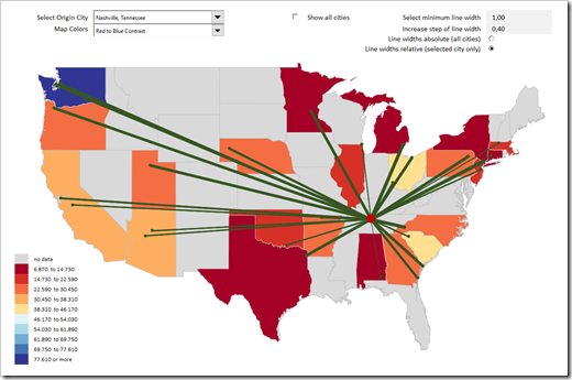 This is the third and final part of our series on how to create a Geographical Flow Map in Microsoft Excel and it will be a relatively short article (at least by my standards).
Why? Because the technique of how to visualize flows on a map in Excel was already covered in part 1 and part 2. Today’s post will simply enhance that visualization with a technique which has been covered in many blog posts here throughout the last 10 years: adding a so called Choropleth or Filled Map. Check out the category Choropleth Maps to see what has already been published about this topic on this blog.
To cut a long story short, this article will only briefly explain the idea and how to configure the colors used on the Flow and the Choropleth Map. As usual, the example Excel workbook is provided for free download.
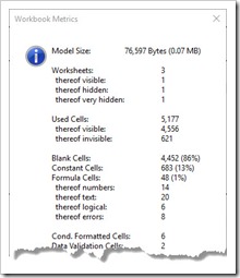 When you are developing a large and complex Microsoft Excel model, you should definitely have an eye on the size of your workbook and its components: how many sheets does your workbook have? How many used cells? How many formula and constant cells? How many of the formulas return an error value? How many Named Ranges are defined? How many Charts, Tables, Pivot Tables, lines of VBA code, etc.?