Category: Data Analysis

  • Showcase for Table Slicers on Excel Dashboards

    A more practical Showcase for using Table Slicers as interactive Filters on an Excel Dashboard including additional features

    The recent post Filter Excel Dashboards with Table Slicers was leading with the following screenshot, showing this prototype of a Customer Care Analysis dashboard:
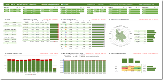
    Showcase Table Slicers on Excel DashboardsFor instructional purposes, however, the article described the how-to on the basis of a way simpler dashboard than that.

    In the past few days I received a couple of messages from my few, but faithful readers, asking if I could publish this more complex dashboard, too.

    No sweat, here it is:

    Download Showcase Slicers on Excel Dashboards (zipped Excel workbook, 5.1MB)

    If you download the workbook, please be informed that

    • all data in this showcase is randomly and mindlessly made up and serves only for the demonstration of the techniques. The distribution of the call volumes e.g. over countries or hours of the day is totally pointless
    • this is a prototype, which I once developed for a potential client to demonstrate possible views and interactive features on a call center dashboard. This is by no means a consistent and story-telling dashboard. It is a collection of ideas. No more, no less.

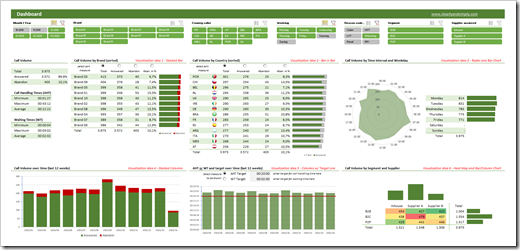
    That being said, it does include a few interesting techniques. The filtering by table slicers, of course, but also

    • the option to sort table views directly on the dashboard using radio buttons above the column headers (call volume by brand and country)
    • the option to let the user decide which measure and target shall be shown on a chart (Average Handling Time or Waiting Time)
    • dynamically changing flag icons inside the table view “Call Volume by Country”

    Agreed, nothing really new under the sun and you probably have seen most of this already. But still, it may be interesting to see all these features combined with the table slicers.

    And for the records: all this is done without VBA. Just good old Microsoft Excel.

    Stay tuned.
  • Filter Excel Dashboards with Table Slicers

    How to use Table Slicers as interactive Filter Controls on a Microsoft Excel Dashboard

    Filtering data by one or several criteria is certainly one of the most common and important activities in data analytics. Adding visual filters to a dashboard is a built-in feature in Tableau and Power BI and as such a walk in the park.

    But what if you need interactive filter controls on a dashboard in Microsoft Excel?

    Filter Excel Dashboards with Table Slicers Intro

    Sure, you can use data validation lists, form controls or ActiveX controls as interactive dashboard objects to set a filter or at least make a selection. You could also write some VBA code to let the user filter data by directly interacting with cell ranges or chart elements. All viable options, but either limited in functionality or a lot of effort to implement.

    Wouldn’t it be nice if you could simply use the slicers, which have become a very popular way for facilitating the filter process on Pivot Tables? In other words, wouldn’t it be nice to create a dashboard like this in Microsoft Excel?

    A Microsoft Excel dashboard with a variety of views (numbers, tables, charts), all filterable using the visual filter controls above the views (the slicers).

    You guessed it, right? It is possible. And even better: it is very simple and straight forward to implement. No VBA, no limitation to Pivot Tables or Pivot Charts, no Power Query, no DAX formulas. Just good old Excel.

    Today’s article explains the basics of the technique, describes the process of the implementation step-by-step and – as always – provides the example workbooks for free download.

    (more…)
  • String Calculations in Tableau

    Concatenation, Conversion, Analysis and Extraction –
    44 Formulas to work with Strings in Tableau’s Calculated Fields

    NY Mag Crossword - Photograper: Lori L. Stalteri (flickr.com)“String Calculations” is a somehow weird expression. Calculations on texts sounds like a contradiction in terms.

    Of course you do not really calculate strings. You manipulate and analyze them like concatenating texts, changing texts (e.g. to upper, lower or proper case), converting texts or parts of texts to numbers or dates, extracting parts or analyzing them (e.g. how many words or do they contain a number), etc.

    If you do not have the option to do this type of things directly in your database, you will use Calculated Fields in Tableau Software to get what you want from the text dimensions in your data source. That’s why I called this post String Calculations in Tableau.

    Today’s post contains a set of 44 more or less practical examples of concatenation, conversion, analysis and extraction of texts. I will not go into the basic string functions of Tableau, like LEFT, FIND, LEN, REPLACE, etc. You can easily look up how they work in the manual or read the explanations directly in the Calculated Field editor.

    I rather tried to pull together a small library of 44 more complex formulas you may find useful when you have to work with strings in Tableau, like concatenate strings and a date, convert a string to a date, reverse words in a string, extract parts of a string, remove line feeds, check if a string contains a number, count the number of words in a string and many more.

    The article lists and explains all 44 formulas. I do not delude myself into believing anyone would read today’s article from start to finish. It is more a reference type of post and this is on purpose.

    However, I recommend having a brief look inside, even if you are not looking for a certain string calculation in Tableau at the moment. I am starting the article with a little text visualization example and I am also providing a Tableau packaged workbook (on Tableau Public ) including all examples for free download at the end of the post.

    (more…)

  • Interactive Tooltip Examples

    3 Examples of how to use an ActiveX Spreadsheet Control as a Tooltip on a Microsoft Excel Worksheet

    Prova Riporti - Photographer il Vanzo - tiny little pieces (flickr.com)The recent post described how to use an ActiveX Spreadsheet Control as a tooltip on Excel worksheets. At first sight this seemed to be a nifty little idea to spice up tooltips on Microsoft Excel worksheets. In the meantime, however, I had to learn that there is a major pitfall:

    The heart of the solution, the ActiveX Spreadsheet Control is part of the so called Office Web Components. So far, so good. The problem is that Microsoft does not ship the Office Web Components with Office 2007 and later anymore. In other words, in a clean, new Office 2007/2010 installation, the ActiveX Spreadsheet Control is not available anymore.

    Microsoft still provides the Office Web Components for free download (Office 2003 Add-in: Office Web Components), but there is still a major drawback: if you want to use the described technique, you have to make sure that every user of your workbook either uses Excel 2003 or has the Office Web Components installed.

    At the end of the previous post I announced a follow up article with more practical examples using the technique. Knowing now what I didn’t know before, I pondered if this article would still make sense. To cut a long story short, I finally decided to publish it despite the limitation described above. Maybe some of you will still find it interesting and useful.

    Today’s post provides 3 different use cases of how to take advantage of the ActiveX Spreadsheet Control in a tooltip:

    • a scrollable tooltip
    • side calculations within a tooltip
    • an improved version of the Summary Card tooltip

    As always the articles provides all Excel workbooks for free download.

    (more…)

  • Interactive Tooltips on Excel Worksheets

    The Next Level of Tooltips on Excel Worksheets: Taking Advantage of the ActiveX Spreadsheet Control

    Marchant mechanical calculating machine - Photographer: Ian's Shutter Habit (flickr.com)Tooltips are one of the most helpful features when prospecting large data sets.

    We already had a couple of articles talking about tooltips, on charts and on worksheets:

    Tooltips on Microsoft Excel Tables

    Charts in Excel Table Tooltips

    Display all Fields of a Row in large Excel Tables

    Better Chart Tooltips with Microsoft Excel 2010

    Today’s post is trying to take this to the next level: an interactive tooltip on a Microsoft Excel worksheet. You may ask:

    “What the heck is an interactive tooltip?”

    What I am thinking of is a tooltip enabling you not only to read additional information but also interact with it. E.g. copy data from the tooltip and paste it somewhere else, do side calculations based on the currently selected data, browse through a longer list of data in the tooltip, etc.

    Impossible? No it isn’t. Microsoft provides a very useful ActiveX control which enables us to do exactly this: the Microsoft Office Spreadsheet Control. Today’s post shows how to take advantage of this ActiveX control in order to provide an interactive tooltip on Excel worksheets – as always including the Excel workbook for free download.

    (more…)