With Named Formulas as the Data Source of a Chart Series, Excel does not always plot the values correctly
959 words, ~5 minutes read
 Update on Monday, August 3, 2020: The described issue is solved, thanks to Andy Pope. Please refer to the update at the end of the article or to Andy’s message in the comment section. Many thanks, Andy.
The recent articles Dynamic Storyboards in Excel and A practical Example for Dynamic Storyboards described a way how to plot several data series in one XY Scatter Chart by offsetting the data points.
During the implementation of the workbooks coming with these articles, I stumbled across a weird Excel oddity:
If you are trying to transfer the offset calculations into Named Formulas and use these Named Formulas as the source of you chart series, Excel does not always plot the data correctly.
Please be advised that today’s post is only a description of the issue. I have no clue why this is happening and therefore I do not have an explanation of what is going on, let alone a solution.
I have a question for you, though: have you ever encountered this problem? And if so, do you know what the root cause might be and how to overcome the problem? If so, please let me know in the comment section of the post.
The Example Data to be plotted in an XY Scatter Chart
In order to facilitate the explanations in this post, I will use a pointless, but more illustrative and easy-to-follow data set: I created coordinates to show the digits 1 to 9 when plotted in an XY Scatter Chart:
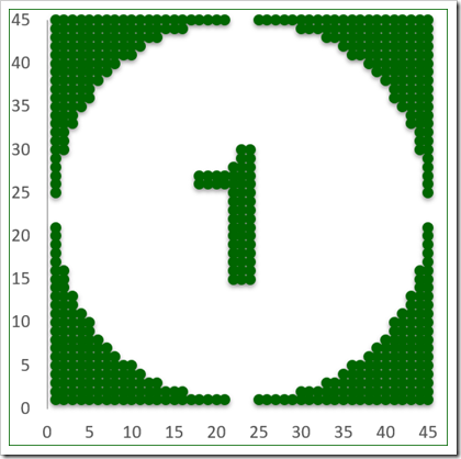 Each digit has coordinates between 1 and 45 on the horizontal and the vertical axis.
The Calculations
If you plot the data as it is, all 9 digits will be displayed in the same range sitting on top of each other. But this is not what we want. What we want to see is a display showing 1 at top left and 9 at bottom right, like this:

The challenge is exactly the same as in Dynamic Storyboards in Excel.
To get there, we need to add appropriate offsets to the coordinates according to the image number. It is a pretty simple calculation: for image 1, for instance, there is no offset added to the horizontal coordinate [X], but an offset of 90 is added to the vertical coordinate [Y]. Image 3 gets a horizontal offset of 90 and a vertical offset of 90. image 7 gets no offset, neither horizontally nor vertically. You get the idea.
First approach is to add calculated columns to the data table like this:
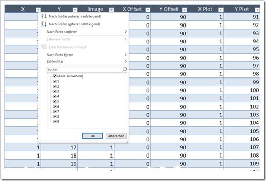
The Usual Suspect – Data Range Links as the Source Data of the Chart
Let’s start with the usual approach: directly link the data series to the calculated columns in the table:
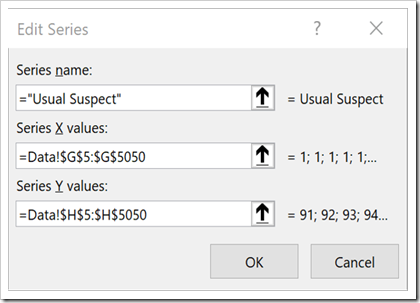
This works as expected and we get this chart:

The offset calculations work and the digits are displayed in correct order from top left to bottom right.
The Simple Named Formula
Now, since we need the calculations for this chart only, we might want to get rid of the calculated columns in the data table by replacing them with Named Formulas.
Let’s start with simple Named Formulas, myXPlotSimple and myYPlotSimple, to replace the columns [XPlot] and [YPlot] in the data table.
Here are the definitions in the Name Manager:
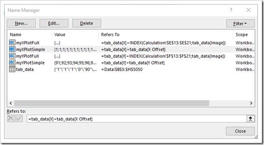 Just like in the calculated columns of the table, the values in column [XOffset] are added to the values in column [X] and [YOffset] is added to [Y].
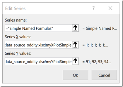
Next step is to replace the data ranges in the data source of the chart series:

The More Complex Named Formula
Next, we also transfer the calculated columns [X Offset] and [Y Offset] into Named Formulas called myXPlotFull and myYPlotFull as shown here:
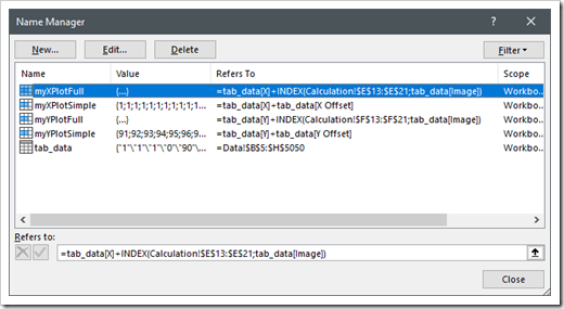 The formula refers to the value in the column [X] of the data and adds the result of exactly the same INDEX-function we used in the calculated column [X Offset] of the table. The results of the formula should be equal to the results in column [X Plot]. We do the same for myYPlotFull.
Once again, we use these Named Ranges as the source of the chart data series:
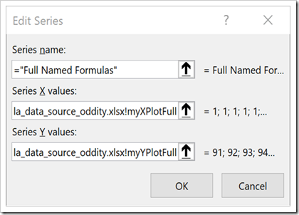 Surprisingly enough, this does not work anymore:

All data points are plotted, but somehow all calculated offsets seem to be not working correctly and all 9 digits are shown at top left of the chart stacked on top of each other.
The interesting thing about this oddity is the fact that all images get the offset of the first image (XOffset = 0, YOffset = 90). If you sort the data table by [Image] descending (i.e. image 9 is the first image in the data table), all points are plotted at bottom right of the table.
The Check
So, what is the problem here? To find out, I inserted a check sheet:
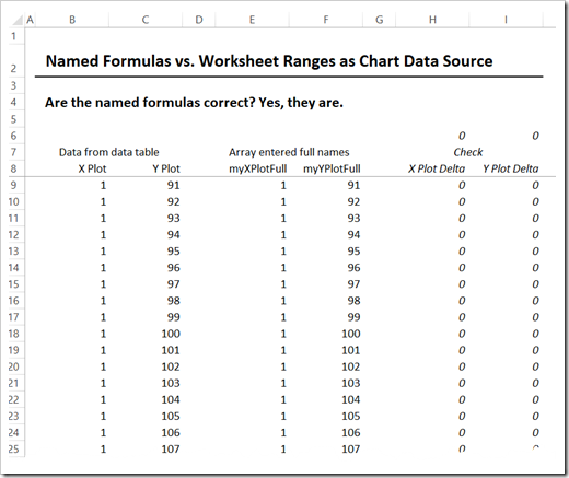
On this simple worksheet, the results calculated in the data table ([XPlot] and [YPlot]) are compared to the multi-cell array-entered Named Formulas myXPlot Full and my myYPlotFull.
As you can see in the check columns right, there is no difference, i.e. the Named Formulas return exactly the same results as the calculations in the table.
If we use the ranges where we just array-entered the Named Formulas as the source of the chart series, the chart works perfectly fine. But if you use the Named Formulas, it doesn’t.
Excel calculates the values accurately, but it does not plot them correctly.
Download
I am not sure if anyone will be interested, but just in case, here is the workbook for free download:
Download Named Formula Data Source Oddity (zipped Excel workbook, 731K)
Thoughts?
Any ideas why this is happening? Have you encountered the same or a similar problem before? Or did I miss something and there is an error in my approach?
Let me know what you think in the comment section below.
Stay tuned.
Update on Monday, August 3, 2020
I published a link to this post on LinkedIn and reached out to the real experts on Excel charts. Wouldn’t you know it. The brilliant Andy Pope provided a perfect explanation and solution within a couple of minutes (see also the comment section):
“The INDEX function does not return an array, so only the single values for XOFFSET (Calculation!E13) and YOFFSET (Calculation!F13) are used. If you change those values all the plots will have the relevant XY start point. To get the INDEX to return an array use this trick:
myXPlotFull: =tab_data[X]+INDEX(Calculation!$E$13:$E$21,N(IF({1},tab_data[Image])))
myYPlotFull: =tab_data[Y]+INDEX(Calculation!$F$13:$F$21,N(IF({1},tab_data[Image])))”
Many thanks Andy, this is very impressive.
Leave a Reply