6 (+1) tips how to mitigate some of the disadvantages of Choropleth Maps in Microsoft Excel
 We already had a couple of articles on Choropleth Maps, either using Microsoft Excel or Tableau. To be honest, I was really surprised how well these posts were received by our readers. The workbook provided for download with the first article Choropleth Maps with Excel is still in undisputed first place of all downloads here on Clearly and Simply. Thus, there was quite an avalanche of posts and comments on this topic and – despite the fact that I promised to stop posting on Choropleth Maps several times before – I announced at the end of the latest article that I am having left one ace up my sleeve regarding Choropleth Maps. Here it is and it will definitely be the last one:
Already back in September last year, Lavih sent me an email including a map template of Argentina based on Gabriel’s implementation using transparencies. With the first email Lavih asked me for an easy way to let the user change the basic fill color of the map. Over a couple of weeks we emailed back and forth and together we developed some ideas on how to improve Choropleth Map visualizations with Microsoft Excel, far beyond only changing the basic fill color.
Today’s post provides 6 (+1) tips on how to spice up your Choropleth Map visualizations using Microsoft Excel, as always including the workbooks for free download.
The challenge
At the end of the first article on Choropleth Maps here, I already mentioned a small, non-exhaustive list of disadvantages coming with this type of visualization:
- No visualization of development over time
- No information on exact values (unless you are implementing tooltips including the data)
- Very limited direct comparability of the regions
- Possible perception problems with regards to the size of regions (e.g. Rhode Island on a US map)
- Possible misinterpretation because the size of a region may have a greater impact on the user’s visual perception than the intensity of the fill color
- Requirement of real estate on a dashboard
Although you can’t do much about numbers 4 to 6, you have options to somehow mitigate at least numbers 1 to 3. The challenge of today’s post is implementing a couple of additional features helping to overcome some of the deficiencies of a Choropleth Map.
Tip 1: Increase direct comparability with an additional bar chart
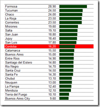 The first tip addresses disadvantage #3 of the list above: the limited direct comparability of the regions. The idea is pretty simple: add an additional bar chart of all regions including the exact values (see left). Sorting the bar chart makes the comparison easier. A how-to tutorial on sorting a list using formulas can be found on Chandoo’s blog.
Highlighting the actual selected region (see also tip 3 below) with a red background helps to immediately identify the position of the selected province within the list of all regions. The highlighting is done with standard Excel conditional formatting.
Tip 2: Format values according to the selected KPI
If you want to let the user select from a list of different KPIs, you may face the following challenge: the displayed values of different KPIs may need different formatting, e.g. the values close to the bar chart (see tip 1 above). If you have some KPIs measured in absolute numbers and others measured as percentages, for instance, you need to change the format of the cells accordingly.
Here is one possible technique how to do this:
- Define the desired custom format of each KPI in a cell range on the worksheet “control”
- Detect the format string for the selected KPI from this list using the function INDEX based on the user selection
- Add the following line to the sub “UpdateMap”:
Range("myMetricsData").NumberFormat = Range("myMetricFormats").Value
“myMetricFormats” and “myMetricsData” are cell range names for the cell containing the required custom format string and the cell range with the data to be displayed / formatted.
That’s it. Each time the user selects a new KPI from the drop down list, the macro “UpdateMap” is called and automatically changes the format of the cells close to the bar chart.
Please be advised that I used a German version of Microsoft Excel to create the workbook posted for download (see below). If you are using an English version, you have to replace the commas by decimal points and vice versa in the cell range C5:C14 on the worksheet “control”.
Tip 3: Show the exact value of one selected region of the map
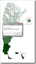 Overcoming the lack of information on the exact values in a Choropleth Map (limitation number 2 mentioned above) is the next issue we will address.
You have two different options to do this:
Option number one is enabling the user to click on each shape of the map and displaying a Message Box including the name of the selected province, the name of the KPI and the value. The Message Box will stay visible until the user leaves the box via the ok button or the ESC key.
To implement this little feature you have to copy the following macro to your workbook and to assign this macro to every freeform shape of your map:
Sub SelectShape()
On Error Resume Next
UpdateMap
Range("myLastClick").Value = Application.WorksheetFunction.Match( _
 ActiveSheet.Shapes(Application.Caller).Name, _
 Range("myShapeNames"), 0)
MsgBox "Province: " & Range("mySelectedState").Value & vbCrLf & _
 Range("mySelectedMetric").Value & ": " & _
 Format(Range("mySelectedValue").Value, _
 Range("myMetricFormats").Value), vbOKOnly, _
 Range("mySelectedMetric").Value
Range("myLastClick").Value = 0
End Sub
After calling the sub UpdateMap, the worksheet function MATCH is used to detect and assign the number of the clicked region. Finally a Message Box is displayed including the according information of the selected province.
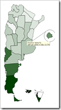 Option number 2 is using screen or tooltips to display the detailed information of one region when hovering over the shape with the mouse.
The basic idea is exploiting Microsoft Excel’s hyperlink functionality. Actually the links point nowhere and clicking on the shapes won’t do anything. But Excel also allows assigning screen tips to hyperlinks and this is where we will include the information (name of province, name of KPI and value). The drawback: the hyperlink does not select a region and thus we will not see the highlighting in the bar chart (see tip 1 above).
To use this option, we need some small modifications of the sub “Update Map” in our VBA:
Sub UpdateMap()
Dim myCell As Range
Dim myScreenTip1 As String
Dim myScreenTip2 As String
Application.ScreenUpdating = False
On Error Resume Next
For Each myCell In Range("MapShapeToTransparency").Columns(1).Cells
Sheets(1).Shapes(myCell.Value).Fill.Transparency = _
 Application.WorksheetFunction.VLookup(myCell.Value, _
 Range("MapShapeToTransparency"), 4, False)
myScreenTip1 = Application.WorksheetFunction.VLookup( _
 myCell.Value, _
 Range("MapShapeToTransparency"), 2, False)
myScreenTip2 = Application.WorksheetFunction.VLookup( _
 myCell.Value, _
 Range("MapShapeToTransparency"), 3, False)
Sheets(1).Shapes(myCell.Value).Hyperlink.ScreenTip = _
 "Province: " & myScreenTip1 & vbNewLine & _
 Range("myActualMetric").Value & ": " & _
 Format(myScreenTip2, Range("myMetricFormats").Value)
Next myCell
Range("myMetricsScale").NumberFormat = _
 Range("myMetricFormats").Value
Range("myMetricsData").NumberFormat = _
 Range("myMetricFormats").Value
Application.ScreenUpdating = True
End Sub
You will notice 3 additional lines in the For Next statement. The first 2 of the new lines detect the information to be displayed using VLOOKUPs, the last line assigns the text to the screen tip of the hyperlink.
This works like a charm in Excel 2003 and earlier, but I hit a minor roadblock using this technique in Microsoft Excel 2007: hovering over a region consisting of different grouped freeform shapes (like Tierra del Fuego or Buenos Aires) does not display the screen tip. Even worse: right clicking on these grouped shapes makes Excel 2007 crash.
Tip 4: Add a color scale caption
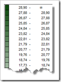 In the previous posts on Choropleth Maps I always used a very generic color scale caption, simply indicating how to read and interpret the color grades on the map (the higher the value, the darker the color and vice versa).
Of course this is lacking context and information and we can considerably improve this by adding data ranges to the colors in the caption (see left).
The implementation is along the lines of the map itself, using rectangle shapes, assigning shape names and coloring them with VBA code. The values are calculated with rather simple formulas creating equivalent buckets.
Please be advised that there is one inaccuracy in this approach: the scale legend is discrete (20 steps of transparencies), whilst the original data uses a continuous range (i.e. assigning the exact percentage according to the data). This is a mismatch that might confuse the users. However, from my point of view, providing this color scale is definitely better than the generic caption used so far.
Tip 5: Let the user change the basic color
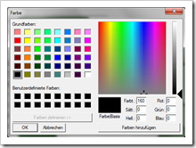 Agreed, this one is not really dedicated to the deficiencies of Choropleth Maps. It is rather an additional nifty interactive option to let the user change the basic color used on the dashboard. Not really necessary, but this one was the starting point of my discussion with Lavih and for the sake of completeness…
Since we are using Gabriel’s implementation with transparencies, we only need one single basic color to define the look and feel of the dashboard. If you want to provide the opportunity to conveniently switch to another look and feel, you may include the following VBA code:
Private Declare Function ChooseColor Lib "comdlg32.dll" Alias _
 "ChooseColorA" (pChoosecolor As myChooseColor) As Long
Dim myCustomColors(0 To 15) As Long
Private Type myChooseColor
 lStructSize As Long
 hwndOwner As Long
 hInstance As Long
 rgbResult As Long
 lpCustColors As Long
 flags As Long
 lCustData As Long
 lpfnHook As Long
 lpTemplateName As String
End Type
Function ShowColor() As Long
Dim myCC As myChooseColor
myCC.lStructSize = Len(myCC)
myCC.lpCustColors = VarPtr(myCustomColors(0))
myCC.flags = 2 '0 for normal, 2 for extended
If ChooseColor(myCC) <> 0 Then
 ShowColor = myCC.rgbResult
Else
 ShowColor = 0
End If
End Function
Sub SelectColor()
Dim myColor As Long
Dim myCell As Range
Application.ScreenUpdating = False
On Error Resume Next
myColor = ShowColor
For Each myCell In _
 Range("MapShapeToTransparency").Columns(1).Cells
 Sheets(1).Shapes(myCell.Value).Fill.ForeColor.RGB = myColor
Next myCell
For Each myCell In Range("myScaleShapeNames").Columns(1).Cells
 Sheets(1).Shapes(myCell.Value).Fill.ForeColor.RGB = myColor
Next myCell
' The following line is only working with Excel 2007 or higher
' ActiveSheet.ChartObjects(1).Chart.SeriesCollection(1). _
' Format.Fill.ForeColor.RGB = myColor
' This is the work around for Excel 2003 and earlier:
' Change the color palette of the first chart fill color (number 17)
' This color has to be selected as the fill color
' of the bars in the bar chart
ActiveWorkbook.Colors(17) = myColor
Application.ScreenUpdating = True
End Sub
The macro “SelectColor” assigned to a button on top of the dashboard calls the color choose dialogue shown above. One single mouse click or inserting the desired RGB values allows a pretty convenient way of changing the basic color of the whole dashboard.
Tip 6: Add trend information of one region after clicking
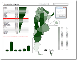 Tip #6 is supposed to mitigate problem #1 of Choropleth Maps mentioned in the introduction (see above): No visualization of development over time.
The idea is simple: since we already have a functionality of enabling the user to select one specific region on the map (see tip 3 above), we can easily add value by displaying a trend chart for this region.
The implementation is almost as simple as the idea: Create a column chart on the worksheet "control" displaying the trend of the selected region (using IF and INDEX), use a camera object on the dashboard linking to this column chart and use some additional lines of VBA to make this camera object visible after the user selected a region and invisible again after the user left the Message Box. Here is the adopted sub SelectShape:
Sub SelectShape()
On Error Resume Next
UpdateMap
Range("myLastClick").Value = Application.WorksheetFunction.Match( _
 ActiveSheet.Shapes(Application.Caller).Name, _
 Range("myShapeNames"), 0)
Sheets(1).Shapes("myBarChart").Visible = True
Sheets(3).ChartObjects(1).Chart.SeriesCollection(1). _
 DataLabels.NumberFormat = Range("myMetricFormats").Value
Application.Calculate
MsgBox "Province: " & Range("mySelectedState").Value & vbCrLf & _
 Range("mySelectedMetric").Value & ": " & _
 Format(Range("mySelectedValue").Value, _
 Range("myMetricFormats").Value), vbOKOnly, _
 Range("mySelectedMetric").Value
Sheets(1).Shapes("myBarChart").Visible = False
Range("myLastClick").Value = 0
End Sub
Besides making the camera object visible and invisible, we have to add another line to format the data labels of the chart according to the defined custom format of the actual KPI (see also tip 2).
The result: 6 tips at a glance
These were our main 6 tips on how to improve Choropleth Map visualizations and here is an overview of what we have done so far: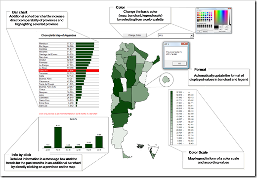 The bonus tip – animate your dashboard
If you are having data over time in your workbook, as it would be required for tip #6, you might want to animate the visualization over time on the dashboard.
I confess: I simply “stole” the idea and the code from Jon Peltier (again!) who has the perfect how-to tutorial (again!). Many thanks Jon (again!).
Thus, I guess there is no need to describe a how-to tutorial here. Simply visit Jon’s PTS blog and read how to do this and download the implementation with Choropleth Maps below.
The Download Links
Here are 3 different Microsoft Excel workbooks for free download:
- The simple version using Message Boxes (clicking)
Download Spice up your Choropleth Map clicking (Excel 97 – 2003, 762.5K) - The simple version using hyperlink screen tips (hovering)
Download Spice up your Choropleth Map hovering (Excel 97 – 2003, 761K) - The full version including trends and animation
Download Spice up your Choropleth Map full (Excel 97 – 2003, 806K)
All data in this workbook is made up.
Last, but not least
Muchas gracias, Lavih! Many thanks for our discussion and all the ideas arising from it.
What’s next?
This was article number 10 on Choropleth Maps on this blog. Much more than I originally planned. But that’s it now. Definitely. I finally ran out of ideas regarding Choropleth Maps. Seriously.
We will come to something completely different during the next few weeks: The upcoming posts will
- show a way how to export Microsoft Excel dashboards to PowerPoint with ease,
- present an example of Tableau’s new fantastic service Tableau Public and
- start a new category of articles here on Clearly and Simply: the development and implementation of optimization algorithms using Microsoft Excel and VBA.
I hope there is something you will be interested in.
Stay tuned.
Update on Thursday, April 19, 2012
Earlier this week, I received an interesting email from Petros Chatzipantazis, one of my few but avid readers. Based on the approaches described above, Petros developed a very clever idea how to make the hyperlink tooltip available and provide an action triggered by clicking on one of the shapes at the same time. Check out Petros’ website spreadsheet1.com for the details.
Many thanks, Petros.
Leave a Reply to Depaul05 Cancel reply