Tag: visualization

  • Software Project Dashboards – Episode 1

    How to create Microsoft Excel dashboards to monitor the progress of a software development project (part 1 of 3)
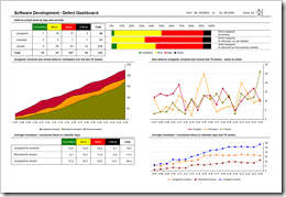
    Software Development Defect Dashboard - click to enlarge When it comes to manage software development projects, you have to monitor a lot of different quantitative and qualitative metrics in order to  answer the main question:

    “Where are we?”

    As in any other project you have to take care of the usual suspects in project controlling like the completion rate of tasks, the milestones and quality gates, the budget adherence, etc. In software development projects, however, there are a couple of very important specific additional facets to be monitored closely:

    1. The actual status and the trend of software defects
    2. The test progress, test coverage and test success
    3. The actual status and the development of change requests

    Today’s article is the first of a 3 post series on how to create minimalist, dynamic software project dashboards with Microsoft Excel; this time a software defect monitor dashboard including the Microsoft Excel workbook for free download.

    (more…)

  • Bluffing a Visual Cross-tab with Excel

    How to create a Tableau lookalike cross-tab chart with Microsoft Excel

    Matt Grams, author of Bullet Graphs for Excel: A Simple Way? is kind enough to contribute another guest post here on Clearly and Simply, this time discussing how to create cross-tab charts with Microsoft Excel.

    Cross-tab Chart - click to enlargeTrellis charts. Panel charts. Visual cross-tabs. Cross-tabs. Variations of small multiples. Whatever you want to call these charts, one thing seems clear to me: Tableau offers aesthetically restrained yet beautiful implementations.

    So how about constructing a visual cross-tab with similar aesthetics in Excel? Today’s post describes the how-to, including an Excel workbook with detailed explanations for free download.

    (more…)

  • Bullet Graphs for Excel: A Simple Way?

    A guest post by Matt Grams discussing an alternative solution of creating bullet graphs with Microsoft Excel

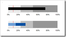
    Bullet Graphs - click to enlargePreamble:

    We proudly present the first guest post here on  Clearly and Simply: Matt Grams describes a very interesting alternative approach of creating bullet graphs in Microsoft Excel without using VBA.

    When you need one or more horizontal bullet graphs in an Excel spreadsheet, what do you do if…

    1. you work exclusively in Excel 2003 or earlier, 
    2. you don’t want to use a 3rd party add-in,
    3. you want your spreadsheet to be free of VBA, and
    4. your bullet graph must have a professional appearance?

    Faced with this scenario of apparently limited options, you’re sure to come across Charley Kyd’s tutorial at ExcelUser. Attempting to build a bullet graph with this method was a useful exercise for me, but the approach left me flustered at the complexity of the data arrangement and chart set-up. If making just one bullet graph was that hard, what are you going to do when you have multiple bullet graphs to implement? Furthermore, not having the bullet graph data values in a single row was far from ideal.

    This post describes an alternative and simpler approach of how to create bullet graphs with Microsoft Excel, including step-by-step tutorials and an example workbook for free download.

    (more…)

  • Week in, week out, Tableau

    Week numbers with Tableau

    © Claudia Hautumm / www.pixelio.de The previous post discussed different methods of calculating week numbers and their effects on analysis and visualizations of data on a weekly basis. The post was focused on using Microsoft Excel.

    However, the challenge caused by different week numbering methods is not restricted to Microsoft Excel. I guess every data analysis and visualization software faces this problem.

    And so does my favorite: Tableau. There is no built-in way to switch between different week numbering methods in Tableau. But Tableau has the flexibility for an easy-to-use solution. This post provides all information of how to use ISO 8601 week numbers in Tableau, including a Tableau packaged workbook for free download.

    (more…)

  • Week in, week out, Microsoft Excel

    Week numbers with Microsoft Excel

    © Claudia Hautumm / www.pixelio.deFor analyzing and visualizing data on a timeline we are often consolidating the data on a monthly basis. Especially for monitoring and reporting, however, you need a higher level of detail, i.e. you will have to analyze and visualize your data by weeks.

    Unlike the months of the year, the definition of a week is not fully standardized. There are different approaches of how to calculate the numbers of the weeks. The results of the data analysis and the according visualizations depend on the week numbering method you are using.

    This post describes 3 different methods of numbering weeks and shows their impact on the resulting data visualization.

    (more…)