Tag: tableau

  • Create Your Own Filled Maps in Tableau

    A step-by-step guide to Richard Leeke’s TabGeoHack for creating your own filled maps in Tableau Software
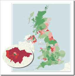
    Filled Map United Kingdom and LondonWay back in 2009, we had a beautiful guest post by Giedre Aleknonyte describing a workaround to generate Choropleth Maps with Tableau (using version 5.0 by the way).

    Those days are over. One of the major new features of Tableau 7 is Filled Maps (or Choropleth Maps as we used to call them in all blog posts here).

    Did I say those days are over? Well, not quite. While Tableau provides filled maps down to the zip code areas in the United States, the level of detail in other countries is more or less rudimentary. In Germany, for example, you can create filled maps only for the 16 states (Bundesländer). This is nowhere near sufficient to do really compelling geographical data analysis and visualization. Up to now there was no way to do anything about it.

    My friend Richard Leeke recently developed a fantastic tool called TabGeoHack which allows you to import literally any geographic level of detail of any region in the world into Tableau in order to use them for visualizations using filled maps. Richard is a co-founder of Equinox Ltd, a New Zealand based IT consulting firm and if you are a long time reader of this blog, you certainly already know him from the fantastic guest post series on Site Catchment Analysis. Even if you haven’t seen those articles, you probably know him from the Tableau Forum.

    Surprisingly enough, Richard made his tool generously available for free in this Tableau Viz Talk post.

    Please be aware that TabGeoHack – as its name suggests – is a totally unsupported hack utility, using an open back door of Tableau. The tool is a workaround with a certainly limited lifetime. It is beyond question that Tableau will provide similar built-in functionality with one of its next versions.

    Richard was kind enough to grant me a sneak preview of TabGeoHack before publishing. Although the download includes a very detailed description and instruction manual, it took me quite a while to cut my teeth on the use of TabGeoHack. That’s why I thought it would be a good idea to write a step-by-step article on how to use TabGeoHack, including an example on Tableau Public, visualizing unemployment rates in Germany, broken down by counties, on a Filled Map.

    So, do you want to create your own filled map of e.g. English counties, Spanish municipalities or even the individual sales regions of your company?

    Here you go.

    (more…)

  • 6 Famous Paintings in Tableau

    Visualize 6 world famous paintings with Tableau Software

    © Songkran / flickr.comIt has been a very long time since the last post here on Clearly and Simply: the start of a guest post series by Sheel Bhatiani about how to Expand your reach in Tableau with Parameters.

    Ever since I was so snowed under with work that I wasn’t able to do the final editing and formatting of Sheel’s articles. I hope for your understanding.

    I know that most of you are eagerly waiting for the guest series to be continued. Agreed, it is long overdue, but please bear with me, I can’t let this one go: Yesterday the Art Newspaper published that the earliest copy of the Mona Lisa has been found at the Prado in Madrid, Spain. Today, Darren Chalk over at The Data Studio published the first article of a series of posts about Art in Tableau.

    This reminded me of publicly available data sets to visualize famous paintings like van Gogh’s Self Portrait, Botticelli's The Birth of Venus and – you guessed it – Leonardo da Vinci's Mona Lisa.

    Way back in June 2010, I already published an emulation of a piece of art using Tableau: The Tableau Replica of Curtis Steiner’s 1,000 Blocks and – although totally useless for business applications – that post was very well received by my readers.

    Thus, I just can’t let this opportunity slip through my fingers and I intersperse this little article before we will continue with Sheel’s next article.

    (more…)

  • Premier League Historical Statistics

    Interactive Visualization of 15 years of England’s Football Premier League – a non-competitive Contribution to Tableau’s “Interactive Sports Viz Contest”

    Premier League LogoLast week, Tableau announced a new visualization contest: The Tableau Interactive Sports “Viz” Contest.

    Intrigued with the very attractive prices Tableau announced, I would have loved to contribute a workbook. Unfortunately, I am not allowed to, because the contest is open to US residents only.

    If you are a regular reader of this blog, you may have noticed that I love using sports data for my examples. We had several visualizations (Tableau and/or Excel) of Football statistics and even one article using Baseball data:

    Since I am so into visualizing sports data, I decided to publish the workbook I would have contributed to the contest: a Tableau visualization of 15 years of historical data of the English Premier League.

    Today’s article provides the workbook for direct interaction here or for download from Tableau Public. A follow-up post later this week will describe step-by-step tutorials of some of the most interesting techniques I used for the implementation.

    (more…)

  • Tableau Quick Tip #3 – Keyboard Shortcuts

    Increase your productivity with a comprehensive list of all Tableau keyboard shortcuts

    © Rainer Sturm / pixelio.deDragging and dropping fields to the different shelves is the heart of user interaction in Tableau Software. In general, Tableau is predominantly designed for using the mouse.

    However, like with any other software application, using keyboard shortcuts can be a big boost for your productivity in Tableau as well. Especially for functions you are using very often, knowing and taking advantage of the keyboard shortcuts can save you a lot of time.

    But which keyboard shortcuts are available in Tableau?

    Well, the Tableau Manual has 5 pages with the most important shortcuts. Aside from the fact that there are some more, flipping through 5 pages during your work with Tableau is inconvenient. The better option would be a small print-out, only displaying those shortcuts you like most and/or you want to learn by heart.

    Today’s short article provides an Excel workbook, including a comprehensive list of all Tableau shortcuts and a feature to design and create such a small display of your favorite shortcuts. You could easily print this and position it somewhere you can have half an eye on while working with Tableau. Of course, today’s quick tip includes the Excel workbook for free download.

    (more…)

  • Tableau Quick Tip #1 – The Summary Card

    Support your ad-hoc analysis and exploration of new data with Tableau's Summary Card

    Intro Tableau Summary CardI decided to start a new little category of posts here on Clearly and Simply: Tableau Quick Tips. Today’s post could be the first one in a series of very short articles describing some of the little nuggets in Tableau’s functionality.

    Let’s give it a try with a quick hint on Tableau’s Summary Card.

    (more…)