Tag: microsoft excel

  • Visual Workbook Navigation with a Chart Carousel

    A Carousel of Charts as a visual and interactive Navigation Control for Microsoft Excel Workbooks

    726 words, ~4 minutes read
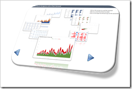
    Visual Navigation IntroIf your Excel workbook has many output worksheets, you should provide your users with an option to facilitate the navigation within the model.

    Sure, the user always has the option to right click on the arrows left to the first tab and select any worksheet from there, but this requires that she/he exactly knows where to find what.

    It is best practice to give the users guidance regarding the content of your model and to enable them to easily navigate to the sheets they are most interested in. Usually, you insert an extra worksheet containing a list of all tabs with hyperlinks or buttons to quickly navigate to those sheets.

    You are interested in something more visually compelling? If so, you came to the right place. Today’s article provides a visual workbook navigation control with a chart carousel dynamically displaying the content of the relevant sheets. The user can easily browse through all views, select the desired one and get to the view with one mouse click. As always, the post comes with an example workbook for free download.

    (more…)

  • How to handle Line Charts with many Data Series

    2 Alternatives to avoid cluttered Line Charts: a Band Chart and an interactive Line Chart highlighting one selected data series when hovering over

    804 words, ~4 minutes read

    Line Charts with many Data Series - Intro

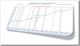
    A Line Chart is definitely the best way to visualize the development of a continuous metric over time for several categories. That being said, Line Charts easily get cluttered and even may become useless, if you have many categories. Now, what is “many”? In my humble opinion Line Charts are already hard to read if they show more than 6 to 8 data series. But what if you have way more than 6? Like all countries in Europe or all states of the US?

    And then what? No worries, there are alternatives. Adding an interactive feature to your chart can solve the issue.

    Today’s post describes two alternative options for Line Charts with many data series: an interactive band chart (without VBA) or a line chart highlighting one data series when hovering over (empowered by VBA). As usual, the article comes with the workbooks for free download.

    (more…)
  • Power BI lookalike Tooltips in Microsoft Excel

    How to create Power BI lookalike Tooltips in Microsoft Excel Charts

    1,361 words, ~7 minutes read

    Tooltips are an extremelyPower BI lookalike Tooltips in Microsoft Excel - Intro helpful feature to explore and understand data.
    When hovering over a data point of a chart, a textbox appears and displays the values and – if applicable – even additional information.

    I love working with Microsoft Excel. I truly love the application. But I will make no bones about it: Microsoft Excel’s native chart tooltips are mostly pointless. There is no option to adjust or format them, to link the content to a cell range or the like. They only display default information and this is pretty useless in most cases. All you can do is to turn them off in Excel’s options to get them out of your hair.

    I already posted a few articles about this subject, the first one back in 2010, including the same rant as above: Better Chart Tooltips with Microsoft Excel 2010.

    Microsoft didn’t do anything about it. Excel’s chart tooltips are still as lame as they have been in the past 20 years. This is remarkable, because Microsoft provides much better tooltips in Power BI. So, they are aware that tooltips are helpful, but apparently they don’t see the necessity to let Excel users take advantage of it, too. So we are still on our own here.

    Although I already provided a few options to display better tooltips in Excel (e.g. Customizable Tooltips on Excel Charts), I would like to come back to this topic again.

    Power BI does not only automatically insert tooltips on charts, it also shows a vertical line across the entire plot area and displays the tooltip even if the mouse cursor is not above the plotted data series.

    That intrigued me. Today’s post will provide 2 options how to mimic Power BI lookalike tooltips on Microsoft Excel charts. As always, the post comes with the Excel workbooks for free download.

    (more…)
  • All Peaks of the Alps visualized in Excel

    Bluffing some of Tableau’s amazing interactive features in Microsoft Excel: an Excel Replica of All Peaks of the Alps visualized with Tableau

    The previous post provided a Tableau visualization of all peaks of the Alps. Peaks of the Alps - IntroI already bluffed some of Tableau’s amazing interactive features in Microsoft Excel and published the solutions here.

    The idea wasn’t mine, though, but Matt Grams’.

    Matt started the journey in 2009 (!) with his beautiful guest article Bluffing a Visual Cross-tab with Excel. I followed a few months later with Bluffing Tableau Actions with Microsoft Excel. Ever since, I posted a few techniques to replicate Tableau’s interactive options in Microsoft Excel.

    Back in 2013, I created an entire Excel replica of one of my Tableau workbooks, which was once selected as the Viz of the Day by Tableau: Bruce Springsteen Discography – A Tableau Infographic. This is the Excel replica: Bruce Springsteen Discography in Excel.

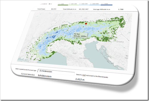
    To carry on this tradition, today’s article provides an Excel replica of All Peaks of the Alps visualized with Tableau. Truth be told, of course not replicating all of Tableau’s features, but still some interesting interactive functionality in Excel beyond the defaults.

    (more…)

  • Optimized Choropleth Maps in Microsoft Excel

    How to create optimized Choropleth Maps in Excel with a higher resolution and without distortions using Excel 365

    Inspired by an idea of my internet friend and highly esteemed colleague Leonid Koyfman, the post US Choropleth Map by County per State – a 4th Option described and provided an Excel workbook with a Choropleth Map of the United States including a second map showing a magnified view of one selected state.

    Optimized Chroropleth Maps in Excel (Intro)The code and technique itself worked fine.

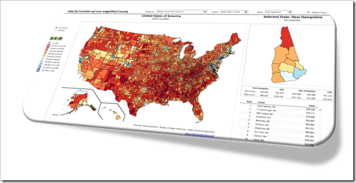
    However, there was one major disadvantage: during the process of creating the map in Excel, the shapes were slightly distorted. The zoomed map of one state still looked good for e.g. Texas or California, but definitely not for smaller states like Rhode Island or Connecticut.

    Today’s post provides a solution to overcome this issue: a way to create a Choropleth Map in Excel without distortions, displaying all counties accurately, no matter at which zoom level. As always, an example workbook is provided for free download.

    (more…)