• Filter Excel Dashboards with Table Slicers

    How to use Table Slicers as interactive Filter Controls on a Microsoft Excel Dashboard

    Filtering data by one or several criteria is certainly one of the most common and important activities in data analytics. Adding visual filters to a dashboard is a built-in feature in Tableau and Power BI and as such a walk in the park.

    But what if you need interactive filter controls on a dashboard in Microsoft Excel?
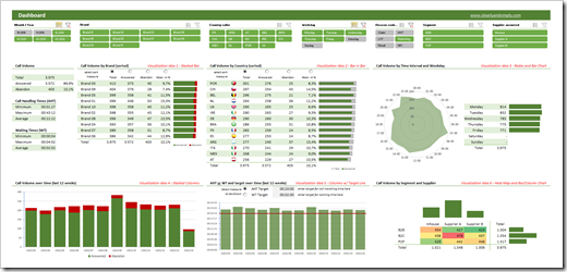
    Filter Excel Dashboards with Table Slicers Intro

    Sure, you can use data validation lists, form controls or ActiveX controls as interactive dashboard objects to set a filter or at least make a selection. You could also write some VBA code to let the user filter data by directly interacting with cell ranges or chart elements. All viable options, but either limited in functionality or a lot of effort to implement.

    Wouldn’t it be nice if you could simply use the slicers, which have become a very popular way for facilitating the filter process on Pivot Tables? In other words, wouldn’t it be nice to create a dashboard like this in Microsoft Excel?

    A Microsoft Excel dashboard with a variety of views (numbers, tables, charts), all filterable using the visual filter controls above the views (the slicers).

    You guessed it, right? It is possible. And even better: it is very simple and straight forward to implement. No VBA, no limitation to Pivot Tables or Pivot Charts, no Power Query, no DAX formulas. Just good old Excel.

    Today’s article explains the basics of the technique, describes the process of the implementation step-by-step and – as always – provides the example workbooks for free download.

    (more…)
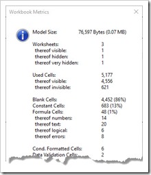
  • Microsoft Excel Workbook Metrics

    A small VBA code snippet to display the most important metrics of an Excel workbook like the count of sheets, cells, formulas, constants, named ranges, charts, tables, lines of code and many more

    Microsoft Excel Workbook Metrics IntroWhen you are developing a large and complex Microsoft Excel model, you should definitely have an eye on the size of your workbook and its components: how many sheets does your workbook have? How many used cells? How many formula and constant cells? How many of the formulas return an error value? How many Named Ranges are defined? How many Charts, Tables, Pivot Tables, lines of VBA code, etc.?
    These metrics will give you an overview on the size and complexity of your model, point you to areas with improvement potential and help you to optimize performance and minimize file size.

    Some Microsoft Excel productivity Add-Ins have features providing this information. But what if you do not have such an Add-In available? Or what if you want to share your workbook with your colleagues or deliver it to a client? In this case it is very helpful to have a VBA code snippet which automatically calculates at least the most important workbook metrics and can easily be included in any workbook without the need of installing an Add-In.

    Today’s article provides this code snippet to detect and display the most important key figures of a Microsoft Excel workbook. As always, the post comes with an example workbook including the open VBA code for free download.

    (more…)

  • Variations of Alternative Bullet Graphs in Excel

    Variations of the Alternative Bullet Graph Design: Visualization of Gaps and Exceedances, two Targets and two Gaps, conditionally formatted Actuals and dynamically sorted Multiple Rows Bullet Graphs

    Bullet Graph Variations

    One of the previous posts presented An Alternative Design of Bullet Graphs: no qualitative ranges, additional data labels and a visualization of the performance gap.

    These ideas can be taken a few steps further:

    • Bullet Graphs with a generalized visualization of the deviation of actual from target: display the gap, if actual is smaller than target and the exceedance otherwise
    • Bullet Graphs with two targets
    • Bullet Graphs with two targets and two gaps
    • Bullet Graphs with a conditionally formatted actual bar
    • Multiple rows Bullet Graphs in alternative design
    • Dynamically sorted multiple rows Bullet Graphs

    Today’s posts presents this set of possible variations of the alternative Bullet Graph design. As always, the article includes a link to download the Microsoft Excel template workbook for free.

    (more…)

  • US Choropleth Map by County per State – a 4th Option

    Another option to display a Choropleth Map of the United States by County for one user-selected state in Microsoft Excel

    The previous post presented three different options to implement a US Choropleth Map by County per State in Microsoft Excel. One approach showed the entire map of the United States and highlighted the selected state (option 2), whereas option 3 filtered the data and only plotted the counties of the selected state.

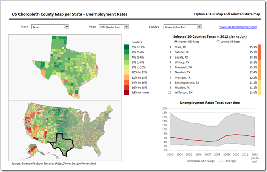
    It was again Leonid Koyfman (who else?), who provided me with an interesting idea for another alternative: Leonid suggested in this comment to combine options 2 and 3 and show both maps in one view. This requires more real estate on the dashboard, but it also combines the advantages of both approaches: it provides a zoomed map of the selected state and keeps the context of this state on the map of the entire USA.

    Since the technique will certainly be most useful on a dashboard showing more than just the maps, I created an example visualization with two additional views:

    US Choropleth Map by County per State Dashboard - click to enlarge

    • On the left side of the dashboard the two maps (zoomed selected state and USA) are displayed
    • At top right of the visualization a table lists 10 selected counties of the current state: the 10 counties with the highest or lowest unemployment rates. A small new VBA routine assigns the according bin color to each of the 10 counties in the narrow column right to the table
    • The band chart at bottom right visualizes minimum, maximum and (unweighted) average of unemployment rates of all counties in the selected state over time

    This is just one example how the technique of visualizing maps for a user selected state could be integrated in a more complex dashboard.

    If you want to use this on your own dashboard, you may want to play around with the size of the maps and where they are located. Size and position of the zoomed state map are defined by the named range “myMapView”. You can adjust the zoomed map by simply changing the cell reference of this name. As for the map of the USA, you have to group all shapes of the US map first, then resize and reposition this group and finally ungroup it again.

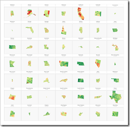
    The major disadvantage remains, though: the zoomed map of the selected state makes the distortions visible. These distortions are inevitable in the process of converting SVG-files to freeform shapes in Excel. Well, at least I couldn’t find a way to avoid them. The problem depends on the size of the selected state: Texas and California, for instance, still look good as a zoomed map. Rhode Island and Connecticut definitely don’t. A crucial downside, no doubt about it. Unfortunately I do not have a solution for this. A map would be needed which will not be distorted in the ungrouping process, but I couldn’t find a better map than the one used here.

    If you are interested, here is the link to download the zipped Excel workbook:

    Download US Choropleth County Map per State (zipped Excel workbook, 2.4 MB)

    Many thanks go to Leonid for the idea.

    Stay tuned.

  • US Choropleth Map by County per State

    How to display a Choropleth Map of the United States by County for one user-selected state

    Choropleth US Map by County per State (Intro)If you are a regular reader of this blog, you certainly know that I am into geographical data visualization. Just click on “Choropleth Maps” in the Categories roll on the right side of the blog and you will see that we already had 18 (!) posts in this category. Some of them discussing maps in Tableau, but most of them dealing with the question how to implement Choropleth Maps or Cartograms in Microsoft Excel.

    I thought I would be through with this topic. I really did. However, I recently noticed that there is one common use case for Choropleth Maps in Excel I never wrote about: visualizing one user-selected region of a bigger map. Imagine you have geographical data with a hierarchy, e.g. USA by state and county (to state the obvious for the majority of my readers). It may well be that one of your dashboards is focused on displaying views for one selected state only.

    Now, what if one of your views shall be a Choropleth Map? How can you show only the selected part of a map on your dashboard?

    Today’s post describes three different options how to do this. As always, the example Excel workbooks are provided for free download without any password protection.

    (more…)