How to create Word Clouds with Tableau and a look at the value of Word Clouds for serious Business Data Analysis
 The previous two posts (Word Clouds with Microsoft Excel and The Implementation of Word Clouds with Excel) provided and explained my VBA-based solution to create dynamic Word Clouds (aka Tag Clouds) in Microsoft Excel.
Unlike Excel, Tableau provides a native feature to create Word Clouds with a few mouse clicks. The feature is available since Tableau version 8, but not everybody is aware of this, because Word Clouds aren’t displayed if you click the Show Me button (Tableau’s “chart gallery”).
That’s why I want to complete my short series on Word Clouds with a step-by-step description of how to create this type of view in Tableau and two tips to make Word Clouds more effective.
However, I am up to something more: Word Clouds are a nice little visualization and come in handy if you want to draw someone’s attention to your presentation or infographic. Having said that, they are more or less useless if you need your data to answer your questions or tell your story. The second part of today’s post will try to prove that there are much better visualizations for serious data analysis than a Word Cloud.
The Data
If you want to visualize a text with a Word Cloud in Tableau, you need the words of the text in one of the two following data structures:
- All words in a one-column-table (each row is a word)
- All words in a two-column table: the first column includes the list of the unique words, the second column their counts (frequencies in the text)
If you have only the continuous text (e.g. copied from a Word document or a website), you need to split up the text into one of these data structures first. The previous post (The Implementation of Word Clouds with Excel) provides a little Excel tool to do this for you with a few mouse clicks.
If you have the choice, I recommend using the two-column table with the unique entries and their frequencies, especially for very long texts. This will improve the performance of your Tableau workbook.
The following descriptions and examples are based on the same text data I used many times before (Bruce Springsteen Discography – An Infographic, Bruce Springsteen Discography in Excel, Word Clouds with Microsoft Excel, The Implementation of Word Clouds with Excel): the lyrics of Bruce Springsteen songs on his studio albums. Agreed, not very resourceful, but to be honest: I was simply too lazy to compile another data source for this article. Please bear with me.
How to make a Word Cloud in Tableau
Case 1 – list of all words (all words in one column)
If your data source has all the words in one row of a table (dimension name is [Words]), you have to conduct the following steps to create a Word Cloud:
Step 1: Drag [Words] to the Text Control of the Marks Shelf:

Step 2: Drag [Words] to the Size Control of the Marks Shelf:

Step 3: Right click on the [Words] pill of the Size Control, click on Measure and on Count:

Step 4: Since the Marks Type was still set to automatic, Tableau now visualizes the data as a Tree Map. To get back to Text (Word Cloud), you have to change the Marks Type with the drop down:

Step 5: If you want to spice up the Word Cloud with colors, drag CNT([Words]) to the Colors Control of the Marks Shelf and you should see something like this:

Case 2 – list of unique entries and their frequencies
If your data source is a two-column table with a list of the unique words (dimension name in the examples is [Words] again) in the first and their frequencies (measure name is [Word Count]) in the second column, you have to conduct the following steps:
Step 1: Drag [Words] to the Text Control of the Marks Shelf
Step 2: Drag [Word Count] to the Size Control of the Marks Shelf
Step 3: Change the Marks Type from Automatic to Text
Step 4: Again, if you want to color the Word Cloud, drag [Word Count] to the Colors Control of the Marks Shelf
That’s it. The beauty and simplicity of Tableau Software. A few mouse clicks compared to a lot of complex VBA code in Microsoft Excel (Word Clouds with Microsoft Excel).
2 tips to make a Word Cloud more effective
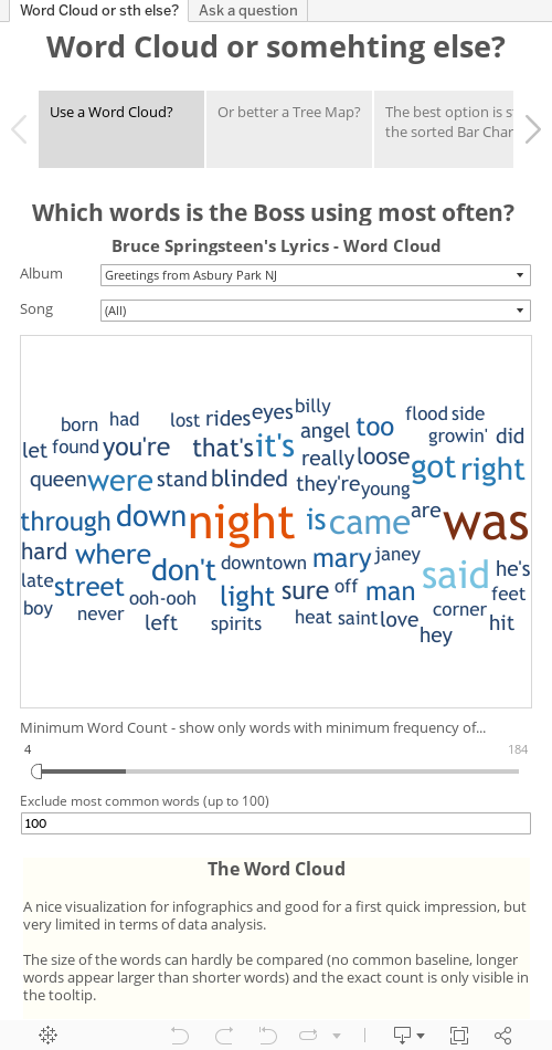
Tip 1 – Show only words with a minimum frequency
If you are visualizing a large number of words, it is usually helpful to display not all words in the Word Cloud. Words with a frequency of 1 or 2 do not provide insight, they rather simply clutter the view. Hence, you should drag CNT([Words]) or [Word Count] (depending on your data structure, see above) on the Filters Shelf, show the Quick Filter, set the Quick Filter to “At Least” and let the user select the minimum frequency of words to be displayed:

Tip 2 – Exclude the most common words
If you are visualizing continuous English texts in a Word Cloud (like books, speeches, song lyrics, film scripts, etc.), chances are that “the”, “be”, “to”, “of” and “and” are the most frequent or at least among the most frequent words (see screenshot above). Thus, it is usually helpful to exclude these words from the Word Cloud.
How can you do this?
Step 1 – Organize a list of the most common words (let’s say 100 or 200)
If you search for something like “most common English words”, you will find a lot of websites providing such a list. It goes without saying that there is no definitive version of such a list, because it always depends on the source of texts which have been used to create the list. For our purposes it doesn’t really matter which list you are using. I took the list provided on Wikipedia: Most common words in English, and pasted it into an Excel worksheet:

Please note that this table also includes the rank of each word in the first column. We will need this measure later for filtering.
Step 2 – Blend this table into your Tableau workbook
Go to Data and Connect to Data and browse for the list of the most common words. Tableau recognizes that the dimension [Words] is included in both data sources and automatically makes the link (see the red chain symbol right to [Words]):

Step 3 – Create a Parameter
Create a new parameter (called e.g. “Exclude most common words”) of type Integer with a range from 0 to 100:

Show the Parameter Control on the worksheet.
Step 4 – Exclude the most common words from the cloud by filtering
First drag [Words] to the Filters Shelf:
 In the following Filter dialogue window, go to the tab Condition, click on By formula and insert MIN([Rank])>[Exclude most common words]:

Click ok.
Now play with the Parameter Control. Change it to e.g. 10 and the 10 most common words will be excluded from the Word Cloud.
So much for the how-to and the tips for creating Word Clouds in Tableau. Now let’s have a closer look at the value of Word Clouds in general.
Is a Word Cloud a good visualization of data?
There are a lot of papers and articles available about the few advantages and many disadvantages of Word Clouds, like Marti A. Hearst’s guest post “What’s up with Tag Clouds” on Stephen Few’s Visual Business Intelligence Newsletter (already published in May 2008, but still an excellent read).
Here is a short summary of pros and cons of Word Clouds from my point of view:
The Pros of Word Clouds
- They are an eye-catching element on a infographic or a PowerPoint presentation and may attract more attention than the usual suspects like a bar chart
- They provide some kind of first insight. The words used most often pop out and can be seen at a glance
- They can represent several dimensions: the words themselves, their frequency (size of words) and another dimension by color-coding the words
- They can serve as an navigation element for highlighting or filtering data in other views of the dashboard
- They are very popular. This is more an observation than an advantage, but still
The Cons of Word Clouds
- Words of similar sizes are hard to compare. Unlike in a bar chart, there is no common base line as a reference and the human eye isn’t very good in comparing the size of areas / words
- Longer words require more space and therefore seem to be more frequent than shorter ones, even if they have the exact same frequency
- They do not guide the audience through the visualization like a sorted bar chart does
- They require a lot of real estate on a dashboard
- The arrangement of the words is either arbitrary or following technical requirements of the algorithm. Words belonging the same category may lie far apart from each other and the smaller ones may be overlooked
Word Cloud or maybe something else?
Now, what are the alternatives to a Word Cloud like this?

Alternative 1 - Tree Map

Apparently, Tableau prefers the Tree Map to the Word Cloud. If the Marks Type is set to Automatic and you drag words to the Text Control and the count of words to the Size Control, Tableau displays a Tree Map (see also the step-by-step description above). I interpret this as a recommendation to rather use a Tree Map than a Word Cloud.
As for my part, I have never been a fan of Tree Maps, though. Honestly, from my point of view a Tree Map isn’t much more than the rectangular sister of a Pie Chart.
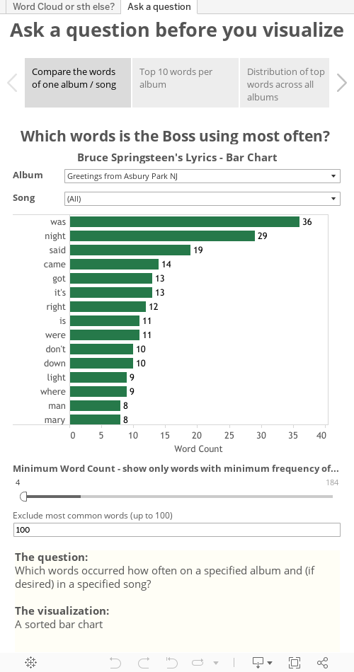
Alternative 2 - Sorted Bar Chart

This may be boring and old school, but unlike Word Clouds and Tree Maps, a Bar Chart provides a common base line and thereby makes comparing the data much easier. Furthermore the sort order guides you through the view. A Tree Map does this too (somehow), but a Word Cloud doesn’t at all.
Here are the 3 alternatives on Tableau Public. Use the Story Points (the boxes at the top) to switch between the 3 views:
Data analysis means asking questions and telling stories
Data analysis and data visualization is all about asking questions and telling stories. Referring to my example data source (the lyrics of Bruce Springsteen’s songs on his studio albums), here is a selection of possible questions you could have:
- Which words occurred how often on a specified album and (if desired) in a specified song?
- Which are the 10 most frequent words on each album?
- How are the Top 10 most frequent words distributed across all albums?
- How often occurs a specified word on all albums in total and per song?
- For any given pair of two words: how often do they occur on each album?
- For any given word: in how many and in which songs and on how many and which albums does it occur and in which context (the lyrics)?
I tried to answer these questions with the following visualizations. Again, please click on the Story Points at the top to walk through the questions and views.
As you can see, I never used a Word Cloud or a Tree Map. Most of the times, the good old Bar Chart is the best choice for the job.
My Conclusion
Word Clouds are an eye-catching visual element and may be used in infographics or PowerPoint presentations. However, they have no place in serious business data analysis and visualization.
What’s Next?
That’s it with Word Clouds. Three articles in a row are definitely enough. The next post will describe how to highlight one selected item out of many across an Excel dashboard.
Stay tuned.
Leave a Reply