Category: Dashboards

  • Export Excel Dashboards to other Applications

    How to export Microsoft Excel Dashboards to PowerPoint, Word, PDF, XPS or Pictures
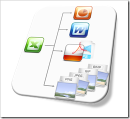
    Export Excel to other ApplicationsEarlier this week I received an email from Andrea, one of my few, but faithful readers. Andrea stumbled across a post from 2010 describing how to export Excel dashboards to PowerPoint and asked if I was planning a follow-up post about exporting from Excel to Microsoft Word.

    Truth be told, not up to that point. I personally barely export from Excel at all, but if I do, I usually export to PowerPoint.

    However, I found Andrea’s idea interesting for several reasons: exporting Excel dashboards to other applications and file formats may indeed be helpful, e.g. for creating reports or papers in Microsoft Word. Furthermore the original implementation exported three different dashboards, but the best use case for a bulk export to another application is an Excel dashboard displaying one selected period out of many or a dashboard with various filter options. In this case it can be a real time-saver if you have the option to export e.g. all weekly reports of a quarter or a defined set of filter combinations in one go. Last, but not least, it is actually no big deal to adjust the original code for other applications and file formats.

    Today’s article provides an example workbook which allows to export the dashboards to PowerPoint, Word, PDF, XPS and some picture file formats (PNG, JPEG, GIF, BMP). As always, the post includes a link to the Excel workbook for free download.

    (more…)

  • US Public Holidays in Tableau

    Calculated Fields in Tableau for US Public Holidays

    Calendar Round - Photographer: vbecker (flickr.com)For the analysis of daily data, the weekday can be an important and helpful additional information.

    For instance: if you are analyzing sales or order figures, incoming calls in a call center, internet usage, web statistics or the like, you will probably see significant differences in the data between working days, weekends and public holidays.

    Your views and dashboards should enable the reader to immediately distinguish between the three types, e.g. by color coding. This is pretty easy to do for the weekends, but it takes some additional efforts to include the public holidays, too.

    Today’s post explains why color coding daily data by the type of the day can be important for analysis and visualization. The article provides and describes Calculated Fields in Tableau for all US public holidays and put them to use in a Tableau Public dashboard showing an interactive calendar with all public holidays in the US between 1900 and 2099.

    (more…)

  • Selecting and Highlighting Areas on Excel Charts

    Interactive Selecting and Highlighting Areas on an Map or an XY Scatter Chart in Microsoft Excel

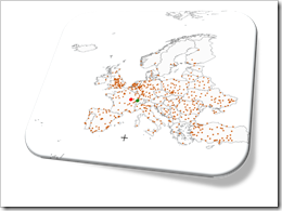
    Selecting and Highlighting on Excel ChartsThe previous post demonstrated an alternative technique to implement a direct interaction with an Excel chart using an ActiveX label control sitting on top of the chart. The example used in that post (a geography quiz) allowed a click on a map and evaluated the coordinates of the position the user clicked on.

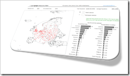
    The technique, however, can also be used in many more cases. If you are working with an XY scatter chart and especially if you are working with a map, interactive selecting and highlighting a user-defined area of the chart can be a very helpful feature for exploring and analyzing the data.

    Tableau Software, for one, allows for different ways of selecting and highlighting areas. Microsoft Excel has no such features built in. With the technique described in the previous post and some additional VBA code, however, you can bluff almost the same functionality in Excel.

    Today’s article describes how to implement selecting and highlighting features on Excel charts. As always the example workbook and the VBA code is provided for free download.

    (more…)

  • Another Technique for Interactive Excel Charts

    Another technique to create interactive charts in Microsoft Excel using an ActiveX Label Control on top of the chart

    Where is it?Interactive features add a lot of analytical power to dashboards. If you want to create a professional analysis dashboard, interactivity is almost a must-have.
    Unfortunately, Excel does not provide built-in interactive features for charts. However, this doesn’t mean you can’t have interactivity on Excel dashboards.

    As always, VBA is the way to overcome Excel’s shortcomings.

    We already had a couple of articles providing workbooks with interactive features, like Bluffing Tableau Actions with Microsoft Excel, The Next Level of Interactive Microsoft Excel Dashboards, Microsoft Excel Site Catchment Analysis, Better Chart Tooltips with Microsoft Excel 2010.

    All of them were taking advantage of the chart object’s mouse event procedures. More precisely, they were based on the great code provided by Jon Peltier here: Get XY on any Chart.

    I recently discovered another technique to implement interactivity on Excel charts. Andy Pope uses an ActiveX label control on top of a chart to track and evaluate mouse positions. Unlike the chart object mouse events, Andy’s approach doesn’t require to activate the chart first.

    I “stole” Andy’s idea and used his technique to create a little interactive geography quiz in Excel: find European cities on a map. Today’s article describes the implementation of the workbook and the code and – as always – provides the Excel file for free download.

    (more…)

  • Highlighting on Excel Dashboards

    Highlight one selected item across all charts and views of an Excel Dashboard: an example and the how-to

    Dashboard EU Unemployment RatesVery often, a dimension is displayed on more than one view of a dashboard.

    Let’s say you want to analyze data of the European Union. Chances are that you will have the dimension “member state” on more than one of your charts.

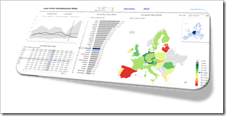
    If you pull these charts together into one dashboard, highlighting a selected member state across all charts is very helpful to explore and analyze the data. It supports the user to easily focus on the selected state and to identify its position in the context of all members at a glance.

    Highlighting is the very simple act of selecting one item out of many (by e.g. clicking) and automatically seeing this item emphasized in all views across the entire dashboard. This is a very effective and user-friendly visualization technique and should be available on every interactive dashboard.

    Today’s post shows how to implement highlighting on an Excel dashboard. As always, including the Excel workbook for free download.

    (more…)