Category: Choropleth Maps

  • Create Excel Choropleth Maps from Shape Files

    How to transform Shape Files into Microsoft Excel Choropleth Maps – including 2 Maps of Germany by Zip Codes
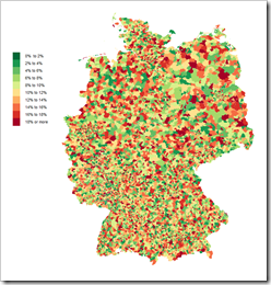
    Germany by Zip CodesOn several occasions I thought (and stated) that I already published everything I have to say about Choropleth Maps with Excel.

    Having said that, it seems as if “the ghosts I called I can’t get rid of now”. Recently someone asked me if I could provide an Excel Choropleth Map of Germany by zip codes. Careless and stupid boy I am, I answered “sure this is no problem”. What a misjudgment.

    If you followed my previous Excel Choropleth Map articles, you know that it takes either an Enhanced Metafile of the map you can ungroup in Excel to get the shapes or at least an SVG file to transform it to an EMF file using e.g. Inkscape

    And here is the roadblock I encountered: I simply couldn’t find a map of Germany by zip codes in one of the required formats. All I could find were ESRI shape files. After hours of searching for EMF and SVG files, I gave up, simply reversed my thinking and looked for a tool to convert shape files into SVG. 5 minutes later I had the solution.

    Today’s post describes how to use Indiemapper, a free online tool, to transform shape files into SVG which can then be used for Microsoft Excel Choropleth Maps in the well-known way.
    (more…)

  • Fast Choropleth Map with Enhanced Features

    Enhance a detailed Choropleth Map in Microsoft Excel with additional features

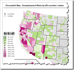
    Choropleth Map with enhanced featuresThe recent article Faster Choropleth Maps with Microsoft Excel provided a faster version of the VBA code to update a detailed Choropleth Map in Microsoft Excel.

    Leonid Koyfman, a faithful reader of Clearly and Simply liked this article. Leonid already contributed his invaluable ideas and insights here before (Excel Multiple Value Filters with Invert Selection). He had a couple of very interesting ideas for the fast Choropleth Map and he is kind enough to share them with us:


    1. Let the user filter the data by value bin and thereby highlight the bins of interest on the map
    2. Show tooltips when hovering over the map to display the name of the county and the unemployment rate in percent
    3. Let the user switch the level of detail: color the map by county or by state

    Today’s article describes Leonid’s enhancements and includes a link to the Excel workbook for free download.

    (more…)

  • Faster Choropleth Maps with Microsoft Excel

    An improved version of a Microsoft Excel Choropleth Map with a better performance for detailed maps

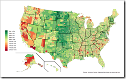
    Choropleth Map US Unemployment by CountyVery soon after starting this blog in 2009 I published a post with a set of Microsoft Excel Choropleth Map templates.  This post is still one of the most popular articles and downloads here.
    A lot of related posts followed and I am feeling very honored that my blogging colleague and France’s data visualization guru Bernard Lebelle of Impact Visuel used 2 of my maps published here on Clearly and Simply in his great new book “Convaincre avec des graphiques efficaces”. Bernard was kind enough to point his readers to my blog in the book. This is much appreciated. However, he should have heaped the praise on Tushar Mehta, who invented this technique. I only “stole” Tushar’s idea.

    Tushar’s approach works great and I know from comments and emails that a lot of my readers have used it with great success.

    There is only one minor drawback with Tushar’s approach: the performance decreases considerably when using it on a map with a lot of shapes, like the US by Counties.

    Today’s post tries to heal this. It discusses how to considerably improve the performance of a detailed map. The article describes the original approach, the optimization potential, the improved implementation and – as always – provides the Excel workbook for free download.

    (more…)

  • Create Your Own Filled Maps in Tableau

    A step-by-step guide to Richard Leeke’s TabGeoHack for creating your own filled maps in Tableau Software

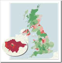
    Filled Map United Kingdom and LondonWay back in 2009, we had a beautiful guest post by Giedre Aleknonyte describing a workaround to generate Choropleth Maps with Tableau (using version 5.0 by the way).
    Those days are over. One of the major new features of Tableau 7 is Filled Maps (or Choropleth Maps as we used to call them in all blog posts here).

    Did I say those days are over? Well, not quite. While Tableau provides filled maps down to the zip code areas in the United States, the level of detail in other countries is more or less rudimentary. In Germany, for example, you can create filled maps only for the 16 states (Bundesländer). This is nowhere near sufficient to do really compelling geographical data analysis and visualization. Up to now there was no way to do anything about it.

    My friend Richard Leeke recently developed a fantastic tool called TabGeoHack which allows you to import literally any geographic level of detail of any region in the world into Tableau in order to use them for visualizations using filled maps. Richard is a co-founder of Equinox Ltd, a New Zealand based IT consulting firm and if you are a long time reader of this blog, you certainly already know him from the fantastic guest post series on Site Catchment Analysis. Even if you haven’t seen those articles, you probably know him from the Tableau Forum.

    Surprisingly enough, Richard made his tool generously available for free in this Tableau Viz Talk post.

    Please be aware that TabGeoHack – as its name suggests – is a totally unsupported hack utility, using an open back door of Tableau. The tool is a workaround with a certainly limited lifetime. It is beyond question that Tableau will provide similar built-in functionality with one of its next versions.

    Richard was kind enough to grant me a sneak preview of TabGeoHack before publishing. Although the download includes a very detailed description and instruction manual, it took me quite a while to cut my teeth on the use of TabGeoHack. That’s why I thought it would be a good idea to write a step-by-step article on how to use TabGeoHack, including an example on Tableau Public, visualizing unemployment rates in Germany, broken down by counties, on a Filled Map.

    So, do you want to create your own filled map of e.g. English counties, Spanish municipalities or even the individual sales regions of your company?

    Here you go.

    (more…)

  • Spice up your Choropleth Maps with Excel

    6 (+1) tips how to mitigate some of the disadvantages of Choropleth Maps in Microsoft Excel

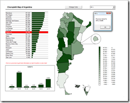
    Spiced Up Choropleth MapWe already had a couple of articles on Choropleth Maps, either using Microsoft Excel or Tableau. To be honest, I was really surprised how well these posts were received by our readers. The workbook provided for download with the first article Choropleth Maps with Excel is still in undisputed first place of all downloads here on Clearly and Simply. Thus, there was quite an avalanche of posts and comments on this topic and – despite the fact that I promised to stop posting on Choropleth Maps several times before – I announced at the end of the latest article that I am having left one ace up my sleeve regarding Choropleth Maps. Here it is and it will definitely be the last one:

    Already back in September last year, Lavih sent me an email including a map template of Argentina based on Gabriel’s implementation using transparencies. With the first email Lavih asked me for an easy way to let the user change the basic fill color of the map. Over a couple of weeks we emailed back and forth and together we developed some ideas on how to improve Choropleth Map visualizations with Microsoft Excel, far beyond only changing the basic fill color.

    Today’s post provides 6 (+1) tips on how to spice up your Choropleth Map visualizations using Microsoft Excel, as always including the workbooks for free download.

    (more…)