Author: Robert

  • All Peaks of the Alps visualized in Excel

    Bluffing some of Tableau’s amazing interactive features in Microsoft Excel: an Excel Replica of All Peaks of the Alps visualized with Tableau

    The previous post provided a Tableau visualization of all peaks of the Alps. Peaks of the Alps - IntroI already bluffed some of Tableau’s amazing interactive features in Microsoft Excel and published the solutions here.

    The idea wasn’t mine, though, but Matt Grams’.

    Matt started the journey in 2009 (!) with his beautiful guest article Bluffing a Visual Cross-tab with Excel. I followed a few months later with Bluffing Tableau Actions with Microsoft Excel. Ever since, I posted a few techniques to replicate Tableau’s interactive options in Microsoft Excel.

    Back in 2013, I created an entire Excel replica of one of my Tableau workbooks, which was once selected as the Viz of the Day by Tableau: Bruce Springsteen Discography – A Tableau Infographic. This is the Excel replica: Bruce Springsteen Discography in Excel.

    To carry on this tradition, today’s article provides an Excel replica of All Peaks of the Alps visualized with Tableau. Truth be told, of course not replicating all of Tableau’s features, but still some interesting interactive functionality in Excel beyond the defaults.

    (more…)

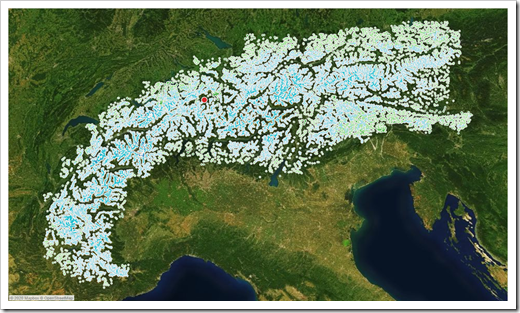
  • All Peaks of the Alps visualized with Tableau

    A Tableau visualization of all peaks of the alps including the option to find and highlight one peak or to select one by clicking on the map

    The FrankensTeam runs one of the most interesting and resourceful websites about advanced charting techniques in Microsoft Excel (E90E50fx). In March 2015 the team met in person for the very first time in Milan. To celebrate this, they published an Excel workbook with a visualization of all peaks of the Alps: Meeting in Milano, trip to the Alps and an Excel chart

    All Peaks of the Alps in Tableau PublicHaving been a mountaineer in my younger days, I was intrigued with this idea. I asked them for permission to use the idea and data for a replica of their visualization in Tableau. They kindly agreed.

    I am deeply ashamed to admit that I am sitting on the Tableau replica for a couple of years already, but never published it. Until today.

    This post provides and explains a Tableau Public workbook showing all peaks of the alps with all the amazing interactive features of Tableau.
    (more…)

  • Optimized Choropleth Maps in Microsoft Excel

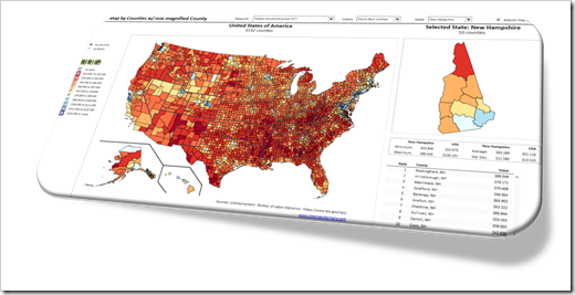
    How to create optimized Choropleth Maps in Excel with a higher resolution and without distortions using Excel 365

    Inspired by an idea of my internet friend and highly esteemed colleague Leonid Koyfman, the post US Choropleth Map by County per State – a 4th Option described and provided an Excel workbook with a Choropleth Map of the United States including a second map showing a magnified view of one selected state.

    Optimized Chroropleth Maps in Excel (Intro)The code and technique itself worked fine.

    However, there was one major disadvantage: during the process of creating the map in Excel, the shapes were slightly distorted. The zoomed map of one state still looked good for e.g. Texas or California, but definitely not for smaller states like Rhode Island or Connecticut.

    Today’s post provides a solution to overcome this issue: a way to create a Choropleth Map in Excel without distortions, displaying all counties accurately, no matter at which zoom level. As always, an example workbook is provided for free download.

    (more…)

  • Filter Excel Dashboards with Slicers and Timelines

    How to use Table Slicers and Timelines as interactive Filter Controls on a Microsoft Excel Dashboard

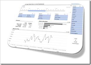
    Filter Excel Dashboards with Slicers and Timelines (Intro)The recent posts

    Filter Excel Dashboards with Table Slicers

    and

    Showcase for Table Slicers on Excel Dashboards

    described a technique how to use Excel’s popular Slicers on tables as easy-to-use, interactive filter controls on a dashboard.

    Although the approach can quickly be implemented and is working fine, it has one major shortcoming: for whatever reason, timelines are only available for Pivot Tables, not for tables. If you have a date dimension in your data (and according to my experiences many data sets do), you can’t let the user filter by dates with a timeline on a table.

    Today’s article will describe a work-around to eliminate this shortcoming. As always, the post provides the example workbook for free download.

    (more…)

  • Dynamic Icons in Microsoft Excel Cell Ranges

    Spice up your interactive Excel Dashboards with dynamically changing Icons, Pictures or Charts

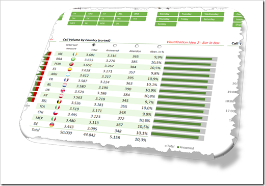
    The Excel workbooks which came with two of my recently published posts showed dynamically changing flag icons inside of a dynamic table on an Excel dashboard.

    Showcase for Table Slicers on Excel Dashboards

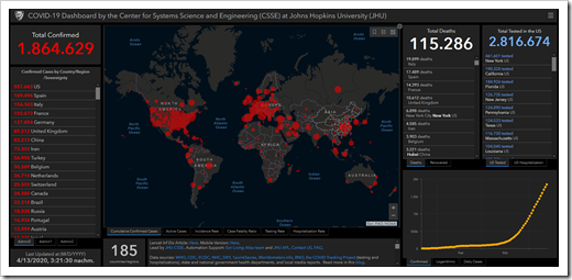
    My 2 Cents on the COVID-19 Dashboard by JHU.

    Dynamic Icons Excel Ranges Intro

    The tables visualized data per country and the flag icons next to the country names were automatically adjusted if the user filtered the data, changed the sort criterion or scrolled within the table.

    This week I received some feedback on these workbooks and readers asked, if I could explain this in more detail. No sweat: todays post provides a step-by-step explanation of the technique and the according workbooks for free download.

    (more…)