Author: Robert

  • How to handle Line Charts with many Data Series

    2 Alternatives to avoid cluttered Line Charts: a Band Chart and an interactive Line Chart highlighting one selected data series when hovering over

    804 words, ~4 minutes read

    Line Charts with many Data Series - Intro

    A Line Chart is definitely the best way to visualize the development of a continuous metric over time for several categories. That being said, Line Charts easily get cluttered and even may become useless, if you have many categories. Now, what is “many”? In my humble opinion Line Charts are already hard to read if they show more than 6 to 8 data series. But what if you have way more than 6? Like all countries in Europe or all states of the US?

    And then what? No worries, there are alternatives. Adding an interactive feature to your chart can solve the issue.

    Today’s post describes two alternative options for Line Charts with many data series: an interactive band chart (without VBA) or a line chart highlighting one data series when hovering over (empowered by VBA). As usual, the article comes with the workbooks for free download.

    (more…)
  • Adjust Power Query Table Style and Properties

    How to adjust the Default Table Style and the Autofit Column Width Property manually and automatically for all Query Tables in a Workbook

    960 words, ~5 minutes read

    Power Query Table Properties - IntroVery often, you get and transform data using Power Query and then load it into a table on a worksheet of your Excel workbook. When loading it for the first time, Power Query makes some decisions for you. Regarding the properties of the query table, but also regarding the used table style.

    Most of theses decisions are fine. Especially two of them can become a pain in the neck, though.

    First one is autofitting the column widths of the sheet to fit to the size of the header and the data. This is great, if you have only the table itself on the sheet, but it can be annoying, if you have also texts or calculations above the query table.

    Second issue is the table design. Power Query uses the built-in Green Table Style Medium 7, not the default Table Style of the workbook.

    I do not know of a way in Power Query to change these settings, so you always have to adjust your query table after the first load.

    Today’s post describes how to do these adjustments manually for one query table and also provides a ready-to-use VBA code snippet to change properties and styles for all tables in a workbook in one go.

    (more…)
  • Power BI lookalike Tooltips in Microsoft Excel

    How to create Power BI lookalike Tooltips in Microsoft Excel Charts

    1,361 words, ~7 minutes read

    Tooltips are an extremelyPower BI lookalike Tooltips in Microsoft Excel - Intro helpful feature to explore and understand data.
    When hovering over a data point of a chart, a textbox appears and displays the values and – if applicable – even additional information.

    I love working with Microsoft Excel. I truly love the application. But I will make no bones about it: Microsoft Excel’s native chart tooltips are mostly pointless. There is no option to adjust or format them, to link the content to a cell range or the like. They only display default information and this is pretty useless in most cases. All you can do is to turn them off in Excel’s options to get them out of your hair.

    I already posted a few articles about this subject, the first one back in 2010, including the same rant as above: Better Chart Tooltips with Microsoft Excel 2010.

    Microsoft didn’t do anything about it. Excel’s chart tooltips are still as lame as they have been in the past 20 years. This is remarkable, because Microsoft provides much better tooltips in Power BI. So, they are aware that tooltips are helpful, but apparently they don’t see the necessity to let Excel users take advantage of it, too. So we are still on our own here.

    Although I already provided a few options to display better tooltips in Excel (e.g. Customizable Tooltips on Excel Charts), I would like to come back to this topic again.

    Power BI does not only automatically insert tooltips on charts, it also shows a vertical line across the entire plot area and displays the tooltip even if the mouse cursor is not above the plotted data series.

    That intrigued me. Today’s post will provide 2 options how to mimic Power BI lookalike tooltips on Microsoft Excel charts. As always, the post comes with the Excel workbooks for free download.

    (more…)
  • Animated Maps in Microsoft Excel

    How to create an animated Choropleth Map (aka Heat Map, Filled Map, Thematic Map or Statistical Map) in Microsoft Excel

    1.006 words, ~5 minutes read

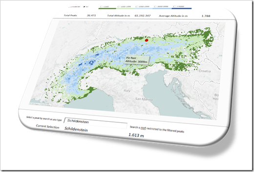
    In one of the recent articles (All Peaks of the Alps visualized in Excel), I tried to show how to combine different advanced techniques in Microsoft Excel (posted here or elsewhere) to create highly interactive Excel dashboards.

    I will tell you no lies: that one was a washout. The interest in that post and workbook was next to nothing. Now, you certainly expect I would have learned my lesson and try something else. I did learn something, but the stubborn old man I am, I can’t let it go yet. Thus, I decided to give the idea another shot.

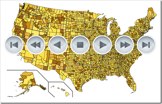
    Animated Choropleth or Heat Maps have become quite popular, especially in the past few weeks. So, there is nothing more obvious than providing a template with an animated Choropleth Map in Excel, is it?

    Animated Maps in Microsoft Excel Intro

    Today’s post will briefly explain how to combine two advanced Excel techniques which have already been published here: a Choropleth Map and the animation of visualizations in Excel.

    As always, the article comes with the workbooks for free download: an animated map of Germany by districts (Kreise und kreisfreie Städte) and one of the United States by counties.

    (more…)

  • Create a Summary Table in Power Query

    How to create a Summary Table in Power Query with aggregated values of the original data source without importing the entire data into Excel

    A frequent use case of Power Query (aka Get and Transform) is to connect to an external, big data source, filter and remove data in a query and load only a fraction of all rows into the Excel workbook.

    This will ensure you only carry along the parts of the data in your workbook you really need and will thereby keep the size lean and the performance fast.

    Power Query Summary Table Intro

    Although you do not need the original data on row level in your workbook, you might be interested in a couple of aggregated measures of the original data table, e.g. the total sum of a column, the count of rows, the distinct count of entries (unique values) in a column, etc.

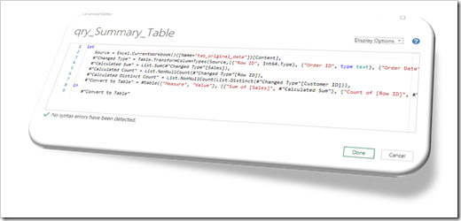
    Today’s post explains how to create a Summary Table with defined aggregations on the original data without loading the entire source. The key of the solution is the M-function #table.

    As always, the post comes with an example workbook for free download.

    (more…)