For what it’s worth: a few remarks on the currently extremely popular COVID-19 Dashboard provided by the Center for Systems Science and Engineering (CSSE) at Johns Hopkins University (JHU)
When the Corona pandemic started, I was tempted to build and publish a dashboard about the spread of COVID-19, too. But then I decided not to. Not only because much brighter people than me beat me to it, but also because the topic is very sensitive. People suffer and people die. Not the type of data I want to analyze and visualize. Hence, I stayed out, stayed home and wrote a few articles about something else (see my recent posts).
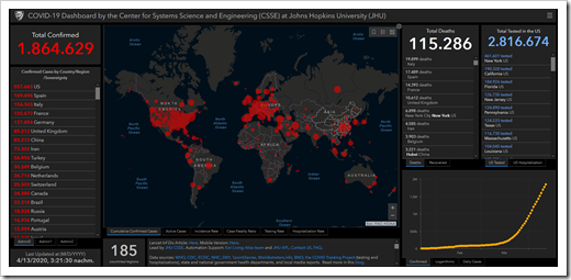
Today I changed my mind. I still don’t want to create a comprehensive COVID-19 dashboard, but I would like to add my 2 cents to the definitely most popular Corona Data Visualization: the COVID-19 Dashboard provided by the Johns Hopkins University:
 This afternoon, I read that this dashboard is currently clicked 1.2 billion (!) times a day.
First things first: it is a great dashboard providing the most important numbers at a glance and various options to drill down into the details. I am very impressed by its features, how quickly this visualization was made available and how often the underlying data is updated. My congratulations to the data science team of the JHU.
Having said that, I also see a few weaknesses and today’s post will discuss two of them.
Without further ado, here are my remarks:
Remark 1: The Lack of Context in the Table of Confirmed Cases
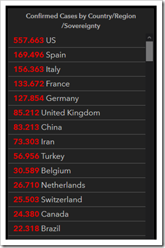
At the most prominent position of a dashboard (top left) the probably most interesting and important information is shown, the confirmed cases by country:
 The numbers are accurate, of course, but they do lack context in my humble opinion.
If you look at this table, you could get the impression as if the United States were affected by the virus more than three times as hard as Spain. And this is correct regarding the absolute numbers.
But you must not forget that the US have 7 times the population of Spain.
If you add the context of population sizes to the analysis, the ranking will considerably change. Please don’t get me wrong: I am not saying you should not show the absolute numbers. Of course you should. But you should also provide a relative metric like [Cases per 100,000 inhabitants] or [Number of Inhabitants per Case].
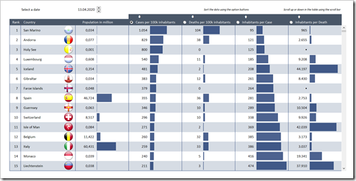
If you do that, you will get to something like this:
 For the very small countries at the top of the list (like San Marino and Andorra), you may argue that this could be an unfortunate coincidence because of the very small numbers (cases and population). And I agree.
However, switching from absolute to relative numbers also changes the view for much larger countries.
For instance, regarding the absolute numbers, Spain has “only” 6% more cases than Italy. However, in relative numbers, Spain has 355 cases per 100k inhabitants, whilst Italy has 259, i.e. the relative number in Spain is 37% higher than in Italy.
Now, where are the USA? You have to scroll down to the next page and will see that the USA are currently ranked on position 19 regarding the metric [Confirmed Cases per 100k Inhabitants].
 170 out of 100,000 US Americans currently have a confirmed COVID-19 infection. Remember: Spain has 355, i.e. more than twice as many.
Now compare that to the view of the absolute numbers, where the US has more than 3 times the cases of Spain.
You see where I am going here?
Remark 2: Inexplicable Definition of Regions
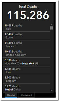
Right to the World Map, the JHU COVID-19 dashboard shows a descending sorted table for total deaths. These numbers are lacking context (relation to population), too, as described for the confirmed cases above.
But there is one additional thing, which I find questionable: the definition of the regions. In this view you’ll find countries (like Italy or Spain), provinces in China (Hubei), provinces in Canada (like Quebec or British Colombia), cities in the US (like New York or Los Angeles), counties in the US (like Essex, New Jersey), etc.
 I can’t recognize any kind of decision rule for clustering the data like this. Maybe there is one, I just don’t understand it.
There are a few issues, why I find this view hard to understand:
- the clustering of regions does not fit to the one in the view of confirmed cases by country
- just as in the view of cases, the context of the population sizes is missing. You can’t compare the regions by absolute numbers, if you don’t know how many people are living there
- finally, the inexplicable clustering of regions
Conclusion
The COVID-19 Dashboard provided by Johns Hopkins University is a great dashboard and I appreciate and applaud the efforts of their Center for Systems Science and Engineering to make this available for the masses.
However, I do think there is some room for improvement, especially regarding the addition of more context to the country-level visualizations.
Download Link
If you are interested in the Excel workbook used for my calculations and screenshots, here it is:
Download COVID-19 Measures in Context (zipped Microsoft Excel workbook, 3.3MB)
Please note that the data in this workbook was downloaded from the European Centre for Disease Prevention and Control on 13th of April 2020. The data in this workbook will not be updated.
Last, but not least: a personal note
Some of you may find this article and discussion inappropriate or even insensitive. I had my doubts, too, and it wasn’t an easy decision. People are suffering and people died. Please be assured that everyone who is infected and everyone who already lost a loved one has my deepest and heartfelt sympathies.
That being said, if we want to understand the data behind this pandemic, we need to discuss the best ways of analyzing and visualizing it. This post is meant as my humble contribution to this discussion. No more, no less.
Please let me know what you think.
Stay tuned.
Leave a Reply to Jennifer Cancel reply