How to display a Choropleth Map of the United States by County for one user-selected state
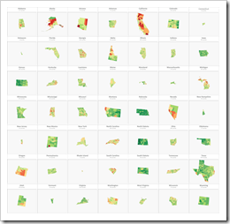 If you are a regular reader of this blog, you certainly know that I am into geographical data visualization. Just click on “Choropleth Maps” in the Categories roll on the right side of the blog and you will see that we already had 18 (!) posts in this category. Some of them discussing maps in Tableau, but most of them dealing with the question how to implement Choropleth Maps or Cartograms in Microsoft Excel.
I thought I would be through with this topic. I really did. However, I recently noticed that there is one common use case for Choropleth Maps in Excel I never wrote about: visualizing one user-selected region of a bigger map. Imagine you have geographical data with a hierarchy, e.g. USA by state and county (to state the obvious for the majority of my readers). It may well be that one of your dashboards is focused on displaying views for one selected state only.
Now, what if one of your views shall be a Choropleth Map? How can you show only the selected part of a map on your dashboard?
Today’s post describes three different options how to do this. As always, the example Excel workbooks are provided for free download without any password protection.
A General Enhancement of the Current Approach
My basis for creating Choropleth Maps in Excel is still the algorithm I developed and published back in September 2012 (!) in the article Faster Choropleth Maps with Microsoft Excel. The VBA code is simple and reasonably fast, but it came with a little flaw: it does not handle Null values in the data. If there is no data available for a region (i.e. Null or an empty string), the approach treats this data point as if it would be zero. This is not how it should be, of course. Regions without data should be visualized in a separate color instead of assigning them to the bin with the zero value.
Hence, I added a row to the color scale for the “no data” regions and adjusted the code to correctly handle regions with no data. If you are interested in the details, have a look at the range “myMapValueToColor” on worksheet [control] and at the Function LookUpBin in the module modChoroplethMap (download link see below).
All options / workbooks presented today are using this enhanced implementation.
Option 1 – Display the entire map, but color code only the selected state
The first approach of visualizing a user-selected state always displays the entire map on the dashboard, but colors only the current state (California in this example):
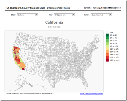 You do not even have to change the VBA code for this solution. A formula using IF, AND, OR and INDEX in the named range “myValues” on sheet [data] simply assigns the values only to the counties of the selected state. For all other counties, the formula returns an empty string (i.e. Null or no data). With the general enhancement in place (see section above), all counties outside the selected state are then automatically color coded with a light grey (or whatever you choose) for “no data” or “n/a”.
Option 2 – Display and color code the entire map and highlight the selected state
The second option always shows the fully colored map of the USA and highlights the selected state with e.g. a thick, black border line:
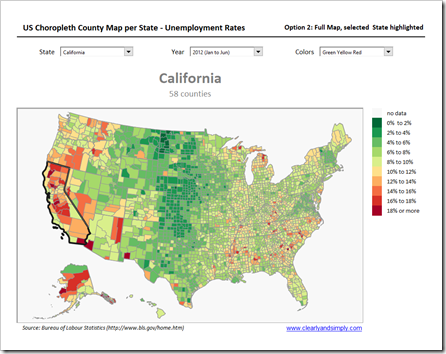 The map contains 50 additional shapes, one for each state. These shapes have no fill color and are used to highlight the selected state. An additional VBA sub called HighlightSelectedState first resets all state shapes to a default line and then applies the highlighting (thick black line) to the shape of the selected state.
Line width and color of the highlighting and the defaults are hard-coded in the VBA-code. It would definitely be more elegant to use cell ranges on the worksheet [control] to simplify the adjustment of line width and color of the states (default and highlight). Having said this, you probably adjust this only once and it isn’t a big deal to find and change the parts of the code if you are not happy with the thick black lines.
Option 3 – Display the map of the selected state only
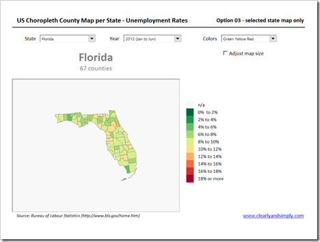
The third and last option filters the data and displays only the counties of the selected state:
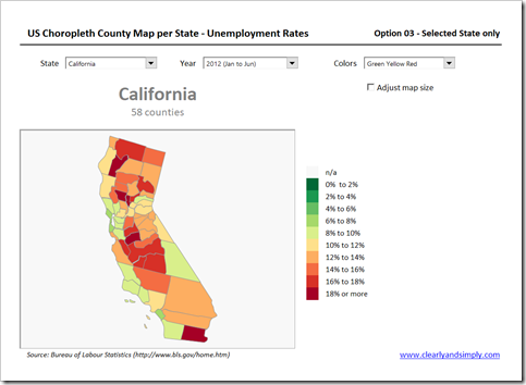 The checkbox “Adjust map size” at top right enables the user to decide whether the state map shall be adjusted to the defined cell range (light grey fill color) or not. If the box is unchecked, the size of the state is kept in proportion to its size on the entire map and Florida looks like this:
 With the box checked, the size of Florida is adjusted to the size of the map view on the dashboard:
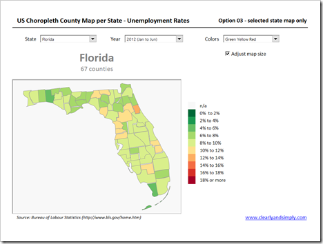 Unlike the first two options, this approach keeps the entire US map on a separate worksheet called [map]. If the user selects a different state, the existing map on the dashboard (sheet [us_map]) will be deleted and all counties of the selected state will be copied from [map] to the dashboard, grouped, repositioned and resized to fit into the defined cell range “myMapView”. All this is done by the VBA sub “UpdateStateMap”. If the user selects a different state, only UpdateStateMap is called. If the user selects a different year or color scale, the entire map on sheet [map] will be updated and then UpdateStateMap will copy the relevant state to the dashboard.
This is the way I implemented it. Another option would be to copy the state to the dashboard first and then color code the map. This would make the coloring code faster, but you would also have some overhead e.g. to recreate the shape index. It may be possible to realize some performance gains with an alternative solution, but the approach presented here is pretty fast (remember: 3,135 shapes are color coded with every map update) and the 2 to 3 seconds the code needs are good enough in my book.
Pros and Cons
Option 1 is easy to implement,but it is a waste of real estate on the dashboard. On average, only 2% of the view (1 of 50 states) visualizes data, the rest is just chart junk. I would not recommend option 1 at all. I simply included it for the sake of completeness.
Option 2 needs a little bit of extra VBA coding, but it is still pretty straight forward. It does not explicitly focus on the selected state (what the user might expect), but to its credit, it shows the state in the context of all other states, which might be useful, depending on the purpose of the dashboard.
Options 3 shows what you would usually expect when you are selecting one state. It filters the data and shows only the relevant data you selected. However, you are losing information about all other states, i.e. you do not see at a glance how this state performs compared to all others. Another downside is the distortion of the shapes. The maps are created by converting ESRI shape files or SVG-files into EMF-files and then importing the EMF into Excel and ungrouping it to freeform shapes. This process unfortunately leads to some distortions of the shapes. You do not see these distortions on the entire map, but if you massively increase the zoom factor (as we do when “Adjust map size” is activated, see above), the distortions become visible. You can already see this in the example of Florida used above, but it becomes a real downside when smaller states are selected. Extreme example is Rhode Island. Have a look.
In a nutshell: I definitely wouldn’t use option 1. The choice between option 2 and 3 depends on the purpose of your dashboard: if your dashboard and story sets a selected state into the context of all other states, option 2 is the way to go. If you are simply focusing on the data of one state, I’d recommend option 3.
The Download Link
Here is a zipped folder including example Microsoft Excel workbooks for all three options:
Download US Choropleth County Map per State (zipped folder, 6.6MB)
Update on June 21st, 2017
I just noticed a little bug in the workbook of option 2: selecting the Disctrict of Columbia led to a runtime error, because the map does not include a state border shape for DC. I fixed this now and updated the workbook for download. If you already downloaded the file and face this issue, please download the zipped folder again.
Stay tuned.
Leave a Reply to Stanley Yoo Cancel reply