Visualize Relationships, Connections and Associations in Networks with Tableau Software
 Clearly and Simply proudly presents a new guest article: Michael Martin of Business Information Arts, Tableau Partner, Tableau Certified Consultant and leader of the Toronto Tableau User Group shows us how to visualize Network Graphs using Tableau Software. Enjoy.
Network Graphs can help us see and measure relationships and connections between people, places, and things over time. This can be expressed as identifying, measuring and understanding process flows, the mix of products in shopping carts, social network and email traffic, affinities and interests people share (or don’t share), and the “hierarchies of influence” in business and / or social systems by identifying who or what triggers events, and the impacts they have on others.
Today’s post describes how you can build Network Graphs using Tableau Software versions 6 or 7, including a detailed how-to tutorial and some information on the background of Network Theory.
What is a Network Graph? A Picture says more than 1,000 words
What are Network Graphs for? Here are just a few practical examples:
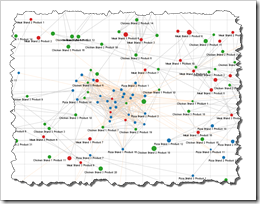
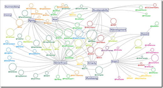
Contacts Between Philanthropic Twitter Users
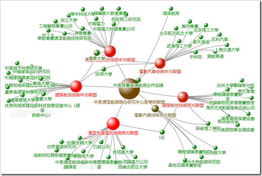
The Organization of Hierarchical Communities
 The Path to Products People Buy
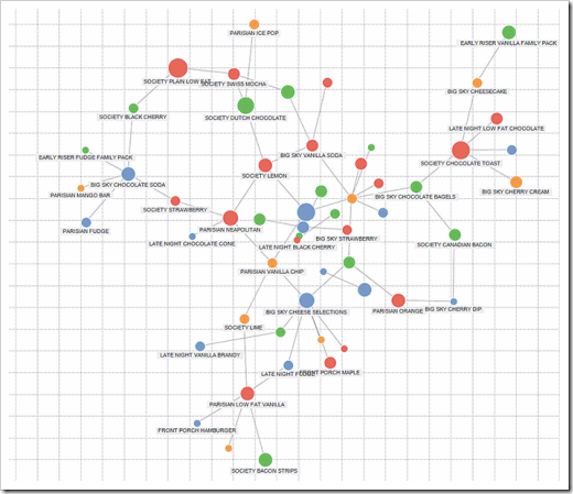 Last, but not least a Network Graph built in Tableau:
Association of Food Groups, Brands and Flavors
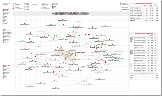 Tableau’s Out of the Box Network Graphs
Tableau Desktop is one of my favorite data analysis and reporting tools. Other excellent products such as Visokio Omniscope support network graphs as one of a wide number of supported view types. But what I have always found so impressive about how Tableau is engineered is how various “loosely coupled” features can be re-assembled to create new ones. Examples of this include double axis graphs, bullet charts, and the support for bubble graphs and tree maps in the upcoming Tableau 8 release (Q1 of 2013). Tableau is a fabulous “Swiss Army Knife” for visualizing data.
Build Network Graphs with Tableau – The How to
My implementation of network graphs in Tableau leverages features that have been around since version 1, the circle and the line mark types, and support for scatter plots – and ability to draw double axis graphs (hackable for years before being officially supported as “combo charts” in version 6). With a little bit of data preparation, this is all you need to draw a network graph in Tableau.
For me, the fun really starts when other great Tableau functionalities (actions, parameters, page field animation, filtering, highlighting, size by, color by, table calculations to name just a few) are brought into play.
Data Preparation
Key to my implementation is data preparation given the requirement to connect elements in the form of a transaction and lay out the design of the network graph in the Tableau view:
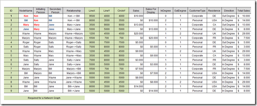 If you want to follow the step-by-step below using my example data, here is the Excel workbook with the data for free download:
Download Network Graphs Example Data (Microsoft Excel 2007/2010, 14.3K)
Demo – A simple Network Graph
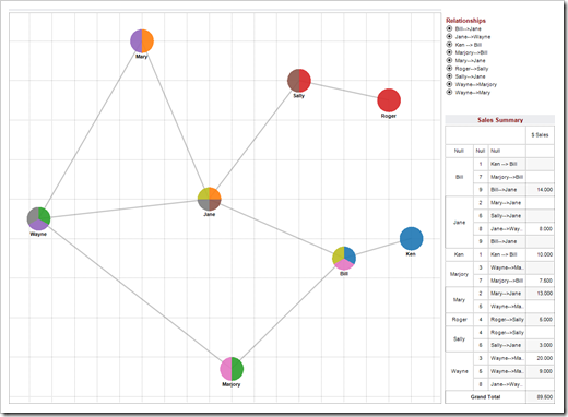
Here’s a simple network graph based on the example data.
Step 1 – The Basic Set Up
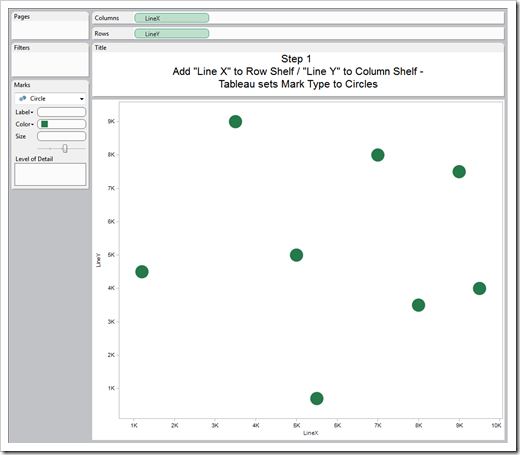
To get started, put the “Line Y” field to the Row Shelf and “Line X” field on the Column shelf. Tableau will automatically set the mark type to circle and render a basic scatterplot. The “Line Y” and “Line X” co-ordinates in the source data are visible via the field value headers.
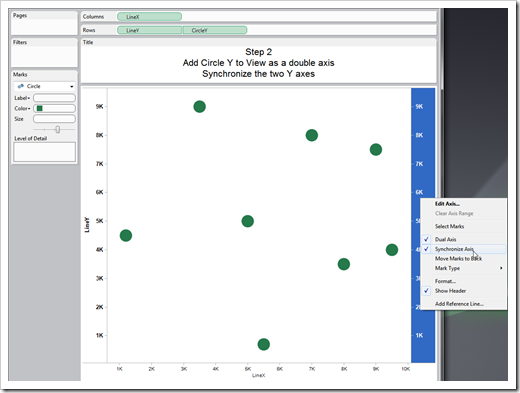
Add the “Circle Y” to View on the rows shelf as a double axis, and synchronize the two Y axes (right click on the axis, and click on “Synchronize axis”).
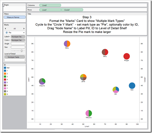
The next step is to format the Tableau Marks Card to show "Multiple Mark Types“. Then cycle to the "Circle Y” mark and set mark type as "Pie“. Drag the "Node Name" field to the Label Pill. You can optionally color the “Node Name” field by ID by dragging ID to Level of Detail Shelf Resize the Pie mark to make larger – each pie slice represents a Transaction ID.
Then cycle to the "Line Y" Mark. Drag the “ID” and “Relationship” fields to Level of Detail shelf. Set the mark type to “Line”. Tableau will connect the dots – and you have a simple Network Graph. Resize the Line Y series to make lines thinner and color the lines as desired.
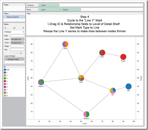 Optionally, you can format the canvas to include grid lines and turn brushing on in the Color Legend. Uncheck the “Show Header” in the “Line X”, “Line Y”, and “Circle Y” fields in the row and column shelves.
Step 5 – The Tooltips
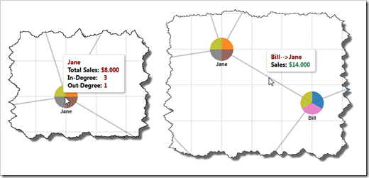
If you hover over nodes in the view with the mouse, you’ll see Tableau generated tooltip text:
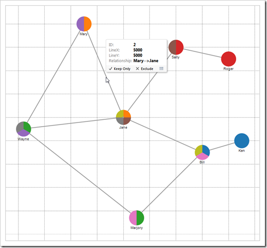 We can do a few things to make the Tooltips more meaningful. With the “Line Y” Mark selected in the Marks Card, place the “Relationship” and “Sales vs Sales For Display” fields in the Level of Detail Shelf.
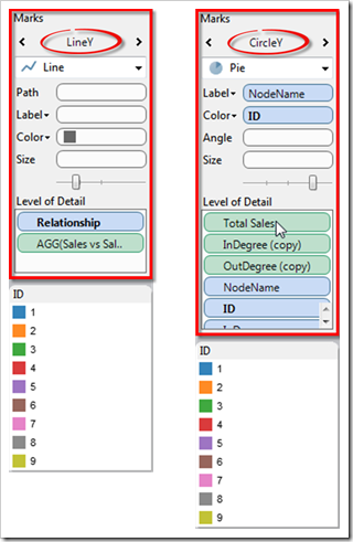 The “Sales For Display” field is a calculated field that I will describe shortly.
Then cycle to the “Circle Y” field in the Marks Card and place the “Total Sales”, “InDegree”, “OutDegree”, “Node Name”, and “ID” fields in the Level of Detail Shelf.
 Step 6 – Calculated Fields and the Tooltips again
The next step is to define a simple calculation which I named “Sales vs Sales For Display” in my workbook:
IF Sum([Sales])=0 THEN Sum([Sales For Display]) ELSE Sum([Sales]) END
The output of this calculation is the value of either the “Sales” or the “Sales For Display” data fields associated with a single transaction. My implementation needs this calculation because without this calculation the value of the “Sales” field will change to zero (or change from zero to the value of the sale) as you pass the halfway point between two connected nodes when traversing the line between connected nodes with the mouse.
If you take another look at the source data, you’ll see that the value of the “Sales For Display” field is the same as the value for “Sales” in the previous row for a given transaction ID. As Tableau aggregates the “Sales” and “Sales For Display” metrics by Transaction ID, the value of the calculation will change as you pass the halfway point in the line connecting the nodes in the transaction with the mouse.
Then edit the tooltip text is shown in the figure below.
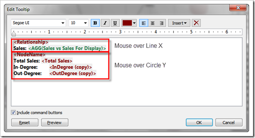 The first two lines will appear when the mouse hovers over a line connecting two nodes (the “Line Y” field). The remaining four lines will display when the mouse hovers over a Node (the “Circle Y” field).
Step 7 (optional) – A Summary Table
You can optionally make a summary sales table that sums the “Sales” field by the “Node Name” field which includes creating a calculation named “Sales Label” that suppresses the display of zero values in the “Sales Field”.
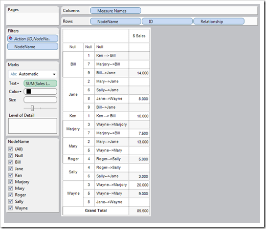 If you look at the source data, you’ll see that the “Relationship” field is encoded to show who the seller and buyer were. The value Ken à Bill describes a transaction where Ken was the seller and Bill was the buyer. Ken is listed as the “Initiating Person” and Bill is listed as the “Secondary Person”. The “Direction” field explains this in another way; from Ken’s point of view as the “Initiating Person”, this is an “Out Degree” connection. From Bill’s point of view as the buyer, this is an “In Degree” connection.
Step 8 (optional) – Filter Actions
You can optionally define a Tableau Filter Action to filter data that will appear in the “Summary Sales Table” based in which transactions in the view are selected with the mouse. In my implementation, the Action is set to run “On Select” based on the values of the “ID” and “Node Name” data fields.
For more information on how to use Actions in Tableau, have a look at this how-to tutorial: The Power of Tableau Actions.
Step 9 (optional) – Animated View
You can optionally animate the view by dropping the “ID” field into the Pages Shelf and inserting the Pages Shelf into the Dashboard by selecting “Current Page”.
After you start the Page Player, transactions will come into the view sorted by the Transaction ID number. With the use of calculations and “Page History” settings, you can create very interesting animated views of transaction oriented data.
The Result
Here is the example packaged Tableau workbook for free
download:
Download
Prototype Scene Graph (Tableau 7 Packaged Workbook, 62.3K)
Network Metrics
The “Network Density” metric is commonly calculated as the number of actual possible connections divided by the number of possible connections. There are 9 actual connections and 56 possible connections in the example data, resulting in a Network Density value of .1607 which depending on the context could be considered to be low or high.
The “Network Centralization” metric tells us how “centered” the network is around the member(s) of the network with the highest number of connections. In a network with three members, this metric is of little value – but in a network with thousands or millions of connections, knowing the people or persons the network is centralized around is meaningful to our understanding of the network. In the data driving my implementation, Jane is involved in four of the nine transactions which would be commonly calculated as (4 / 9) = .444. This would be considered a high value in most cases, so you could say that the total network is highly centralized (around Jane).
The “Network Homophily” metric describes the degree that connected nodes share similar characteristics – i.e. are connected nodes largely alike? The richer the source data is, the more important and interesting this metric can be as the row count increases. This metric is of particular interest to marketers.
Switching to Node specific metrics; the “In Degree” metric is the count of in-coming connections to a Node from other nodes in the network. The “Out Degree” metric is the count of outgoing connections from a single node to other nodes in the network. These two metrics are often used to help analysts and marketers understand how “social” products within particular retail categories are with products in similar or different retail categories.
The “Betweeness” metric helps us understand how important a particular node is to the overall “performance” of the network from the perspective of a particular metric or class of metrics. The example data describes connections through “Sales”. If Sally and Roger had made huge sales to each other or to Jane, removing Jane from the network would lower the “total value” of the network because Roger and Sally are in the network by virtue of their relationships to Jane.
The “Closeness” metric helps us understand how useful a given network member is for getting a message from outside the network circulated within the network as soon as possible. If an outside person wanted to circulate a message within the network described in the example data, the go-to person is Jane because she is directly connected (one hop away) to five other network members, who in turn are a hop away from the remaining network members (Roger and Ken).
Although the “Betweenness” and “Closeness” metrics are important, they don’t necessarily predict the ranking of members in a network by the governing metric (in this example, sales). The top seller in the network is Wayne by virtue of a 20k sale to Marjory. If you size the “Node ID” field by “Sales”, you would immediately realize how important Wayne is to the network from a sales performance point of view.
The “Eigenvector Centrality” metric explains the degree to which a given node is connected to the most important node in the network. In a given network, an “introverted” member with low “in degree” and “out degree” metrics and has little or no “betweenness” or “closeness” could in fact be quite important due to its influence on members who are very well connected. If Jane is heavily influenced by Sally’s purchasing recommendations, Sally’s role in shaping the profile of the network is important given Jane’s position in the network as the most important buyer in the network.
Recommended Further Resources
There are many great resources on and off the web for learning about network theory and metrics. Here are a few that I’ve found helpful, with apologies to other great resources that I haven’t encountered yet.
University of Maryland Human / Computer Interaction Lab contains links to many interesting data visualization projects and white papers related to network data visualizations.
Node XL is an Excel add-in for visualizing network graphs.
Analyzing Social Media Networks With NodeXL by Derek Hansen, Ben Schneiderman and Mark Smith, published by Morgan Kaufman.
Gephi is an open source tool for visualizing network graphs.
Aaron Koblin provides a great visualization of airline flight patterns over North America.
About Michael
Michael Martin (email Michael) works internationally in a variety of business sectors that include market research, consumer packaged goods and retail, banking, hospitality, commercial construction, entertainment, governmental, and non-profit.
His project deliverables include business performance forecasts, strategic and operational case study white papers, operational dashboards and scorecards, associative and neural networks, customer / product segmentation and market-basket analyses.
Michael is a Tableau Partner, a Certified Tableau Consultant and leads the Tableau Toronto User Group.
Robert’s Note
A big time thank you very much to Michael for contributing this fantastic article. If you enjoyed what you have read, please drop Michael a line to say thank you by email (email link see above) or leave him a comment here.
Stay tuned.
Leave a Reply to keyur Cancel reply