Choropleth Map Template USA by Counties

Amendment #5 to Choropleth Maps with Excel: a Map Template for the United States by Counties
Pop Soda Coke by US Counties - click to enlargeIn a comment on Multicolored Choropleth Maps with Excel Dave Hammer wrote

“… I'm doing some mapping right now by County and Congressional District. Some folks at Wikipedia have supplied some excellent .svg maps with proper labels […] but I'm hitting a roadblock with Excel. […] They're easily imported into Excel as an enhanced metafile and then ‘ungrouped’ to create an excellent map – but all the data associated with the shapes is lost during this process. […]”

Actually there is a way of converting .svg files (scalable vector graphics) into Microsoft Excel without losing the data associated to the shapes. The next post will describe a detailed how-to tutorial, but I thought you might be interested to see the results in a sneak preview. This post offers free downloads of choropleth maps of the United States by county, in the classic and the multicolored version.

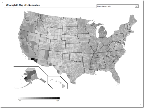
This is the classic version of a choropleth map of the United States by county: population, area and unemployment rate in different shades of grey (or any color you may choose):

Choropleth Map USA by Counties - click to enlarge 

Download Choropleth Map USA by counties (Microsoft Excel 2003, zipped, 1043.5K)

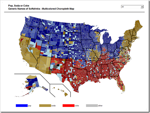
And here is the multicolored version, the well known example of “The Great Pop vs Soda Controversy” by county:

 Pop Soda Coke by US Counties - click to enlarge

Download Pop Soda Coke Choropleth Map by US counties (Microsoft Excel 2003, zipped, 1324.9K)

There are a couple of drawbacks coming with these workbooks:

  • Huge file size

3,135 freeform shapes in Microsoft Excel considerably increase the file size of the workbook: the classic version has 3.5 MB, the multicolored version even 4.5 MB.

  • Low performance

Updating the map takes approximately 10 seconds (on my computer). I guess this is still acceptable, but it is definitely far from a perfect user experience.

  • Loss of quality

Ungrouping the Enhanced Meta File to freeform shapes seems to relocate some of the freeform shapes. It looks good in a zoom factor of 100% or even 200%, but if you increase the zoom factor to 400%, you will understand what I am talking about.

As mentioned above, the next post will include a detailed tutorial of how to import .svg files into Microsoft Excel.

Stay tuned.
Comments

31 responses to “Choropleth Map Template USA by Counties”

  1. Harold Avatar

    Thought you might like to see a small addition that I did to your great choropleth maps.
    Some people need to look at numbers as well as shapes/colors so I added some text boxes & put the formatted numbers on the map as well.
    This works fine for Australia (<10 data points) but would be a bit messy for US states etc.
    In any case, you can download the template here:
    http://www.xlnumerics.com/images/stories/HG-XLN/Australia-by-state.xls

  2. Robert Avatar

    Harold,
    many thanks for your comment and the download link to your workbook. Nice work.
    Displaying the exact values in text boxes on the map increases the information displayed without requiring additional real estate. I like the approach.
    As mentioned at the end of the first article (Choropleth Maps with Excel) I am usually implementing an additional visualization like a bar chart (see dashboard of Lithuania at a glance). Thereby the exact values are shown as well and the bar chart increases the comparability of the regions.
    I totally agree with you. Both approaches will only work with a very limited number of regions on the map: feasible for Australia or Germany by state, but a map of the United States by county is definitely out of the race.

  3. Shane Avatar
    Shane

    How would i go about making one of these maps just using a few states like nc sc va, to map different things in their counties

  4. Robert Avatar

    Shane,
    thanks for your comment.
    Simply delete what you do not need:
    1. Delete the states you do not need on the map
    2. Delete the data rows you do not need on the worksheet data
    3. Delete the rows you do not need on in the cell range “MapNameToShape” (B65:C3199) on the worksheet “control”, i.e. if you don’t want to have Alaska in your workbook, delete rows 65 to 91, etc.
    I hope this will be helpful.

  5. aspa0001@stud.slu.se Avatar
    aspa0001@stud.slu.se

    Hi , thanks for sharing,
    I need a map of Iran (with provinces).if anybody has it please send it to me at:
    aspa0001@stud.slu.se
    thanks

  6. Robert Avatar

    Wikimedia Commons has maps of Iran as well, e.g.:
    http://commons.wikimedia.org/wiki/File:Iran.svg
    I hope this will be helpful.

  7. Shawn Avatar
    Shawn

    In the classic version, what do i need to do to change the color scale from white-to-black to light yellow-to-red?

  8. Robert Avatar

    Shawn,
    thanks for your comment and question.
    The color scale is defined on the worksheet [control] using the columns B and D. In column D the RGB value is calculated in a user defined VBA function based only on the inputs in column B. This worked in my specific case, because the white to black RGB gradient goes from 255,255,255 to 0,0,0.
    If you want to change the gradient colors, you have to add 2 additional columns right to column B and insert the desired RGB values in the 3 columns. In your case from 255, 250, 0 (yellow) down to 255, 5, 0 (red).
    Finally change the user defined formula in column F (which has been column D in my version before inserting 2 new columns) to refer to the 3 different input columns, e.g. =udf_RGB(B13,C13,D13) and copy down the formula.
    I hope this will be helpful.

  9. appletree Avatar
    appletree

    Hi, have you found a solution to the low-resolution issue?

  10. Robert Avatar

    appletree,
    if your question on “the low-resolution issue” refers to the fact that some of the shapes are a little relocated during the export, I am sorry, no: i do not have a solution. To be honest, I never tried to find one.
    As described above, the inaccuracies are coming with the ungrouping of the EMF file in Excel. As long as it looks ok with a zoom factor of 100% and on a print out, I do not care about some minor issues in 400% zoom. Sorry.

  11. john Avatar
    john

    hello. does anyone have an excel file like this with pa, ohio, vw, md,de and ny?

  12. Robert Avatar

    John,
    you do not have to wait for someone posting his template. You have different options to create your own maps meeting your requirements:
    Option 1: use the map posted for download above, delete the states / counties you do not need and adjust the data sheet and the mapping table
    Option 2: create your own Choropleth Map as described here

    Build your own Choropleth Map with Excel

    and / or here

    Create Excel Choropleth Maps from Shape Files

  13. mike Avatar
    mike

    Hello,
    Great work here! Is there a way to use this for just states – i.e. with no counties?
    -MD

  14. Robert Avatar

    Mike,
    sure. Have a look at this post:

    Choropleth Maps with Excel

    The template provided there is without Alaska and Hawaii, but you can produce your own map as described here:

    Build your own Choropleth Maps with Excel

  15. John Petersen Avatar
    John Petersen

    Hello,
    I am working with the above black and white map to track some data. I wanted to have 1 Excel spreadsheet that had the entire US on 1 tab and then a tab for each state, all pivoting off of the Data Tab. I have tried copying the main US tab but it doesn’t seem to work. Can anyone tell me if it is possible to have the Data push to multiple tabs/shapes that exist on multiple tabs?
    Thanks,
    John

  16. Robert Avatar

    John,
    thanks for your comment. Yes, this is possible, but it requires some modifications of the workbook:
    Step 1 – refer to the active sheet instead of sheet 1
    The code in the workbook provided above will always only change the color of the shapes in sheet 1. If you want to have several maps on several sheets, you have to replace
    Set myShape = Sheets(1).Shapes(myTargetCell.Offset(0, 1))
    by
    Set myShape = ActiveSheet.Shapes(myTargetCell.Offset(0, 1))
    Step 2 – update the map when the sheet is activated
    Since the code is now coloring the map on the active sheet, you have to update the map not only when the user selects a new measure from the drop down, but also when the sheet is activated. Simply call the sub UpdateMap in the Worksheet_Activate event sub.
    Step 3 – coloring based on the state level
    Steps 1 and 2 will work already, but the coloring of all maps will always be based on the entire data, i.e. the entire USA. I assume you want the state maps to be colored on the state level (e.g. the coloring of California will only use the data of all counties of California instead of all data of the US). To do so, you need to store the name of the active sheet somewhere on the [Control] tab and update this cell when the sheet is activated (ActiveSheet.Name). Then adjust the formulas in column H of the data sheet to return only the relevant data, e.g.
    =IF(OR(RIGHT(C5,2)=myActiveSheet,myActiveSheet=”US”),INDEX(D5:F5,1,Control!$C$8),0)
    Having said that, I highly recommend using the code provided in this blog post:

    Faster Choropleth Maps with Microsoft Excel

    The code / workbook provided there has a much better performance when updating the map(s).

  17. rperrett Avatar
    rperrett

    In the Soda Pop Chloropleth map, how can I go about figuring out the color? I only have 3 rows for 0%, 50%, and 100%, and I have 24 columns , but Im finding it difficult to change the color for each column/dropdown item. Could you please help?

  18. Robert Avatar

    rperrett,
    the code in the model uses the property .Fill.ForeColor.RGB to color the shapes.
    If you want to define this value based on the RGB values, you can use this user defined function:
    Function udf_RGB (bR As Byte, bG As Byte, bB As Byte) As Long
    udf_RGB = RGB(bR, bG, bB)
    End Function
    You pass the R, G and B value of the color you want to the function and the function will return the color value, e.g.
    udf_RGB(100,100,100) will return 6,579,300
    (a gray)
    udf_RGB(0,175,100) will return 6,598,400 (a green)

  19. rperrett Avatar
    rperrett

    Wow, that is awesome! thank you so much. This map is amazing. Thank you for your quick response.

  20. Gulgun Avatar
    Gulgun

    Hello,
    I have downloaded the map for US counties. Thanks a lot for making this available.
    My variable of interest is sth different and it varies between 0 and 1. I would like to change the thresholds (for example: 0-0.2, 0.3-0.5, 0.6-0.8, 0.8-1.0). But, I am not sure how to do it. Could you please help?
    Thanks a lot!

  21. Robert Avatar

    Gulgun,
    first of all I would recommend to use the faster version of the algorithm provided here:
    Faster Choropleth Maps with Microsoft Excel
    Same map, but it updates the colors 10 times faster than the algorithm provided in the article above.
    You can adjust the number of color bins and the thresholds on the worksheet [Control]. Delete the rows you do not need and adjust the thresholds as you like.

  22. Gulgun Avatar
    Gulgun

    Hi Robert,
    Thank you so much for your prompt response! I will follow your advice.

  23. Maritza Avatar
    Maritza

    Excellent work teacher I thought I knew excel but seeing your excellent work let me tell you that I am a novice thank you for sharing your codes friend Robert you will have an example of presidential elections would be excellent a job like this or how a job would fit like this where it shows on the map the regions most voted by the candidates thank you.

  24. Robert Avatar

    Maritza,
    first of all I would recommend to check out the following post, which provides a much faster algorithm to color maps with many regions:
    Faster Choropleth Maps with Microsoft Excel
    Secondly, you can create your own filled map. Have a look at these posts:

    Build your own Choropleth Map with Excel

    and / or here

    Create Excel Choropleth Maps from Shape Files

  25. Maritza Avatar
    Maritza

    Excellent examples robert friend I’m practicing the map of my country but do not spend with the recreate shape index and I put all the forms with their names as it shows your worksheet but I get error can not help me what is the error.

  26. Robert Avatar

    Maritza,
    if you inserted new shapes (as you did), is crucial to run the sub RecreateShapeIndex. Otherwise the algorithm will not work correctly. i.e. the values and according colors will most likely not be applied to the correct regions.

  27. Maritza Avatar
    Maritza

    Thank you for your help, excellent friend Robert, I already painted the shapes … I have a doubt because when I gather all the shapes, the shapes are not painted …

  28. Robert Avatar

    Maritza,
    I am sorry, I do not think I can help you based on the error descriptions you are able to provide in comments here. Can you send me your workbook by email or post it somewhere for download?

  29. Maritza Avatar
    Maritza

    Now it works when you unbundle the Robert forms. And why when they group does not work get me that doubt Robert will thank you greetings.

  30. Robert Avatar

    Maritza,
    it’s because of how the algorithm is designed. If you group the shapes, the groups form a shape at top level of the shape collection and the algorithm does not look for and thereby can’t find the shapes inside this group. If grouping the shapes is important to you, you can add some code to ungroup the shapes before coloring and then regroup them again after the coloring is done.

  31. Maritza Avatar
    Maritza

    Thank you Robert for answering my questions you are grateful.

Leave a Reply

Your email address will not be published. Required fields are marked *