Visiting a friend

Chandoo's KPI Dashboards revisited – the Box Plots

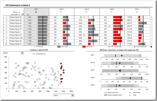
In summer 2008 my friend and Microsoft Excel MVP Chandoo was kind enough to give me the opportunity of contributing guest posts to his excellent blog Chandoo.org. Actually Chandoo even featured a whole 6 post series on how to create interactive KPI dashboards with Microsoft Excel. Here is a screenshot of the final dashboard:

PHD KPI Dashboard - click to enlarge


The last part of the series was about box plots to visualize the distribution of the data (Box Plots Excel Dashboards Tutorial), including average and target values. At that time Chandoo and I decided to apply Occam’s razor and we restricted the tutorial to a simplified version of box plots, working only for data sets with positive values.

This follow-up post on my own blog is about how to create these box plots for all kind of data distribution, i.e. positive and negative values.

The technique of making these box plots applicable to data regardless the sign is pretty much the same as already described in the original post on Chandoo.org:

  • Use a stacked bar chart with one category and several data series
    You need 8 instead of 4 dummy data series for the universal solution
  • Write formulas to calculate the values of the 8 data series
    It took me some time to figure out the correct combination, but the formulas themselves are not too complicated: nested IFs, MIN and MAX (for details see the workbook, download link below)
  • Format the bars according to their position on the stack: invisible, light grey, dark grey and so on
  • Add the average and the target values as additional series to the chart and change the chart type of these new series to XY scatter charts
    (X is the average / target value, Y is a dummy 1)
  • Set the scale of the secondary vertical axis to minimum 0 and maximum 2 in order to position the average and target aligned with the bars
  • Format the average and the target the way you want
    In our example: a cross for the average and a vertical line (using vertical error bars) for the target
  • Get rid of the chart junk
    No fill color and no border for plot or chart area; no line, tick marks etc. for the vertical axes, etc.

Here is a screenshot of the result:

Simplified Box Plot - click to enlarge

Download the box plot example for free:

Download Simplified Box Plot (Excel 97 – 2003, 101.5K)

The workbook contains a set of possible combinations of values for testing. If you want to see something else, simply delete the formulas in row 16 and type in your own data.
Comments

9 responses to “Visiting a friend”

  1. Daniel Avatar
    Daniel

    Another excellent post, looking forward to following this blog!

  2. Chandoo Avatar

    Thanks for revisiting this post and providing a better solution for the box plot.
    btw, I have posted a review of clearly and simply.com on phd, it should be up in 8 more hours. 🙂

  3. Miguel Avatar
    Miguel

    We miss your excellent posts.

  4. Robert Avatar

    Miguel,
    Thank you very much for the appreciation.
    I know, my last post is already more than two weeks back and my intention was to publish biweekly. I am really sorry. Unfortunately I am very busy at the moment and I barely have time to work on blog posts.
    To keep you interested, here is what is in the pipeline / on my plan for the next weeks:
    1. A 2-post series on Fabrice’s brilliant Sparklines for XL: a general review and a real life example (a price benchmarking tool) including the workbook for free download.
    2. The Lithuanian dashboard revisited. An alternative solution how to create a dashboard like this (without Excel).
    3. Another project management tool: Creating PowerPoint Gantt Charts directly from Microsoft Project with a mouse click. I noticed that the Project Management posts do not attract as many readers as the posts on dashboards and visualization. But this one might be interesting, if you are using Microsoft Project and want to export the project plan to PowerPoint with ease.
    4. An article on an optimization algorithm including a visualization of how the algorithm is working and the file for free download.
    5. One or two posts on simple and advanced forecasting techniques with Microsoft Excel, again including workbooks for free download.
    Well, this is just the plan and there might be some changes to it. I almost finished the 2 sparklines posts, but I have to prepare all the other ones…
    I hope there is something that attracts your attention and keeps you coming back to Clearly and Simply.
    Please stay tuned. Within one more week I will post something new here. I promise.

  5. Daniel Avatar
    Daniel

    Sounds interesting, especially the benchmarking tool and the forecasting techniques.

  6. Miguel Avatar
    Miguel

    Thanks Robert for your response. I’m afraid we both share the same profession: Project Management.

  7. Belen Avatar

    Thanks
    I have learned much here.
    Good luck to you.

  8. salman Avatar
    salman

    sir , thank you very much for the elegant kpi dashboard
    i have a suggestion to revisit the dashboard, what if the products are divided into groups ,and every group assigned to one area for example from product 1 to 20 assigned to area1 and 20 to 4o area2 and so on,and in the dashboard to put a combo box that have a list of areas plus all areas as a selection also, when the user select one choice all the features in the original dashboard is executed
    i think it will be more comprehensive dashboard and of course great revisit
    i emailed you with a modified file , hope to review it
    thanks again

  9. Robert Avatar

    Salman,
    thanks for your comment and question (and for your email).
    Actually, I think this has already been discussed in the comments on one of the original posts:
    See the comments number 31 and 33 of part 4 of the KPI dashboard series on Chandoo’s blog.
    I also provided an example workbook for download in my answer.

Leave a Reply to Miguel Cancel reply

Your email address will not be published. Required fields are marked *