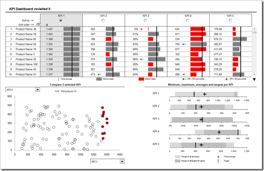
2D Tabular Heatmaps with Microsoft Excel
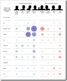
 Inspired by a NY Times chart, Juice Analytics recently had a post and a discussion on bubble chart heat maps: Bubble, bubble toil and trouble. Chris Gemignani wrote:
“The first tool we tried, simply on principle, was Excel 2003. As expected, making a NY Times quality bubble chart in Excel 2003 is a hard problem.”
Juice Analytics is one of my favorite blogs on visualization and I learned a lot from the blog and website. But in this case I do not agree at all. And it seems as if I am not alone.
What had to come, came. Some of us – including myself – could not let this rest.
- I used Fabrice Rimlinger’s famous Sparklines for XL (free download here) and created a replica of the NY Times chart. Fabrice was kind enough to publish this on his blog (Yes, we can) and his own version with an improved visualization using bar charts (Stick to the classics?).
- Two days later my friend and Excel MVP Chandoo showed Visualizing Search Terms on Travel Sites, a bubble-chart solution with plain old Excel (no VBA).
- Last, but not least: Andreas Lipphardt of xlCubed was ahead of his times and had a post on creating heatmap tables with Excel based on bubble charts already in August 2008.
Conclusion: Yes you can. It is not a hard problem to create quality heat maps with Microsoft Excel.
But let’s take one step back. What if you don’t want to use the size of the bubbles for visualization? What if you want to create a classic heat map, i.e. the higher the value, the darker the fill color of the cell and vice versa? Following a definition like the one on Wikipedia:
“A heat map is a graphical representation of data where the values taken by a variable in a two-dimensional map are represented as colors.”
Can you create a classic 2-dimensional tabular heatmap with Microsoft Excel as well?
Yes, you can. And there is more than one way to skin the cat. This post shows the different options and includes all examples for free download.
(more…)


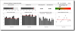
 Using Key Performance Indicators (KPIs) in Customer Care management is a prime example of Performance Dashboards. Call Center Managers usually monitor the performance of their Customer Care with an extensive list of different metrics and KPIs visualized on one or several real-time dashboards. On a higher level and in a more condensed form the numbers are also reported to the Top Management on regular intervals, usually at least weekly.