Tag: us unemployment map

  • Optimized Choropleth Maps in Microsoft Excel

    How to create optimized Choropleth Maps in Excel with a higher resolution and without distortions using Excel 365

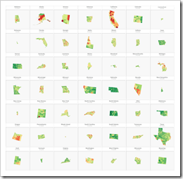
    Inspired by an idea of my internet friend and highly esteemed colleague Leonid Koyfman, the post US Choropleth Map by County per State – a 4th Option described and provided an Excel workbook with a Choropleth Map of the United States including a second map showing a magnified view of one selected state.

    Optimized Chroropleth Maps in Excel (Intro)The code and technique itself worked fine.

    However, there was one major disadvantage: during the process of creating the map in Excel, the shapes were slightly distorted. The zoomed map of one state still looked good for e.g. Texas or California, but definitely not for smaller states like Rhode Island or Connecticut.

    Today’s post provides a solution to overcome this issue: a way to create a Choropleth Map in Excel without distortions, displaying all counties accurately, no matter at which zoom level. As always, an example workbook is provided for free download.

    (more…)

  • US Choropleth Map by County per State – a 4th Option

    Another option to display a Choropleth Map of the United States by County for one user-selected state in Microsoft Excel

    The previous post presented three different options to implement a US Choropleth Map by County per State in Microsoft Excel. One approach showed the entire map of the United States and highlighted the selected state (option 2), whereas option 3 filtered the data and only plotted the counties of the selected state.

    It was again Leonid Koyfman (who else?), who provided me with an interesting idea for another alternative: Leonid suggested in this comment to combine options 2 and 3 and show both maps in one view. This requires more real estate on the dashboard, but it also combines the advantages of both approaches: it provides a zoomed map of the selected state and keeps the context of this state on the map of the entire USA.

    Since the technique will certainly be most useful on a dashboard showing more than just the maps, I created an example visualization with two additional views:
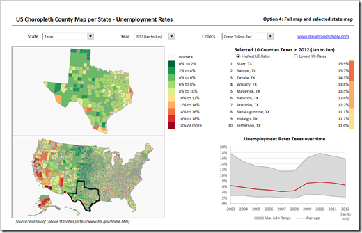
    US Choropleth Map by County per State Dashboard - click to enlarge

    • On the left side of the dashboard the two maps (zoomed selected state and USA) are displayed
    • At top right of the visualization a table lists 10 selected counties of the current state: the 10 counties with the highest or lowest unemployment rates. A small new VBA routine assigns the according bin color to each of the 10 counties in the narrow column right to the table
    • The band chart at bottom right visualizes minimum, maximum and (unweighted) average of unemployment rates of all counties in the selected state over time

    This is just one example how the technique of visualizing maps for a user selected state could be integrated in a more complex dashboard.

    If you want to use this on your own dashboard, you may want to play around with the size of the maps and where they are located. Size and position of the zoomed state map are defined by the named range “myMapView”. You can adjust the zoomed map by simply changing the cell reference of this name. As for the map of the USA, you have to group all shapes of the US map first, then resize and reposition this group and finally ungroup it again.

    The major disadvantage remains, though: the zoomed map of the selected state makes the distortions visible. These distortions are inevitable in the process of converting SVG-files to freeform shapes in Excel. Well, at least I couldn’t find a way to avoid them. The problem depends on the size of the selected state: Texas and California, for instance, still look good as a zoomed map. Rhode Island and Connecticut definitely don’t. A crucial downside, no doubt about it. Unfortunately I do not have a solution for this. A map would be needed which will not be distorted in the ungrouping process, but I couldn’t find a better map than the one used here.

    If you are interested, here is the link to download the zipped Excel workbook:

    Download US Choropleth County Map per State (zipped Excel workbook, 2.4 MB)

    Many thanks go to Leonid for the idea.

    Stay tuned.
  • US Choropleth Map by County per State

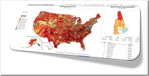
    How to display a Choropleth Map of the United States by County for one user-selected state

    Choropleth US Map by County per State (Intro)If you are a regular reader of this blog, you certainly know that I am into geographical data visualization. Just click on “Choropleth Maps” in the Categories roll on the right side of the blog and you will see that we already had 18 (!) posts in this category. Some of them discussing maps in Tableau, but most of them dealing with the question how to implement Choropleth Maps or Cartograms in Microsoft Excel.
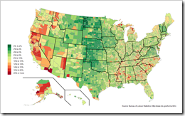
    I thought I would be through with this topic. I really did. However, I recently noticed that there is one common use case for Choropleth Maps in Excel I never wrote about: visualizing one user-selected region of a bigger map. Imagine you have geographical data with a hierarchy, e.g. USA by state and county (to state the obvious for the majority of my readers). It may well be that one of your dashboards is focused on displaying views for one selected state only.

    Now, what if one of your views shall be a Choropleth Map? How can you show only the selected part of a map on your dashboard?

    Today’s post describes three different options how to do this. As always, the example Excel workbooks are provided for free download without any password protection.

    (more…)

  • Fast Choropleth Map with Enhanced Features

    Enhance a detailed Choropleth Map in Microsoft Excel with additional features

    Choropleth Map with enhanced featuresThe recent article Faster Choropleth Maps with Microsoft Excel provided a faster version of the VBA code to update a detailed Choropleth Map in Microsoft Excel.

    Leonid Koyfman, a faithful reader of Clearly and Simply liked this article. Leonid already contributed his invaluable ideas and insights here before (Excel Multiple Value Filters with Invert Selection). He had a couple of very interesting ideas for the fast Choropleth Map and he is kind enough to share them with us:


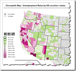
    1. Let the user filter the data by value bin and thereby highlight the bins of interest on the map
    2. Show tooltips when hovering over the map to display the name of the county and the unemployment rate in percent
    3. Let the user switch the level of detail: color the map by county or by state

    Today’s article describes Leonid’s enhancements and includes a link to the Excel workbook for free download.

    (more…)

  • Faster Choropleth Maps with Microsoft Excel

    An improved version of a Microsoft Excel Choropleth Map with a better performance for detailed maps

    Choropleth Map US Unemployment by CountyVery soon after starting this blog in 2009 I published a post with a set of Microsoft Excel Choropleth Map templates.  This post is still one of the most popular articles and downloads here.

    A lot of related posts followed and I am feeling very honored that my blogging colleague and France’s data visualization guru Bernard Lebelle of Impact Visuel used 2 of my maps published here on Clearly and Simply in his great new book “Convaincre avec des graphiques efficaces”. Bernard was kind enough to point his readers to my blog in the book. This is much appreciated. However, he should have heaped the praise on Tushar Mehta, who invented this technique. I only “stole” Tushar’s idea.

    Tushar’s approach works great and I know from comments and emails that a lot of my readers have used it with great success.

    There is only one minor drawback with Tushar’s approach: the performance decreases considerably when using it on a map with a lot of shapes, like the US by Counties.

    Today’s post tries to heal this. It discusses how to considerably improve the performance of a detailed map. The article describes the original approach, the optimization potential, the improved implementation and – as always – provides the Excel workbook for free download.

    (more…)