Tag: maps in excel

  • Animated Maps in Microsoft Excel

    How to create an animated Choropleth Map (aka Heat Map, Filled Map, Thematic Map or Statistical Map) in Microsoft Excel

    1.006 words, ~5 minutes read

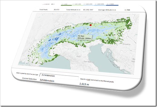
    In one of the recent articles (All Peaks of the Alps visualized in Excel), I tried to show how to combine different advanced techniques in Microsoft Excel (posted here or elsewhere) to create highly interactive Excel dashboards.

    I will tell you no lies: that one was a washout. The interest in that post and workbook was next to nothing. Now, you certainly expect I would have learned my lesson and try something else. I did learn something, but the stubborn old man I am, I can’t let it go yet. Thus, I decided to give the idea another shot.

    Animated Choropleth or Heat Maps have become quite popular, especially in the past few weeks. So, there is nothing more obvious than providing a template with an animated Choropleth Map in Excel, is it?
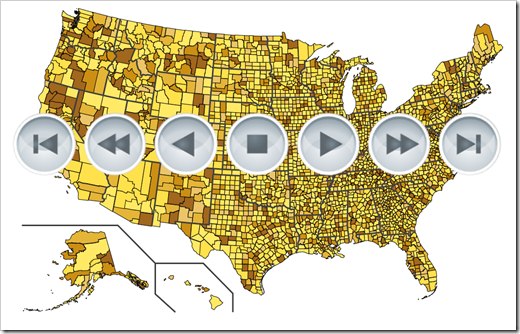
    Animated Maps in Microsoft Excel Intro

    Today’s post will briefly explain how to combine two advanced Excel techniques which have already been published here: a Choropleth Map and the animation of visualizations in Excel.

    As always, the article comes with the workbooks for free download: an animated map of Germany by districts (Kreise und kreisfreie Städte) and one of the United States by counties.
    (more…)

  • All Peaks of the Alps visualized in Excel

    Bluffing some of Tableau’s amazing interactive features in Microsoft Excel: an Excel Replica of All Peaks of the Alps visualized with Tableau

    The previous post provided a Tableau visualization of all peaks of the Alps. Peaks of the Alps - IntroI already bluffed some of Tableau’s amazing interactive features in Microsoft Excel and published the solutions here.

    The idea wasn’t mine, though, but Matt Grams’.

    Matt started the journey in 2009 (!) with his beautiful guest article Bluffing a Visual Cross-tab with Excel. I followed a few months later with Bluffing Tableau Actions with Microsoft Excel. Ever since, I posted a few techniques to replicate Tableau’s interactive options in Microsoft Excel.

    Back in 2013, I created an entire Excel replica of one of my Tableau workbooks, which was once selected as the Viz of the Day by Tableau: Bruce Springsteen Discography – A Tableau Infographic. This is the Excel replica: Bruce Springsteen Discography in Excel.

    To carry on this tradition, today’s article provides an Excel replica of All Peaks of the Alps visualized with Tableau. Truth be told, of course not replicating all of Tableau’s features, but still some interesting interactive functionality in Excel beyond the defaults.

    (more…)