Tag: interactive excel tooltips

  • Power BI lookalike Tooltips in Microsoft Excel

    How to create Power BI lookalike Tooltips in Microsoft Excel Charts

    1,361 words, ~7 minutes read

    Tooltips are an extremelyPower BI lookalike Tooltips in Microsoft Excel - Intro helpful feature to explore and understand data.
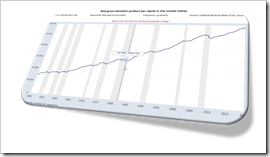
    When hovering over a data point of a chart, a textbox appears and displays the values and – if applicable – even additional information.

    I love working with Microsoft Excel. I truly love the application. But I will make no bones about it: Microsoft Excel’s native chart tooltips are mostly pointless. There is no option to adjust or format them, to link the content to a cell range or the like. They only display default information and this is pretty useless in most cases. All you can do is to turn them off in Excel’s options to get them out of your hair.

    I already posted a few articles about this subject, the first one back in 2010, including the same rant as above: Better Chart Tooltips with Microsoft Excel 2010.

    Microsoft didn’t do anything about it. Excel’s chart tooltips are still as lame as they have been in the past 20 years. This is remarkable, because Microsoft provides much better tooltips in Power BI. So, they are aware that tooltips are helpful, but apparently they don’t see the necessity to let Excel users take advantage of it, too. So we are still on our own here.

    Although I already provided a few options to display better tooltips in Excel (e.g. Customizable Tooltips on Excel Charts), I would like to come back to this topic again.

    Power BI does not only automatically insert tooltips on charts, it also shows a vertical line across the entire plot area and displays the tooltip even if the mouse cursor is not above the plotted data series.

    That intrigued me. Today’s post will provide 2 options how to mimic Power BI lookalike tooltips on Microsoft Excel charts. As always, the post comes with the Excel workbooks for free download.

    (more…)
  • User-defined Excel Chart Tooltips

    How to provide different options of customized tooltips on a Microsoft Excel chart and let the user decide which one to display

    User Defined Tooltips in Microsoft ExcelOne of the previous posts described four different techniques how to create customizable, meaningful tooltips on XY Scatter Charts in Microsoft Excel:
    Customizable Tooltips on Excel Charts

    Two of the approaches used a camera object (aka linked picture) to allow more formatting options of the tooltip.

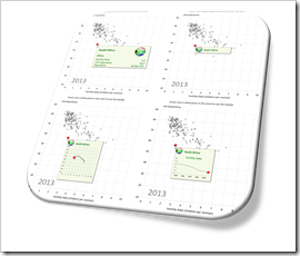
    This idea can be taken one step further: with camera objects, you can easily provide more than one type of tooltip and let your user interactively select the tooltip which is most helpful for his analysis.

    Today’s article describes how to enable your user to select from five different tooltips with one single click: dimensions and measures, only a dimension and three additional charts displaying further information on the data point currently hovered over with the mouse. The post describes the idea and the implementation and of course makes the example workbooks available for free download.

    (more…)

  • Customizable Tooltips on Excel Charts

    How to create customizable, meaningful tooltips on XY Scatter Charts in Microsoft Excel

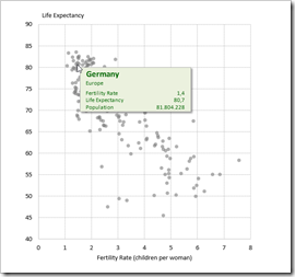
    Customizable Chart Tooltips on Excel XY Scatter ChartBack in December 2010, I published an article about Better Chart Tooltips with Microsoft Excel. The post described the weaknesses of Microsoft Excel’s standard chart tooltips and provided a VBA-based technique how to get to customizable, meaningful and more useful tooltips in Excel.

    Today, I would like to revisit this topic for several reasons:

    Firstly, Microsoft hasn’t done anything about this shortcoming in the versions 2013 and 2016. The problem of insufficient chart tooltips in Excel remains.

    Secondly, the workbook provided in 2010 implemented the better chart tooltips on another dashboard with additional features, which was published here: Bluffing Tableau Actions with Microsoft Excel. Many people have asked for a simplified, generic template only providing the tooltips on a standard XY Scatter chart.

    Next, reader Will Clark came up with the great idea of using a camera object instead of a simple textbox, in order to have more formatting options.

    Last, but not least, I discovered another approach for creating interactive charts in Excel. I already used and published this in several posts (Another Technique for Interactive Excel Charts, Selecting and Highlighting Areas on Excel Charts, Select Areas on a USA Map in Microsoft Excel and Zooming in and out of Excel Charts), but this technique is also viable for implementing chart tooltips.

    Today’s post will discuss again Excel’s shortcomings in terms of chart tooltips, briefly describe 4 different techniques how to overcome this issue and – as always – provide the Microsoft Excel workbooks for free download.

    (more…)